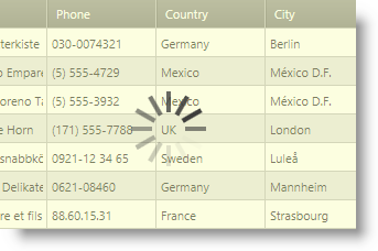
This topic explains how to change the default overlay style of the xamBusyIndicator™ control.
The following topics are prerequisites to understanding this topic:
Use the XamBusyIndicator OverlayStyle property to apply a custom style to the Rectangle element that is placed over the xamBusyIndicator content when the indicator is busy.
The following table maps the desired configuration to the property settings that manage it.
The screenshot below demonstrates how the xamBusyIndicator control looks as a result of the following settings:

Following is the code that implements this example.
In XAML:
<ig:XamBusyIndicator IsBusy="True" >
    <ig:XamBusyIndicator.OverlayStyle>
        <Style TargetType="{x:Type Rectangle}">
            <Setter Property="Opacity" Value=".5" />
            <Setter Property="Fill" Value="#FFF8FCC1" />
        </Style>
    </ig:XamBusyIndicator.OverlayStyle>
</ig:XamBusyIndicator>The following topics provide additional information related to this topic.