This topic explains the features supported by the control from developer perspective.
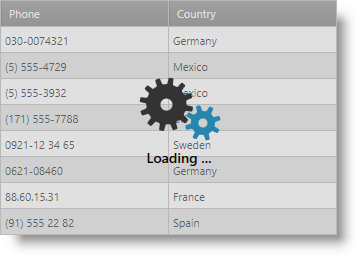
The xamBusyIndicator is a control that overlays its content and displays an indication that an underlying long-running process is executed.
The xamBusyIndicator control provides various animations, some of them have determinate and indeterminate mode.

The following table summarizes the main features of the xamBusyIndicator control. Additional details are available after the summary table.
The xamBusyIndicator control provides a set of pre-built animations.
The animations default brushes are fully customizable as well as the animations speed.
You can also create your own animation and replace the default control animation.

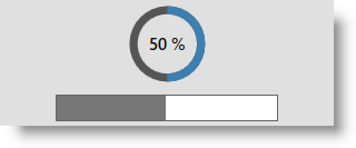
The xamBusyIndicator control provides two animations that have both indeterminate and determinate mode – ProgressRing and ProgressBar.
When in determinate mode, they display the underlying activity progress.

Related Topic:
The xamBusyIndicator control may appear after a specified interval.
Related Topic:
The Busy content area in the xamBusyIndicator control is fully customizable.
Related Topic:
A UIElement can be specified to receive the focus when the xamBusyIndicator control is no longer active.
Related Topic:
The default overlay style of the xamBusyIndicator control can be changed easily just by setting the OverlayStyle property to the Rectangle element.
Related Topic:
The full set of themes is provided for the xamBusyIndicator control. The dictionary containing the theme is named "[theme-name].WPF.xaml". For example the dictionary for the Metro theme is named "Metro.WPF.xaml".
The following topics provide additional information related to this topic.