This topic explains how to customize the xamBusyIndicator™ control default animations brushes.
The following topics are prerequisites to understanding this topic:
This topic contains the following sections:
The following table summarizes the pre-build animations in the xamBusyIndicator control, their customizable brushes and available modes – determinate and indeterminate. Additional details are available after the summary table.
Use the AzureBusyAnimation LowerElementsFill and UpperElementsFill properties to change the default Azure animation brushes.
In order to change the animation brushes in runtime, see the Changing Animations Brushes in Runtime section.
The screenshot below demonstrates how the xamBusyIndicator Azure animation looks as a result of the following settings:

Following is the code that implements this example.
In XAML:
<ig:XamBusyIndicator IsBusy="True" Name="Azure" >
    <ig:XamBusyIndicator.Animation>
        <ig:AzureBusyAnimation LowerElementsFill="#FFB8D432" UpperElementsFill="#FF59B4D9"/>
    </ig:XamBusyIndicator.Animation>
</ig:XamBusyIndicator>Use the GearsBusyAnimation BigGearFill and SmallGearFill properties to change the default Gears animation brushes.
In order to change the animation brushes in runtime, see the Changing Animations Brushes in Runtime section.
The screenshot below demonstrates how the xamBusyIndicator Gears animation looks as a result of the following settings:

Following is the code that implements this example.
In XAML:
<ig:XamBusyIndicator IsBusy="True" Name="Gears" >
    <ig:XamBusyIndicator.Animation>
        <ig:GearsBusyAnimation BigGearFill="#FF324047" SmallGearFill="#FF43A898"/>
    </ig:XamBusyIndicator.Animation>
</ig:XamBusyIndicator>Use the ProgressRingBusyAnimation RingBackground, Background, Foreground and RingFill properties to change the default ProgressRing animation brushes.
In order to change the animation brushes in runtime, see the Changing Animations Brushes in Runtime section.
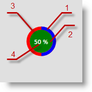
The screenshot below demonstrates how the xamBusyIndicator ProgressRing animation looks as a result of the following settings:

RingFill
Background
RingBackground
Foreground
Following is the code that implements this example.
In XAML:
<ig:XamBusyIndicator IsBusy="True" IsIndeterminate="False" Name="ProgressRingDeterminate" ProgressValue=".5" >
    <ig:XamBusyIndicator.Animation>
        <ig:ProgressRingBusyAnimation RingBackground="Red" Background="Green" Foreground="White" RingFill="Blue"  />
    </ig:XamBusyIndicator.Animation>
</ig:XamBusyIndicator>Use the SingleBrushBusyAnimation AnimationFill property to change the default SpinnerBalls animation brush.
In order to change the animation brushes in runtime, see the Changing Animations Brushes in Runtime section.
The screenshot below demonstrates how the xamBusyIndicator SpinnerBalls animation looks as a result of the following settings:

Following is the code that implements this example.
In XAML:
<ig:XamBusyIndicator IsBusy="True" Name="SpinnerBalls">
    <ig:XamBusyIndicator.Animation>
        <ig:SpinnerBallsBusyAnimation AnimationFill="#FF609BAE" />
    </ig:XamBusyIndicator.Animation>
</ig:XamBusyIndicator>Use the SingleBrushBusyAnimation AnimationFill property to change the default SpinnerBars animation brush.
In order to change the animation brushes in runtime, see the Changing Animations Brushes in Runtime section.
The screenshot below demonstrates how the xamBusyIndicator SpinnerBars animation looks as a result of the following settings:

Following is the code that implements this example.
In XAML:
<ig:XamBusyIndicator IsBusy="True" Name="SpinnerBars" >
    <ig:XamBusyIndicator.Animation>
        <ig:SpinnerBarsBusyAnimation AnimationFill="#FF3C7B82" />
    </ig:XamBusyIndicator.Animation>
</ig:XamBusyIndicator>Use the SingleBrushBusyAnimation AnimationFill property to change the default SpinnerBarsWave animation brush.
In order to change the animation brushes in runtime, see the Changing Animations Brushes in Runtime section.
The screenshot below demonstrates how the xamBusyIndicator SpinnerBarsWave animation looks as a result of the following settings:

Following is the code that implements this example.
In XAML:
<ig:XamBusyIndicator IsBusy="True" Name="SpinnerBarsWave" >
    <ig:XamBusyIndicator.Animation>
        <ig:SpinnerBarsWaveBusyAnimation AnimationFill="#FF3C7B82" />
    </ig:XamBusyIndicator.Animation>
</ig:XamBusyIndicator>Use the SingleBrushBusyAnimation AnimationFill property to change the default SpinnerSegmented animation brush.
In order to change the animation brushes in runtime, see the Changing Animations Brushes in Runtime section.
The screenshot below demonstrates how the xamBusyIndicator SpinnerSegmented animation looks as a result of the following settings:

Following is the code that implements this example.
In XAML:
<ig:XamBusyIndicator IsBusy="True" Name="SpinnerSegmented" >
    <ig:XamBusyIndicator.Animation>
        <ig:SpinnerSegmentedBusyAnimation AnimationFill="#FF43A898" />
    </ig:XamBusyIndicator.Animation>
</ig:XamBusyIndicator>The following example explains how to bind the xamBusyIndicator Gears animation brushes and change them in runtime using the xamColorPicker control.
Use the GearsBusyAnimationPresenter BigGearFill and SmallGearFill properties to bind to the xamColorPicker SelectedColorPreview property in order to change the animations colors dynamically.
Unlike the GearsBusyAnimation BigGearFill and SmallGearFill properties which are not bindable and used only for initialization, the GearsBusyAnimationPresenter BigGearFill and SmallGearFill properties are bindable dependency properties.
The following screenshot is a preview of the final result.

To complete the procedure, you need the following:
Add the following NuGet package references to your project:
Infragistics.WPF.ColorPicker
Infragistics.WPF
For more information on setting up the NuGet feed and adding NuGet packages, you can take a look at the following documentation: NuGet Feeds.
The following steps demonstrate how to change the Gears animations brushes in runtime.
Add the xamBusyIndicator control to your page
In XAML:
<ig:XamBusyIndicator Name="Gears" IsBusy="True" Animation="Gears" Width="200" />Add a xamColorPicker control to your page and bind its SelectedColorPreview property to a xamBusyIndicator animation brush
In XAML:
<ig:XamColorPicker SelectedColor="#FF324047" Width="100" SelectedColorPreview="{Binding ElementName=Gears, Path=AnimationPresenter.BigGearFill, Mode=TwoWay, Converter={StaticResource ColorToSolidColorBrushValueConverter}}" />Following is the full code for this procedure.
In XAML:
<Grid>
    <Grid.Resources>
        <local:ColorToSolidColorBrushValueConverter x:Key="ColorToSolidColorBrushValueConverter" />
    </Grid.Resources>
    <StackPanel>
        <ig:XamBusyIndicator Name="Gears" IsBusy="True" Animation="Gears" Width="200" />
        <StackPanel Orientation="Horizontal" HorizontalAlignment="Center">
            <TextBlock Text="BigGearFill" Width="100" />
            <ig:XamColorPicker SelectedColor="#FF324047" Width="100"
            SelectedColorPreview="{Binding ElementName=Gears, Path=AnimationPresenter.BigGearFill, Mode=TwoWay, Converter={StaticResource ColorToSolidColorBrushValueConverter}}" />
        </StackPanel>
        <StackPanel Orientation="Horizontal" HorizontalAlignment="Center">
            <TextBlock Text="SmallGearFill" Width="100"/>
            <ig:XamColorPicker SelectedColor="#FF43A898" Width="100"
            SelectedColorPreview="{Binding ElementName=Gears, Path=AnimationPresenter.SmallGearFill, Mode=TwoWay, Converter={StaticResource ColorToSolidColorBrushValueConverter}}" />
        </StackPanel>
    </StackPanel>
</Grid>
In C#:
public class ColorToSolidColorBrushValueConverter : IValueConverter
{
    public object Convert(object value, Type targetType, object parameter, CultureInfo culture)
    {
        var result = new Color();
        if (value is SolidColorBrush)
            result = ((SolidColorBrush)value).Color;
            return result;
    }
     public object ConvertBack(object value, Type targetType, object parameter, CultureInfo culture)
     {
         SolidColorBrush result = null;
         if (value is Color)
             result = new SolidColorBrush((Color)value);
         return result;
    }
}
In Visual Basic:
Public Class ColorToSolidColorBrushValueConverter
      Implements IValueConverter
      Public Function Convert(value As Object, targetType As Type, parameter As Object, culture As CultureInfo) As Object
            Dim result = New Color()
            If TypeOf value Is SolidColorBrush Then
                  result = DirectCast(value, SolidColorBrush).Color
            End If
            Return result
      End Function
      Public Function ConvertBack(value As Object, targetType As Type, parameter As Object, culture As CultureInfo) As Object
            Dim result As SolidColorBrush = Nothing
            If TypeOf value Is Color Then
                  result = New SolidColorBrush(DirectCast(value, Color))
            End If
            Return result
      End Function
End ClassThe following topics provide additional information related to this topic.