Descripción general de Web Components Stepper
El componente paso a paso de Web Components proporciona un flujo de trabajo similar al de un asistente y se utiliza para mostrar el progreso a través de pasos numerados. Permite a los desarrolladores dividir un contenido extenso en una secuencia de pasos lógicos, lo que ayuda a los usuarios finales a navegar más fácilmente por todo el proceso. El paso a paso Web Components se muestra como una línea vertical u horizontal. El Web Components Stepper tiene múltiples funciones como la validación de pasos, el estilo, la orientación y la navegación con el teclado.
Web Components Stepper Example
El siguiente ejemplo de paso a paso de Ignite UI for Web Components muestra el componente en acción. Visualiza el proceso por el que debe pasar un usuario final para configurar los detalles de un pedido, siguiendo varios pasos consecutivos.
Getting Started with Web Components Stepper
En primer lugar, debe instalar el Ignite UI for Web Components ejecutando el siguiente comando:
npm install igniteui-webcomponents
Antes de usarlosIgcStepperComponent, debes registrarlo de la siguiente manera:
import { defineComponents, IgcStepperComponent } from 'igniteui-webcomponents';

defineComponents(IgcStepperComponent);
Para una introducción completa al Ignite UI for Web Components, lee el tema Empezar.
Ahora puedes empezar con una configuración básica del Web ComponentsIgcStepperComponent y sus pasos.
How To Use Web Components Stepper
EsIgcStepComponent la representación de cada paso que pertenece a elIgcStepperComponent. Los pasos proporcionaninvalidactiveoptionaldisabled ycomplete propiedades, que te permiten configurar los estados de los pasos según los requisitos de tu negocio.
Declaring Web Components Stepper
Los pasos se pueden declarar utilizando uno de los siguientes enfoques.
- Iterando a través de un conjunto de datos
<igc-stepper>
    ${stepsData.map((step) => html`
    <igc-step .disabled=${step.disabled}>
        <div slot="indicator">
            <igc-icon .iconName=${step.indicator}></igc-icon>
        </div>

        <p slot="title">${step.title}</p>
    </igc-step>
    `
</igc-stepper>
- Creando pasos estáticos
<igc-stepper>
    <igc-step>
       <p slot="title">Step 1</p>
    </igc-step>
    <igc-step>
       <p slot="title">Step 2</p>
    </igc-step>
</igc-stepper>
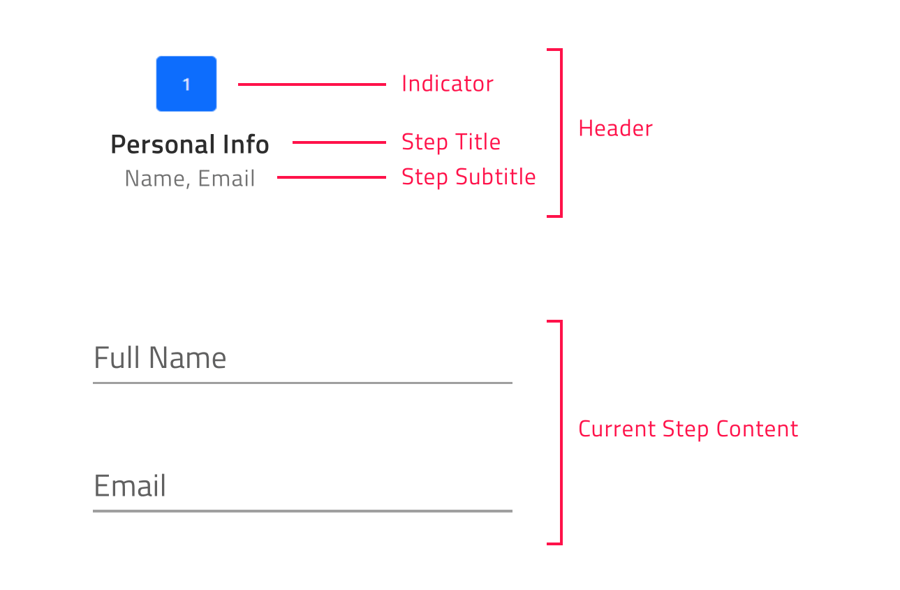
Para cada paso, el usuario puede configurar indicador, título y subtítulos usando lasIndicatorTitle ranuras ySubtitle de la siguiente manera:
[!Note] The
DefaultIgcStepComponentslot renders the content of the step.
<igc-stepper>
    <igc-step>
       <igc-icon slot="indicator" iconName="home"></igc-icon>
       <p slot="title">Home</p>
       <p slot="subtitle">Home Sub Title</p>
       <div>
          Step Content
       </div>
    </igc-step>
</igc-stepper>
Orientation in Web Components Stepper
Puedes personalizar la orientación del motor paso a paso a través de la propiedad expuestaorientation. Podría configurarse en horizontal (valor por defecto) o vertical.
Orientación paso a paso horizontal
horizontal es el valor predeterminado para laIgcStepperComponent propiedad de orientación. Cuando el Web Components stepper está orientado horizontalmente, tienes la oportunidad de determinar si el contenido de los pasos se mostrará por encima o por debajo de los encabezados de los pasos. Esto podría lograrse estableciendo elIgcStepperComponent contentTop Propiedad booleana, cuyo valor por defecto es falso. En caso de que esté activado, el contenido de los pasos se mostrará encima de las cabeceras de los pasos.

Orientación vertical del paso a paso
Puedes cambiar fácilmente del diseño horizontal al vertical. Para cambiar la orientación por defecto deberías poner laorientation propiedad en vertical.
El siguiente ejemplo demuestra cómo se puede cambiar la orientación del paso a paso y la posición de los títulos en tiempo de ejecución.
Step States
Web ComponentsIgcStepperComponent soporta cinco estados de pasos y cada uno de ellos aplica estilos diferentes por defecto:
- active- Determina si el paso es el que se muestra actualmente. Por diseño, si el usuario no establece explícitamente el atributo activo de algún paso como verdadero, el primer paso activo sería el primer paso no deshabilitado.
- discapacitado- Determina si el paso es intratable. Por defecto, el atributo deshabilitado de un paso está configurado como falso.
- inválido- Determina si el paso es válido. En función de su valor, se decide si el usuario tendrá la capacidad de avanzar en modo paso a paso lineal. Su valor por defecto es falso.
- opcional: por defecto, el atributo opcional de un paso está configurado como falso. Si no se requiere validez de un paso en el paso a paso lineal, entonces se puede activar el atributo opcional para poder avanzar de forma independiente a la validez del paso.
- complete- Por defecto, el atributo complete de un step devuelve false. Sin embargo, el usuario puede anular este comportamiento completo por defecto configurando el atributo completo según sea necesario. Cuando el paso se marca como completo, no solo el estilo del encabezado del paso cambia por defecto, sino también el estilo de la línea de progreso entre el paso completado y el siguiente.
Linear Web Components Stepper
El Web ComponentsIgcStepperComponent te da la oportunidad de establecer el flujo de pasos usando lalinear propiedad. Por defecto, lineal está configurado como falso y el usuario puede seleccionar cualquier paso no deshabilitado en elIgcStepperComponent.
<igc-stepper linear="true">
    <igc-step>
       <p slot="title">Step 1</p>
    </igc-step>
    <igc-step>
       <p slot="title">Step 2</p>
    </igc-step>
</igc-stepper>
Cuando la propiedad lineal se establece como verdadera, el paso a paso requerirá que el paso no opcional actual sea válido antes de pasar al siguiente.
Si el paso no opcional actual no es válido, no podrá avanzar al siguiente paso hasta que valide el actual.
[!Note] Optional steps validity is not taken into account in order to move forward.
Step Interactions
IgcStepperComponentproporciona los siguientes métodos API para interacciones escalonadas:
- navegar a– activa el paso por índice dado.
- siguiente: activa el siguiente paso no deshabilitado.
- prev: activa el paso anterior no deshabilitado.
- restablecer: restablece el paso a paso a su estado inicial.
[!Note] The reset method would reset the stepper to its initial state, i.e. activates the first step. It would not clear the step`s content. This should be done manually.
Customizing the Steps
El Ignite UI for Web Components Stepper te da la posibilidad de configurar diferentes opciones para títulos, indicadores y mucho más.
Esto podría lograrse a través de lastepType propiedad de laIgcStepperComponent. Toma los siguientes valores:
- Full (valor por defecto)
- Indicador
- Título
lleno
Si se definen títulos y subtítulos, con esta configuración se representarán tanto los indicadores como los títulos.
El usuario también tendría la capacidad de definir la posición del título para los escalones, para que pudiera colocarse antes, después, arriba o debajo del indicador de pasos. El usuario puede configurar la posición del título usando latitlePosition propiedad. Toma los siguientes valores:
- indefinido (valor por defecto)
- fin
- comenzar
- abajo
- arriba
Cuando el Web ComponentsIgcStepperComponent está orientado horizontalmente y la posición del título no está definida, los títulos se muestran debajo de los indicadores.
Cuando la orientación está en vertical y la posición del título no está definida, los títulos se muestran después de los indicadores.
[!Note] titlePosition property is applicable only when the stepper stepType property is set to full.
indicador
Si quieres mostrar solo indicadores para los pasos, configura la opción stepType como indicador.
El indicador escalonado soporta cualquier contenido, aunque con la restricción de que su tamaño sea siempre de 24 píxeles. Teniendo esto en cuenta, recomendamos usarIgcIconComponent oIgcAvatarComponent como indicadores de paso.
Título
Si quieres mostrar solo los títulos de los pasos, pon la opción stepType en título.
De esta manera, si se definen subtítulos, también aparecerán debajo del título del paso.
[!Note] This container could be re-templated as per your requirement without any size restrictions. For example, you could add an indicator with size greater than 24 pixels inside it.
El siguiente ejemplo muestra todos los tipos de pasos expuestos y cómo podrían cambiarse:
Stepper Animations
Las animaciones de Web ComponentsIgcStepperComponent ofrecen a los usuarios finales una experiencia preciosa interactuando con los pasos definidos. Las opciones de animación disponibles varían según la orientación del motor paso a paso.
Cuando el motor paso a paso está orientado horizontalmente, está configurado para usar laslide animación por defecto. También es compatiblefade como alternativa. Las animaciones se configuran mediante lahorizontalAnimation entrada.
En un diseño orientado verticalmente, el tipo de animación podía definirse usando laverticalAnimation propiedad. Por defecto, su valor está establecido engrow y el usuario también puede configurarlo enfade.
Configurarnone ambos tipos de animación desactiva las animaciones del stepper.
ElIgcStepperComponent componente también te permite configurar la duración de la transición entre los pasos. Esto podría lograrse mediante laanimationDuration propiedad, que toma un número como argumento y es común a ambas orientaciones. El valor por defecto está fijado en 320ms.
Keyboard Navigation
El Ignite UI for Web Components Stepper ofrece una gran variedad de interacciones con el teclado al usuario final. Esta funcionalidad está activada por defecto y permite a los usuarios finales navegar fácilmente por los pasos. La navegación Web ComponentsIgcStepperComponent cumple con los estándares de accesibilidad del W3 y es cómoda de usar.
Combinaciones de teclas
- TAB- mueve el foco al siguiente elemento tabulable
- SHIFT + TAB- mueve el foco al elemento tabulable anterior
- ↓: mueve el foco al encabezado del siguiente paso accesible cuando el paso a paso está orientado verticalmente
- ↑- mueve el foco al encabezado del paso accesible anterior cuando el paso a paso está orientado verticalmente
- ←: mueve el foco al encabezado del paso accesible anterior en ambas orientaciones
- →- mueve el foco al encabezado del siguiente paso accesible en ambas orientaciones
- HOME- mueve el foco al encabezado del PRIMER paso habilitado en el paso paso a paso
- END- mueve el foco al encabezado del paso LAST habilitado en el paso paso a paso
- ENTER o SPACE- activa el paso actualmente enfocado
Styling Web Components Stepper
Puedes cambiar la apariencia de laIgcStepComponent opción usando algunas de las piezas CSS expuestas que se enumeran a continuación:
| Nombre de la pieza | Descripción |
|---|---|
header-container |
Envoltura de la cabecera del paso y sus separadores. |
disabled |
Indica un estado deshabilitado. Se aplica al contenedor de encabezado. |
complete-start |
Indica un estado completo del paso actual. Se aplica al contenedor de encabezado. |
complete-end |
Indica un estado completo del paso anterior. Se aplica al contenedor de encabezado. |
optional |
Indica un estado opcional. Se aplica al contenedor de encabezado. |
invalid |
Indica un estado no válido. Se aplica al contenedor de encabezado. |
top |
Indica que el título debe estar encima del indicador. Se aplica al contenedor de encabezado. |
bottom |
Indica que el título debe estar debajo del indicador. Se aplica al contenedor de encabezado. |
start |
Indica que el título debe estar antes del indicador. Se aplica al contenedor de encabezado. |
end |
Indica que el título debe estar después del indicador. Se aplica al contenedor de encabezado. |
header |
Envoltorio del indicador y texto del paso. |
indicator |
El indicador del paso. |
text |
Envoltorio del título y subtítulo del paso. |
empty |
Indica que no se ha proporcionado ningún título ni subtítulo al paso. Se aplica al texto. |
title |
El título del paso. |
subtitle |
El subtítulo del paso. |
body |
Envoltorio del contenido del paso. |
content |
El contenido de los pasos. |
Usando estas piezas CSS podemos personalizar la apariencia delIgcStepperComponent componente de esta manera:
igc-step::part(title) {
  color: var(--ig-primary-500);
}
igc-step[active]::part(indicator) {
  background-color: var(--ig-primary-500);
}
igc-step::part(indicator) {
  background-color: var(--ig-surface-500);
}