Get Started with Ignite UI for Angular
Ignite UI for Angular is a library of 100+ enterprise UI components - including data grids, charts, editors, navigation controls, and layout containers - distributed as the igniteui-angular npm package by Infragistics. This guide walks through three installation paths (Ignite UI CLI, Angular Schematics, and Angular CLI with ng add) and ends with a working IgxGridComponent rendered from local data.
Ignite UI for Angular targets Angular 17 and later, with standalone components as the default bootstrapping model. It does not support Vue, React, or Web Components natively - for those frameworks see Ignite UI for React, Ignite UI for Web Components, and Ignite UI for Blazor.
Ignite UI for Angular is offered under a dual-license model: some components are open source under MIT, others require a commercial license. For details see Ignite UI Licensing and Open Source vs Premium.
Prerequisites
- Node.js 20 LTS or later (Node.js 22 LTS recommended)
- npm 10+ (bundled with Node.js 20), yarn, or pnpm
- Angular CLI 17+ for the
ng addinstallation path - Visual Studio Code or any editor with TypeScript language support
Install Ignite UI for Angular
Ignite UI for Angular supports three installation paths. Use the Ignite UI CLI or Angular Schematics when starting a new project from scratch. Use ng add when adding Ignite UI for Angular to an existing Angular workspace.
Install with Ignite UI CLI
The Ignite UI CLI is a standalone command-line tool that scaffolds a fully configured Angular project with Ignite UI for Angular in a single command. Install it globally:
npm install -g igniteui-cli
Activate the guided project wizard:
ig
Or create a project non-interactively:
ig new <project-name> --framework=angular --type=igx-ts --template=side-nav
Note
As of Ignite UI CLI v13.1.0, the igx-ts project type generates a project that uses standalone components by default. To use NgModule-based bootstrapping instead, set --type=igx-ts-legacy.
Note
At some point during the process you may be asked to log in to the Infragistics npm registry if not already configured. This applies when using components under a commercial license.
For a full walkthrough of all CLI options and project templates, see Getting Started with Ignite UI CLI and Angular Schematics and Ignite UI CLI.
Install with Angular Schematics
The Ignite UI for Angular Schematics collection integrates into the Angular CLI workflow and provides the same guided experience as the standalone CLI, without requiring a separate global tool:
npm i -g @igniteui/angular-schematics
Activate the guided wizard:
ng new --collection="@igniteui/angular-schematics"
For a step-by-step walkthrough see Step-by-Step Guide Using Ignite UI for Angular Schematics.
Install with Angular CLI (ng add)
If you already have an Angular project or prefer to work entirely within the Angular CLI, use ng add to install and configure Ignite UI for Angular. Create a new Angular app first if needed:
ng new <project-name> --style=scss
SCSS is recommended because the Ignite UI for Angular Theming Library is built on it and ng add configures the default theme automatically. Then add Ignite UI for Angular:
ng add igniteui-angular
Note
ng add installs the trial version of igniteui-angular. If your project was scaffolded with the Ignite UI CLI, skip this step - the CLI already handles package setup. To switch to the licensed package later, see Upgrade from Trial to Licensed below.
Additional packages
Some Ignite UI for Angular components ship as separate npm packages and are added independently:
Grid Lite - open source (MIT)
A lightweight grid for projects that need basic data display without the full commercial feature set. Its API is compatible with IgxGrid, so upgrading later requires minimal changes.
ng add igniteui-grid-lite
Dock Manager - premium
A pane-based layout component where end users can pin, resize, move, and hide panes at runtime.
ng add igniteui-dockmanager
Add Components with CLI or Schematics
After the initial project setup, add Ignite UI for Angular component views using either the component schematic or the add command:
ng g @igniteui/angular-schematics:component
ig add
Note
The ig add command is available in projects created by the Ignite UI CLI or in Angular CLI projects where Ignite UI for Angular was added with ng add igniteui-angular.
Add Components Manually (Standalone)
As of Angular 19, standalone components are the default bootstrapping model. The following example adds an IgxGridComponent to a standalone Angular application without using Schematics or the CLI.
Some components use animations, which require a provider in the bootstrapApplication call. Configure this in app.config.ts:
// app/app.config.ts
import { ApplicationConfig, importProvidersFrom } from '@angular/core';
import { BrowserModule } from '@angular/platform-browser';
import { provideAnimations } from '@angular/platform-browser/animations';
import { Provider } from '@angular/core';

const providers: Provider[] = [
  importProvidersFrom(BrowserModule),
  provideAnimations()
];

export const appConfig: ApplicationConfig = { providers };
Import and use the Grid
Import IgxGridComponent and IgxColumnComponent directly in your standalone component. Because this is a standalone component, add both to the imports array rather than to an NgModule:
// app.component.ts
import { Component } from '@angular/core';
import { IgxGridComponent, IgxColumnComponent } from 'igniteui-angular';
@Component({
selector: 'app-root',
templateUrl: './app.component.html',
styleUrls: ['./app.component.css'],
imports: [IgxGridComponent, IgxColumnComponent]
})
export class AppComponent {
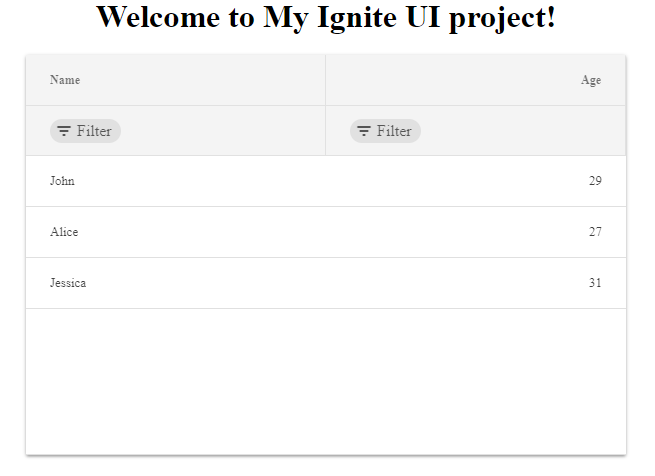
localData = [
{ Name: 'John', Age: 29 },
{ Name: 'Alice', Age: 27 },
{ Name: 'Jessica', Age: 31 },
];
}
Add the grid to the component template, binding [data] to the local array and defining columns explicitly:
<!-- app.component.html -->
<igx-grid [data]="localData" width="600px" height="400px" [allowFiltering]="true">
  <igx-column field="Name" dataType="string"></igx-column>
  <igx-column field="Age" dataType="number"></igx-column>
</igx-grid>
This renders an Ignite UI for Angular Grid with column filtering enabled, displaying three rows of local data.
Run the application
Run the application using the command for your setup:
ig start
Or, for projects created with the Angular CLI:
ng serve
Upgrade from Trial to Licensed
To switch from the trial igniteui-angular package to the licensed version, run the upgrade schematic in your project root:
ng g @igniteui/angular-schematics:upgrade-packages
Or, using the Ignite UI CLI:
ig upgrade-packages
The schematic updates package dependencies and replaces source references. You will be prompted to log in to the Infragistics private npm registry if not already configured.
AI-Assisted Development
Ignite UI for Angular ships two tools for AI-assisted development.
Agent Skills are structured knowledge files that teach AI coding assistants - GitHub Copilot, Cursor, Windsurf, Claude, JetBrains AI - how to work correctly with Ignite UI components, APIs, and theming patterns. Skills cover data grids, grid operations, charting, and theming. See Ignite UI for Angular Skills.
The Ignite UI MCP Server is a built-in server in the Ignite UI CLI that connects AI assistants to live Ignite UI component documentation and API references directly inside your editor. Unlike static skills, the MCP server answers queries about current APIs, retrieves setup guides on demand, and supports accurate code generation for Ignite UI components. Start it with ig mcp after installing the CLI. For client configuration and available tools, see Ignite UI CLI MCP Overview.
API References
Additional Resources
- Ignite UI for Angular Skills
- Ignite UI CLI MCP Overview
- Angular Schematics and Ignite UI CLI
- Ignite UI CLI Commands
- Grid overview
- Grid Lite overview
Our community is active and always welcoming to new ideas.
 GitHub