Guía paso a paso con esquemas Ignite UI for Angular
El modo paso a paso de Ignite UI for Angular Esquemas es un asistente interactivo integrado en la@igniteui/angular-schematics colección. Te guía durante el bootstrap del proyecto, la selección de plantillas y la tematización, y luego te permite añadir vistas de componentes antes de terminar. El asistente puede activarse tanto para la creación de nuevos proyectos como para añadir vistas a un proyecto existente previamente creado con los Ignite UI Angular Esquemas.
El modo paso a paso no soporta uso no interactivo ni guionizado; para ello, utiliza los comandos directong new yng g con argumentos explícitos. El asistente se basa en;Inquirer.js ver terminales compatibles para la compatibilidad.
Para activar el mago guiado, corre:
ng new --collection="@igniteui/angular-schematics"

Create a New Project
El asistente te guía a través de cuatro pasos de configuración antes de dar un andamiaje al proyecto.
Step 1: Choose a bootstrapping type
El primer prompt pregunta si arrancar la aplicación usando componentes independientes o NgModules.

Los componentes independientes son los Angular 17+ por defecto y se recomiendan para proyectos nuevos. Elige NgModules solo si estás integrando con una base de código ya existente basada en NgModules.
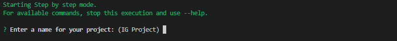
Step 2: Enter a project name
Introduce un nombre para la nueva solicitud. El proyecto se crea en un directorio con el mismo nombre.
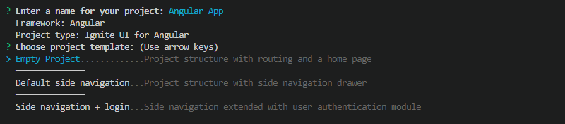
Step 3: Choose a project template
Navega por las plantillas de proyectos disponibles usando las teclas de flecha y pulsa ENTER para confirmar. Hay tres plantillas disponibles:
- Empty- Una estructura de proyecto con rutas y página principal, sin navegación predefinida
- Navegación lateral: una estructura de proyecto con un cajón de navegación lateral preconstruido
- auth: un proyecto de navegación lateral extendido con un módulo básico de autenticación (ver Plantilla de Proyecto de Autenticación para más detalles)
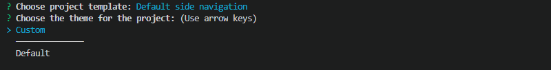
Step 4: Choose a theme
Hay dos opciones temáticas disponibles:
- default- incluye un archivo CSS precompilado (
igniteui-angular.css) con el default Ignite UI for Angular Tema basado en materiales enangular.json - personalizado- genera una paleta de colores y configuración de temas usando la API
app/styles.scssde Temas, lista para personalización
Tras completar estos cuatro pasos, el asistente genera la estructura del proyecto, inicializa un repositorio Git y hace commit del estado inicial. Luego pregunta si terminar o continuar añadiendo una vista de componentes.
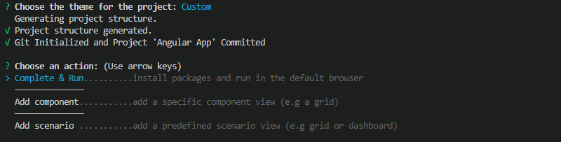
Add Component Views
La colección Ignite UI for Angular Schematics ofrece plantillas individuales de componentes y plantillas de escenarios más elaboradas. Este modo está disponible tanto como continuación de la creación de proyectos como como operación independiente en un proyecto existente.
Para activar el asistente de componentes en un proyecto existente, ejecuta elcomponent esquema (alias:c):
ng g @igniteui/angular-schematics:component
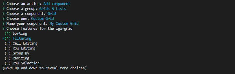
El asistente muestra las plantillas de componentes disponibles, agrupadas por categoría. Navega con las flechas y pulsa ENTER para seleccionar.
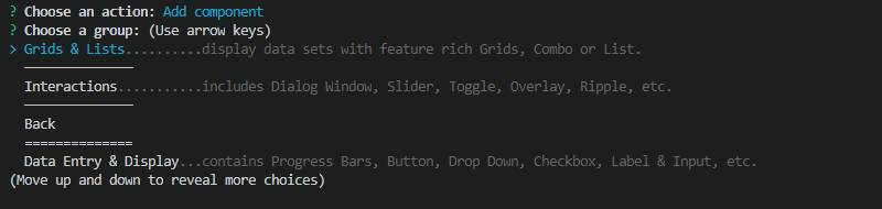
Algunas plantillas —como la Cuadrícula Personalizada— muestran una lista de funciones opcionales. Usa la tecla ESPACIO para activar opciones individuales antes de confirmar con ENTER.
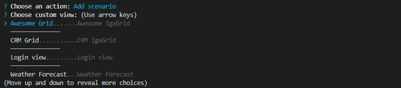
También existen plantillas de escenarios que ofrecen vistas de aplicación más completas que combinan múltiples componentes. Selecciona "Escenarios" en la lista de categorías para explorarlos.
Después de añadir una plantilla, el asistente pregunta si añadir más vistas o completar el proceso. Al completarse, se instalan las dependencias restantes de paquetes y la aplicación se sirve y se abre en tu navegador predeterminado.
Para añadir más vistas Ignite UI for Angular a un proyecto más adelante sin el asistente, usa el comando esquemático directo:
ng g @igniteui/angular-schematics:c [template] [name]
AI Assistant Integration
La CLI de Ignite UI—que comparte la misma cadena de herramientas de andamiaje que estos esquemas— incluye un servidor MCP integrado que conecta asistentes de código de IA con documentación Ignite UI componentes en vivo. Si tu flujo de trabajo usa la CLI de Ignite UI junto con la CLI Angular, inicia el servidor despuésig mcp de instalar la CLI globalmente.
Para la configuración del cliente MCP y una descripción completa de las herramientas disponibles, véase Ignite UI CLI MCP.
 GitHub