This topic provides a conceptual overview of the XamRadialGauge™ control’s Background feature. It describes the properties of the background area and provides an example of its implementation.
The following topics are prerequisites to understanding this topic:
This topic contains the following sections:
Displayed as a circle, the background section of the XamRadialGauge control is where all the different elements such as needles and tick marks are added to the gauge.
This area can be customized to be either circular or fitted by setting the BackingShape property. A circular shape creates a 360 degree circle gauge while a fitted shape creates a filled arc segment encompassing the scale.
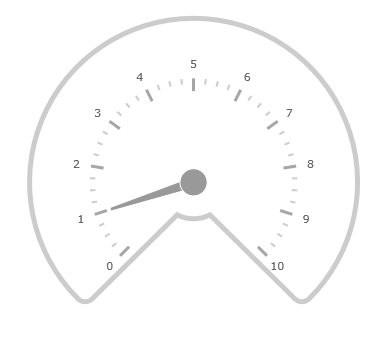
The following image is a preview of the XamRadialGauge control rendered with the background configured as Fitted.

The following table summarizes the properties of the XamRadialGauge control related the background area.
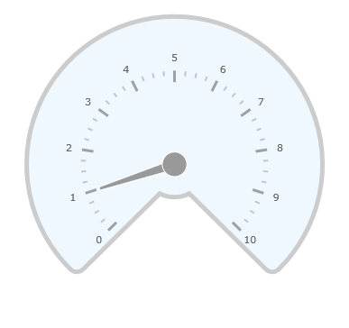
The following screenshot shows how the XamRadialGauge control renders using this background properties configuration:

Following is the code that implements this example
In XAML:
<ig:XamRadialGauge
    x:Name="radialGauge"
    MinimumValue="0"
    MaximumValue="10"
    Value="1"
    BackingShape="Fitted"
    BackingBrush="AliceBlue"
    BackingCornerRadius="10"
    BackingOuterExtent=".9"
    BackingInnerExtent=".2"
    BackingOversweep="4"
    BackingStrokeThickness="5"
/>
In C#:
var radialGauge = new XamRadialGauge();
radialGauge.MinimumValue = 0;
radialGauge.MaximumValue = 10;
radialGauge.Value = 1;
radialGauge.BackingShape = RadialGaugeBackingShape.Fitted;
radialGauge.BackingCornerRadius = 10;
radialGauge.BackingOuterExtent = 0.9;
radialGauge.BackingInnerExtent = 0.2;
radialGauge.BackingOversweep = 4;
radialGauge.BackingStrokeThickness = 5;
radialGauge.BackingBrush = new SolidColorBrush(Color.AliceBlue);The following topics provide additional information related to this topic: