
The Ultimate UI for WPF 2011 Volume 2 release includes a number of powerful new features and controls to allow you to take even more advantage of our WPF controls.
Below is a list of the features and controls that we added or updated for the 2011 Volume 2 release. Click through the links to explore the set of new features.
This document contains the following sections:
The Infragistics Math Library™ is a library of mathematical and statistical structures and functions that you can use with all Infragistics controls. Refer to the Infragistics Math Library topic for more information on this library.
The Infragistics Math Library extends the operations in the System.Math class to several new mathematical objects:
The Infragistics Math Calculators is a library of mathematical and statistical calculators that you can use with all Infragistics controls to compute various calculations.

Figure 1 – Formula for Variance and Mean Calculations.
The Infragistics Math Calculators are required to calculate value overlay and error bars in the xamDataChart control. Refer to the Infragistics Math Calculators topic for more information on this library. They can be categorized in the following types of calculators:
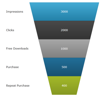
The funnel chart displays data in a funnel shape. It displays sections in a top-down composition each representing the data as slices from largest value to the smallest value. Refer to the xamFunnelChart topic for more information on this control.
Preview of the xamFunnelChart.
This section provides information about new features of the xamDataChart control.
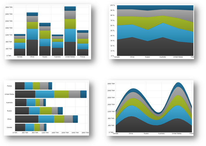
The xamDataChart control is updated to provide support a number of new series types. Refer to the Category Series topic for more information on these series.
Bar Series
Stacked 100-Area Series
Stacked 100-Bar Series
Stacked 100-Column Series
Stacked 100-Line Series
Stacked 100-Spline Series
Stacked 100-Spline Area Series
Stacked Bar Series
Stacked Area Series
Stacked Column Series
Stacked Line Series
Stacked Spline Series
Stacked Spline Area Series
Point Series (Community Technology Preview)
Preview of some of the new types of series in the xamDataChart control.
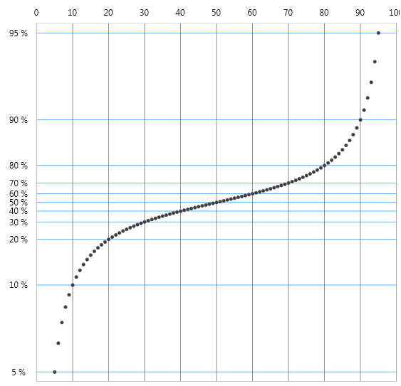
The axis scalers feature of the xamDataChart control allows you to implement custom axis scalers for scaling values plotted along numeric axes. Refer to the Using Axis Scales and Creating Custom Axis Scalers topics for more information on this chart feature.
Preview of the xamDataChart with y-axis scaled using custom axis scaler.
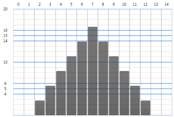
The axis tickmark values feature of the xamDataChart control allows you to implement custom axis tickmark values on numeric axes. Refer to the Creating Custom Axis Tickmark Values topic for more information on this chart feature.
Preview of the xamDataChart with custom tickmark values on y-axis.
The series inheritance feature of the xamDataChart control allows you to implement custom types of series from a base Series object or by extending existing types of series. Refer to the Creating Custom Series topic for more information on this chart feature.
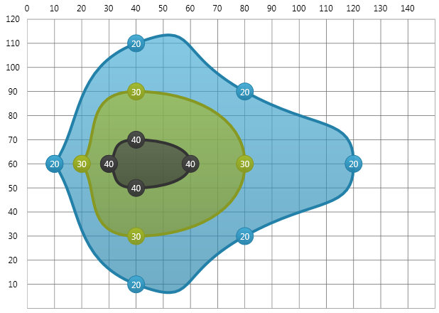
Preview of the xamDataChart with custom series showing filled contours connecting data points with the same values.
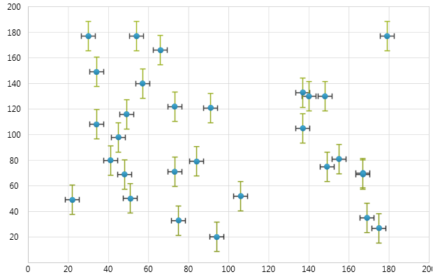
The error bars feature of the xamDataChart control allows plotting various error bars on data points plotted. All error bars are calculated using the Infragistics Math Calculators assembly and they can be used on all types of Scatter Series and most Category Series. Refer to the Series Error Bars topic for more information on this chart feature.
Preview of the xamDataChart with error bars set on data points of Scatter Series.
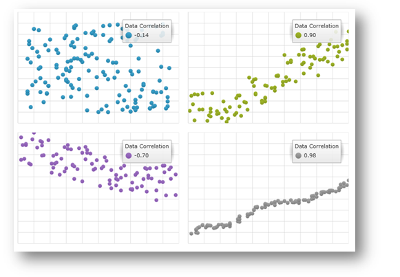
The data correlation formula allows calculation of the correlation between two variables in a set of data displayed in the xamDataChart using the Infragistics Correlation Calculator, which is part of the Infragistics Math Calculators assembly. Refer to the Series Data Correlation topic for more information on this chart feature.
Preview of the xamDataChart with data correlation displayed as a legend item.
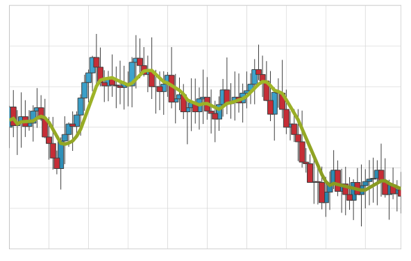
The xamDataChart control allows plotting Weighted Moving Average as new type of trend line. Refer to the Trend Lines topic for more information on this chart feature.
Preview of the xamDataChart with a trend line showing Weighted Moving Average on Financial Price Series.
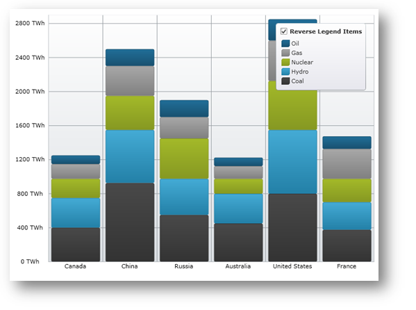
The xamDataChart control supports reversing display order of legend items using the ReversLegendOrder property of stacked series.
Preview of the xamDataChart with reversed display order of legend items in chart legend.
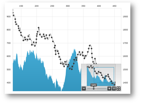
The xamDataChart control supports integration with the xamOverviewPlusDetailPane control which provides panning and zooming functionality and an overview of the contents of the chart when data is plotted using AreaSeries or LineSeries. Refer to the xamOverviewPlusDetailPane topic for more information on this navigation control.
Preview of the xamDataChart with the xamOverviewPlusDetailPane control.
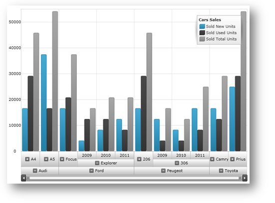
The xamDataChart control supports plotting data from OLAP (Online Analytical Processing) Flat Data source using OlapXAxis and OlapColumnSeries objects.
Preview of the xamDataChart with OLAP data plotted using OlapXAxis.
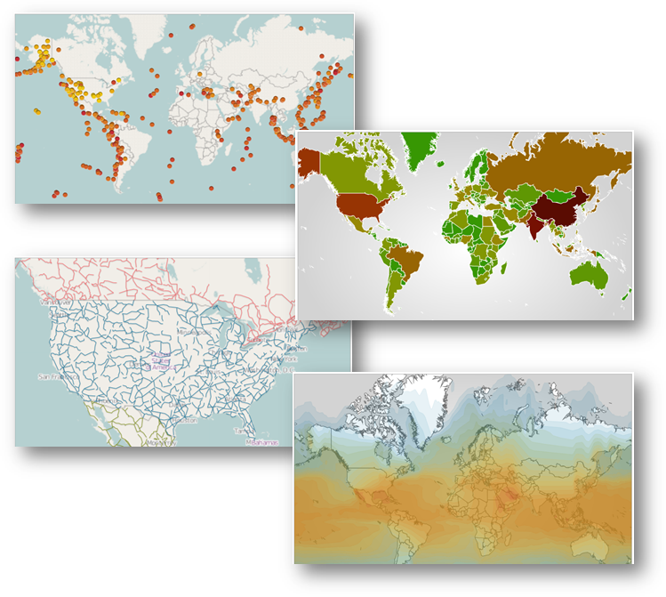
The xamGeographicMap is a new control released as Community Technology Preview. The Geographic Map combines features of xamMap control including plotting of different geo-imagery sources, Shapefiles, and geographic locations with performance of data plotting and navigation of the xamDataChart control.
Preview of the xamGeographicMap control with different data sources.
This section provides information about new features of the xamNetworkNode control.
The xamNetworkNode control is now able to navigate using the mouse and keyboard for moving the xamNetworkNode within the view portal.
Table 1 - New Navigation Functionalities
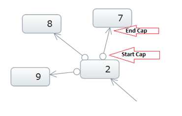
The xamNetworkNode control now is able to establish various relationship types for the connected nodes with icons indicating the source and target of the connected nodes within the control.
The image below demonstrates the setting for LineStartCap/LineEndCap. Source node with the LineStartCap related to the target node with the LineEndCap:
Remove nodes from a network from the network layout, and or from the data source.
Removing the node ‘4’ from the view:
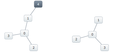
Figure: Removing nodes - before (left) and after (right)
If the node that is being removed is connected to another node, the connecting node will display without the connecting line.
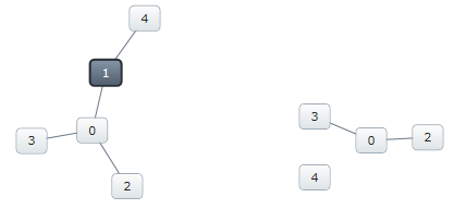
Figure: Removing a connected node - before (left) and after (right)
The xamNetworkNode control now features a number of ways to show and hide nodes:
Show/Hide using the Expansion indicator
Show/Hide without Expansion indicator, using code behind
Enter key on the keyboard (when expansion indicators are visible)
In addition to the default modes, any node can hide itself by setting the node’s Visibility property to “Collapsed”.
The following image displays the xamNetworkNode control with expansion indicators enabled on the parent node. The parent nodes have connections to the child nodes that can be shown and hidden. The plus sign indicates that the child nodes are hidden
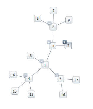
Figure: Displaying expansion indicators.
The xamNetworkNode control visual states are organized in groups, each consisting of several visual state properties where the control can be set to one of the states from any of the selected groups.
The following images illustrate the different visual states the xamNetworkNode control currently supports:
Experience the zooming functionality. The xamNetworkNode control now includes an enhanced feature which allows you to zoom in on a one or more selected nodes. The control also supports zooming in on any user-searched nodes.
This image illustrates zooming in on a single node.
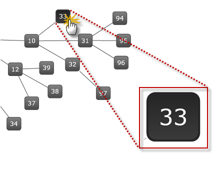
Figure: Displaying zooming in on a node.
This section provides information about new features of the xamPivotGrid control.
In the xamPivotGrid™ control features a number of significant performance improvements. In the 2011 Volume 1 (previous) release, the control had performed with longer response time with 50,000 records. Now with the current release it can render 1,500,000 records in approximately 2 seconds.
In XMLA data source the data is organized in cubes and each dimension contains defined hierarchies. The current enhancement includes improving the hierarchy rendering which boosts the performance of the flat data source as well.
Please refer to the “Handling large data” sample in the Performance section of the samples browser, which demonstrates the improved performance capabilities.
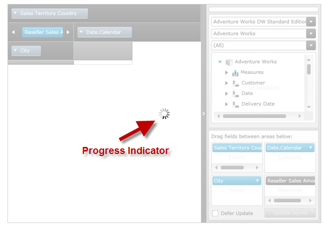
The xamPivotGrid control’s DataSource now supports an IsBusy property which is used to determine if the data processing is still in progress (busy) or completed. This is identical to an existing property called “Processing” of xamPivotGrid control’s DataSource object. If the data processing is in progress the value is “true”. This allows the user to implement a progress indicator; if desired; to display on the page during the time of processing or loading the data.
Preview of the progress indicator while the xamPivotGrid is busy loading data.
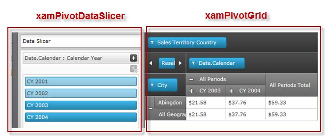
The xamPivotDataSlicer™ control features an easier way of filtering the data in addition to the existing pivot grid filtering. With this enhanced filtering capability you can now filter the hierarchies selected in columns, rows and filter areas in conjunction with the measures of the pivot grid simply by using the items listed in the data slicer. One or more items can be select by pressing down the Ctrl key on the keyboard and Left mouse button click.
In the following image you can see the selected items on the data slicer filtering the information shown in the data hierarchy.
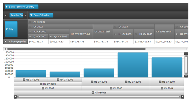
A new axis type is exposed called OlapAxis which is used by the xamDataChart control to plot data. The OlapAxis is the key element of the integration process in a sense that it is bound to the same data source as the pivot grid using the DataSource property. The supported data source types are XMLADataSource and FlatDataSource of the pivot grid. For more details and code examples refer to the Integration with Data Chart topic.
Preview of xamPivotGrid integration with xamDataChart.
The xamSparkline is a full functional chart that can fit in one grid cell. Currently this is a Community Technology Preview control, and it supports four chart types: Line, Area, Column, and WinLoss. The chart renders with one dimensional data of type Numeric or DateTime. It has a capability to display the markers such as high/Low, first/last, negative and markers for all data points.
Here are the different chart types showing the High and Low markers:
The timeline labels now have the capability to automatically adjust the tick marks based on zooming in on the selected time segment of the data. For example:
When Timeline displays Year unit type, the tick marks will display the Months after zooming.
When Timeline displays Month unit type, the tick marks will display the Days after zooming.
When Timeline displays Day unit type, the tick marks will display the Hours after zooming.
Before zooming: the control displays the days of the month:
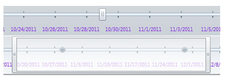
After zooming: The control Auto-Adjusts the labels and displays the hours:

Refer to the Auto Adjust Labels topic for more information on this feature.
With Resource Washing, you can set the color (the WashColor) on groups of resources (WashGroups) in an existing ResourceDictionary to update the color of the controls in your application.
Related topics: