We recommend that you use the xamDataGrid control instead of the xamGrid control. The xamGrid is being planned for retirement over the next few years and will not receive any new features. We will continue to provide support and critical bug fixes for the xamGrid during this time. For help or questions on migrating your codebase to the xamDataGrid, please contact support.
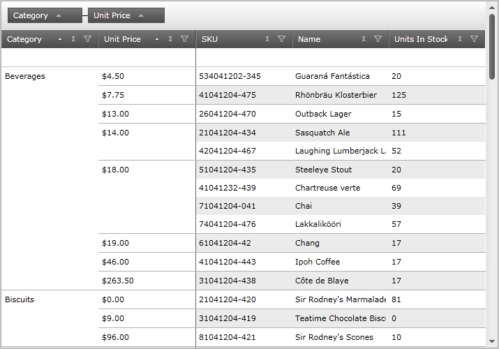
The cell merging feature provides an alternative view of grouped data: groups are shown as merged cells (Figure 1) as opposed to showing as collapsed group headers, which is the case with the GroupBy feature.

Figure 1: Columns grouped in a grid by the cell merging feature
Enabling Cell Merging
You can enable cell merging on the xamGrid control by setting the GroupBySettings object’s GroupByOperation property to MergeCells. Setting the GroupBySettings object’s AllowGroupByArea property determines the location on the grid where users can drag columns to group their data.
In XAML:
<!-- Enable Cell Merging
     Set the GroupBy area on the grid -- >
<ig:XamGrid.GroupBySettings>
   <ig:GroupBySettings AllowGroupByArea="Top" GroupByOperation="MergeCells" />
</ig:XamGrid.GroupBySettings>
In Visual Basic:
Imports Infragistics.Controls.Grids
' Enable Cell Merging
MyDataGrid.GroupBySettings.GroupByOperation = GroupByOperation.MergeCells
' Set GroupBy area on the grid
MyDataGrid.GroupBySettings.AllowGroupByArea = GroupByAreaLocation.Top
In C#:
using Infragistics.Controls.Grids;
// Enable Cell Merging
MyDataGrid.GroupBySettings.GroupByOperation = GroupByOperation.MergeCells;
// Set GroupBy area on the grid
MyDataGrid.GroupBySettings.AllowGroupByArea = GroupByAreaLocation.Top;
Cell Merging Behavior
When the grid’s columns are grouped using the cell merging feature, some of the grid’s other features are affected and behave differently.
The sections below describe how each of the grid’s key features are affected due to the cell merging feature. It also explains how certain features interact with cell merging.
Activation While the user is navigating through the merged cells column using the keyboard, they will be able to see the hidden cells. Cells within a merged column are positioned underneath a MergedContentControl control, so when your end user selects the control, the cells hidden underneath become active and visible for that row. (Figure 2)
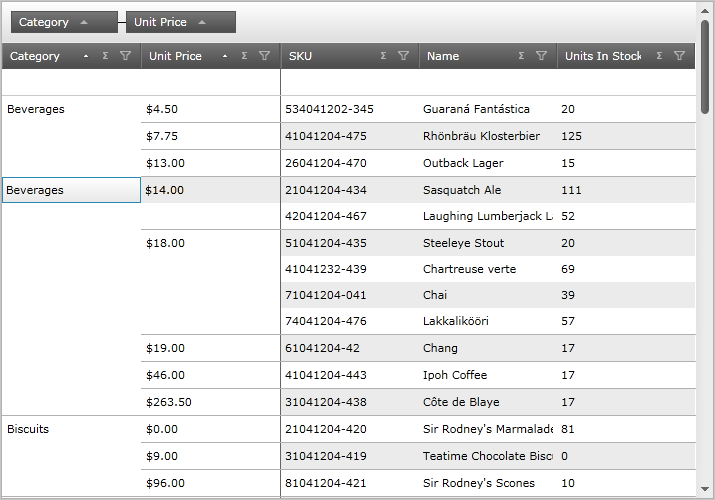
Figure 2: The xamGrid control with active cells
Alternate Row Styling
Alternate row styling is not displayed on the merged columns.
The user cannot move merged columns either within the merged columns area or the rest of the grid. They cannot also move unmerged columns into the merged columns area.
The user can implement conditional formatting while the cell merging feature is enabled. However, the merged cells will not display the new styling as conditional formatting appears on the individual cells which are hidden underneath the MergedContentControl control.
The user can edit cells within merged columns the same way cells in unmerged columns are edited. Once a cell in a merged column is edited, based on the new value, it could appear in a new grouping.
Fixed columns appear to the right of the merged columns. (Figure 2) The same FixedBorderIndicator control is used to separate fixed and merged columns from the rest of the columns in the grid. If the grid contains merged and fixed columns, the FixedBorderIndicator control will display once, to the right of the fixed column.
The user cannot fix merged columns: the fixed indicator does not appear on merged columns.
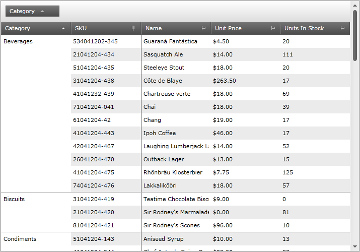
Figure 3: The xamGrid control with cell merging and fixed columns enabled
A column that is of type GroupColumn cannot be merged; however the children of a GroupColumn column can be merged. For example, based on the screenshot below, the user cannot merge the PatientInformation and FullName columns; however, they can merge the First Name and Last Name columns.

Figure 4: The xamGrid control with GroupColumns enabled
When the user merges the children columns of the GroupColumn column, then that particular child column will be removed from the group. When that column is unmerged, then it will return to its original group.
Hovering
When the xamGrid control’s RowHover property is set to Row, as the mouse hovers over the merged column, the data of that the row is displayed. (Figure 3)
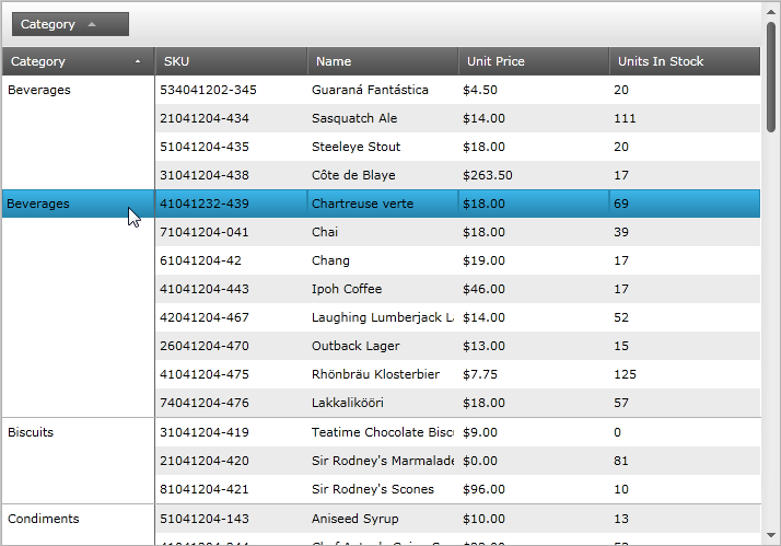
Figure 5: Hovering over the merged column displays the data of that the row
When the paging and cell merging features are enabled on the xamGrid control, paging will behave as expected. If the paging mechanism breaks a merged column’s information on to the next page, the value of the merged columns’s value will appear on the next page as well.
When the sorting and cell merging features are enabled on the xamGrid control, all merged columns will have sorting priority over other sorted columns.
When the summary and cell merging features are enabled on the xamGrid control, additional summary rows are displayed for each merged grouping. The summary values are then displayed for each grouping, as shown in Figure 4.
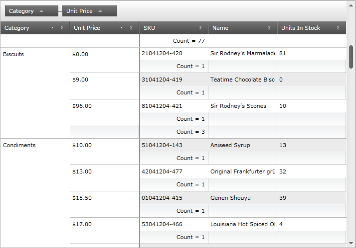
Figure 6: Displaying summary values for each grouping
Styling Points
There are three main controls used for the cell merging feature:
FixedBorderCellControl – the line that separates the merged columns from the rest of the columns in the xamGrid control
MergedContentControl – the cells that used to display the merging
MergedSummaryCellControl – the SummaryRows used for merged cells. This allows you to style these summary rows differently than the normal summary rows
There are no properties available to target these controls. Instead, you can use Implicit styling to style the controls, as demonstrated in the code snippet below. (Figure 5)
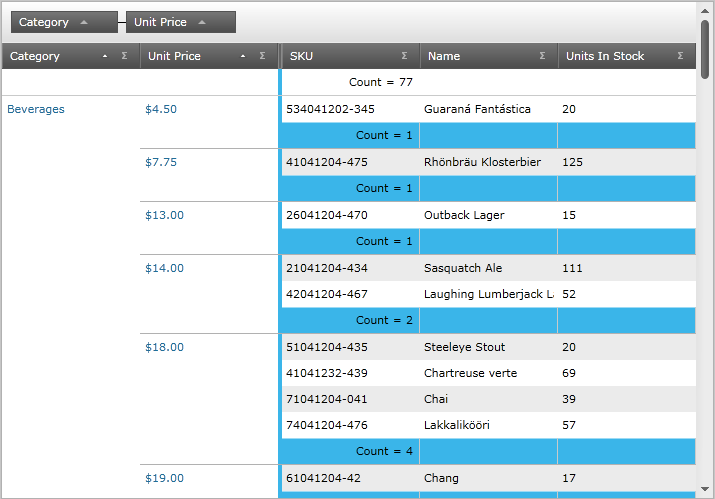
Figure 7: The styling implemented by the sample code
In XAML:
xmlns:igPrim="http://schemas.infragistics.com/xaml/primitives"
In XAML:
<Style TargetType="igPrim:FixedBorderCellControl">
   <Setter Property="Background" Value="#FF3AB5E9" />
</Style>
<Style TargetType="igPrim:MergedContentControl">
   <Setter Property="Foreground" Value="#FF216e99" />
</Style>
<Style TargetType="igPrim:MergedSummaryCellControl">
   <Setter Property="Background" Value="#FF3AB5E9" />
</Style>