Getting Started With Ignite UI for React
Ignite UI for React is a complete set of UI widgets, components, and Figma UI kits for React by Infragistics. It enables developers to build modern, high-performance HTML5 and JavaScript apps for desktop browsers, mobile experiences, and progressive web apps (PWAs).
Ignite UI for React comprises several packages available under either an MIT or a commercial license, depending on the components and services they contain. For a detailed list of components and their license, please refer to the License FAQ and Installation and Open Source vs Premium topics.
Prerequisites
- Install NodeJS.
- Install Visual Studio Code.


Using Ignite UI CLI
To create an application from scratch and configure it to use Ignite UI React you can use the Ignite UI CLI. The first step is to install the respective package globally as follows:
npm install -g igniteui-cli
If you want to get a guided experience through the available options, you can initialize the step-by-step mode that will help you create and set up your new application. To start the guide, simply run the ig command:
ig
Then choose React as the framework and Ignite UI for React TS as the project type. Select the Default Top Navigation project template, add a specific component/view, or select Complete & Run.
Or create a project directly in one command, for example:
ig new <project-name> --framework=react --type=igr-ts --template=top-nav
For a step-by-step walkthrough of the wizard, see Step-by-Step Guide Using Ignite UI CLI. For a full reference of all CLI commands and options, see the CLI Overview.
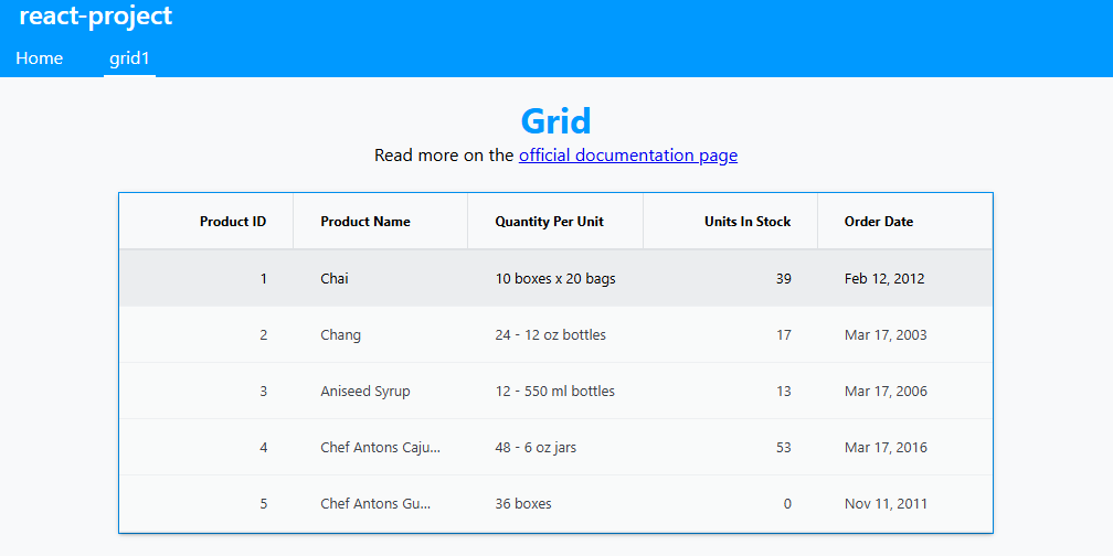
If you added a Grid component during the prompts, once the application is running you should see something similar to the following:
Note
Keep in mind that by default Ignite UI CLI installs the Trial version of Ignite UI for React's Grid component which is under commercial license.
Alternatively, you can use popular frameworks such as Next.js, Vite, or Expo as recommended by the React team. The following are step-by-step instructions for creating React applications with Ignite UI for React using one of these methods.
Using Vite CLI
Creating a New React Project
Common React toolchains such as Next.js, Vite, and Expo each provide CLI tools for scaffolding a new application.
1 - Open VS Code, select Terminal menu and then New Terminal option.
2 - Type the following command in the terminal window:
npm create vite@latest
Then follow the prompts to choose a name for the project, React as the framework, whether to use TypeScript, and various other options provided by Vite. Please refer to this topic for more information on the different ways to boilerplate a React application.
Adding an Ignite UI React Grid Component
Package Installation
To add the Ignite UI React Grid component to the app you need to install the igniteui-react-grids package:
npm install igniteui-react-grids --save
Importing Component Modules
Then we can import the required modules of the components we want to use. Let's do this for the Grid and Column components that we will also use in the template. We also need to import one of the themes.
import { IgrGrid, IgrColumn } from 'igniteui-react-grids';
import 'igniteui-react-grids/grids/themes/light/bootstrap.css';
Using Components
We are now ready to use the Ignite UI for React grid component in our markup! Let's go ahead and define it:
// App.tsx
function App() {
  const data = [
    { name: "John", age: 30 },
    { name: "Jane", age: 25 },
    { name: "Bob", age: 35 }
  ];

  return (
    <div style={{ height: "100%", width: "100%" }}>
      <IgrGrid
        data={data}
        autoGenerate={false}>
        <IgrColumn
          field="name"
          header="Name"
          dataType="string">
        </IgrColumn>
        <IgrColumn
          field="age"
          header="Age"
          dataType="number">
        </IgrColumn>
      </IgrGrid>
    </div>
  );
}
Running Application
Finally, we can run our new application:
npm run dev
After executing this command, your project will be built and served locally on your computer. It will automatically open in your default browser and you will be able to use Ignite UI for React components in your project. The final result should show a data grid with sample data:

Updating Existing Apps
If you want to use Ignite UI for React in an existing React CLI project, we have you covered! All you have to do is execute these commands:
npm install --save igniteui-react
npm install --save igniteui-react-charts igniteui-react-core
npm install --save igniteui-react-excel igniteui-react-core
npm install --save igniteui-react-gauges igniteui-react-core
npm install --save igniteui-react-grids igniteui-react-core
npm install --save igniteui-react-maps igniteui-react-core
npm install --save igniteui-react-spreadsheet igniteui-react-core
Or
yarn add igniteui-react-charts igniteui-react-core
yarn add igniteui-react-excel igniteui-react-core
yarn add igniteui-react-gauges igniteui-react-core
yarn add igniteui-react-grids igniteui-react-core
yarn add igniteui-react-maps igniteui-react-core
yarn add igniteui-react-spreadsheet igniteui-react-core
This will automatically install packages for Ignite UI for React, along with all of their dependencies, font imports and styles references to the existing project.
Upgrade from Trial to Licensed
The Ignite UI CLI installs the trial version of Ignite UI for React by default. To upgrade from the trial package to the licensed version, run the upgrade command in your project root:
ig upgrade-packages
You will be prompted to log in to the Infragistics private npm registry if not already configured. For details on the license model, see License FAQ and Installation and Open Source vs Premium.
AI-Assisted Development
Ignite UI provides a three-part AI toolchain - Agent Skills, the Ignite UI CLI MCP server, and the Ignite UI Theming MCP server - that grounds AI coding assistants in correct component APIs, import paths, and design tokens. Once connected, your AI assistant can scaffold projects, add and modify components, answer documentation questions, and generate accurate Ignite UI for React code without leaving your editor.
Run ig ai-config from your project root to copy Ignite UI for React Agent Skills and write the Ignite
UI MCP server configuration to .vscode/mcp.json in a single step.
For an overview of all three layers and setup instructions, see AI-Assisted Development with Ignite UI. For the full CLI MCP client setup guide, see Ignite UI CLI MCP. For an end-to-end walkthrough using both MCP servers, see Build an App End-to-End with CLI MCP and Theming MCP.
Ignite UI for React Packages Overview
Ignite UI for React is a comprehensive suite of UI components, design toolkits, and supporting services for React. Built to empower developers to create modern, high-performance React applications for desktop browsers, mobile experiences, and progressive web apps (PWAs), Ignite UI for React leverages the latest React best practices and APIs.
Charts & Graphs
Ignite UI for React contains a library of Charts & Graphs that lets you visualize any type of data through its 65+ types of chart series and combinations to create stunning and interactive charts and dashboards. Built for speed and beauty, designed to work on every modern browser and with complete touch and interactivity, you can quickly build responsive visuals on any device.
Gauges
Ignite UI for React provides Radial Gauge, Linear Gauge, and Bullet Graph components used to illustrate data in an easy and intuitive way. The Radial Gauge has a variety of customization options in order to create a predefined shape and scale. The Linear Gauge provides a simple view of a value compared against a scale and one or more ranges. It supports one scale, one set of tick marks and one set of labels. The Bullet Graph component lets you create data visualizations, replacing meters and gauges that are used on dashboards with simple bar charts.
Maps
The Ignite UI for React Geographic Map component brings the ability to visualize geographic data in your application. It can render data sets consisting of many geographic locations in shapes of markers, lines, polygons, or even interactive bitmaps. It allows you to overlay multiple map layers with geographic data, mark specific geographic locations and display information using custom markers and colors.
Grids & Inputs
Ignite UI for React provides several Grid components that allow you to bind and display data with little configuration in the form of Grid Lite - a light-weight grid component under MIT license, Data Grid - a feature-rich grid component under commercial license, List, Tree, and even Spreadsheet.
Buttons, Inputs, Layouts, and Menus
Ignite UI for React provides various types of Buttons, Inputs, Menus, and Layouts that give you the ability to build modern web applications using encapsulation and the concept of reusable components in a dependency-free approach. See the Storybook here. These components are based on the Indigo Design System, are fully supported by App Builder and are backed by ready-to-use UI kits for Figma.