This topic provides an overview of the configurable visual elements of XamSparkline™ control and the features that manage these visual elements.
The following table lists the topics required as a prerequisite to understanding this topic.
This topic contains the following sections:
The XamSparkline control has several visual elements and corresponding features through which these elements can be configured and customized. The primary benefit of Sparkline compared to other charting controls is that it can render in a limited space such as a grid cell with all its visual elements shown. With that in mind, the Sparkline cannot display every label of the data points. It only allows showing high and low values on Y axis, and first and last values on X axis.
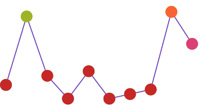
The Sparkline has the ability to mark the data points with elliptical icons to indicate the highest, lowest, first, last and negative values. The markers can be customized with a desired shape or color.
It allows displaying the (X/Y) axis, which takes up the space from the chart by decreasing the chart size in order to accommodate area for the axis and labels.
The following screenshot depicts the visual elements of the XamSparkline control. The elements that are configurable through properties are listed below. None of these visual elements is displayed by default.

Configurable Visual Elements:
Markers
Trend Line
Normal Range
Unknown Values
Axis
Tooltip
The following table maps the visual elements of the XamSparkline control and the properties that configure them.
The following table summarizes the main features of the XamSparkline control. The features are explained in further detail in the text blocks following the table.
Markers are symbols overlaid on a single data point to indicate the individual data points plotted on the chart based on the X/Y coordinates.

The Markers in XamSparkline can be specified to identify the data points based on the data and/or the location of the data points.
The following table displays the supported Marker types.
Trend lines are lines drawn from the starting point to the end point indicating the trending direction and movement of the series, so that the viewer can evaluate the tendencies in the data and mentally extrapolate past, future, or unknown values.

The Trend Line feature enables you to choose among several formulas for generating a trending directional line. The formula to use is specified in the TrendLineType property. The Trend Line renders in front of the series data so it is always visible.
The following table displays the supported trend line types. Each trend line type is drawn based on the calculation formula of its type.
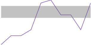
The Normal Range is a horizontal stripe drawn to represent some pre-defined meaningful range when the data is being visualized.

The typical use of the Normal Range is to indicate what values are considered normal or good. For example, if the Sparkline represented the person’s heart rate over time, the normal range of 60-100 beats per minute would be the range to be highlighted as Normal, and the data points outside of this range would be easy to identify.
The range width and position is determined by the NormalRangeMinimum and NormalRangeMaximum properties.
The XamSparkline can detect unknown values and render the space for the unknown values using a specified interpolation algorithm.
If there are missing values in the data (typical “unknown” values found in data are null and double.NaN ), XamSparkline can render in the space with unknown values by linear interpolation. The following table demonstrates the difference in a Sparkline plotted from the same data set (containing missing values) without using Unknown Values Plotting and with it.
This feature is managed through the UnknownValuePlotting property. The allowed values are DontPlot and LinearInterpolate .
The following Sparkline types support Unknown Values Plotting:
Area
Line
The Column and Win/Loss types do not interpolate unknown values. These Sparkline types will always display a blank space where unknown values are present.
The Sparkline allows displaying the X and Y axes (both or only one of them) with corresponding labels.
The axes of the XamSparkline control can be customized in the following aspects:
Visibility
The visibility of the X and Y axis are managed by separate properties ( HorizontalAxisVisibility and VerticalAxisVisibility, respectively) so it is possible to have only one of them displayed.
Label
Label text
You can add descriptive labels to the X axis. This capability is managed by the LabelMemberPath property.
Label font
The label fonts can be customized using the typical font-related control properties: Foreground, FontFamily, FontSize, FontStyle, and FontStretch. Therefore, it is not possible to use a different font for each axis.
The following topics provide additional information related to this topic.