In this article you will learn how to change the style which a NodeBinder applies to the nodes. Each NodeBinder can apply a different style to the nodes.
A custom template for the nodes must contain a NodesPanel element named “NodesPanel”. This element will hold the child nodes.
Create a project in Blend and add to it a xamTreemap control.
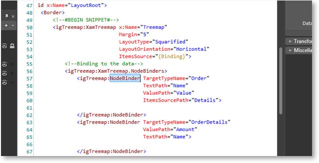
Add NodeBinders to your xamTreemap.
Highlight the NodeBinder which you will style:

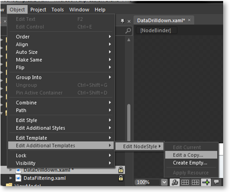
Go to the Object menu – Object \ Edit Additional Templates \ Edit NodeStyle \ Edit a Copy…
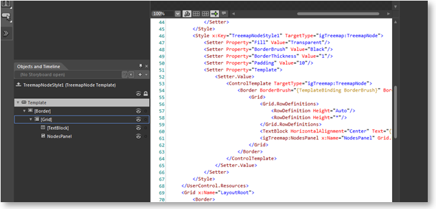
Edit the template of your custom treemap node style:
When the xamTreemap control binds to data, it creates a root node which will contain the nodes from the data source.
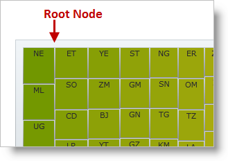
You can style this node by assigning a style to the DefaultStyle property of the xamTreemap control.
In XAML:
<Style TargetType="ig:TreemapNode">
    <Setter Property="Template">
        <Setter.Value>
            <ControlTemplate TargetType=" ig:TreemapNode">
                <Border BorderThickness="{TemplateBinding BorderThickness}"
                        Background="{TemplateBinding Fill}"
                        CornerRadius="{TemplateBinding CornerRadius}"
                        BorderBrush="{TemplateBinding BorderBrush}">
                    <Grid>
                        <Grid.RowDefinitions>
                            <RowDefinition Height="Auto" />
                            <RowDefinition Height="*" />
                        </Grid.RowDefinitions>
                        <TextBlock Text="{TemplateBinding Text}"
                                   HorizontalAlignment="Center" />
                        <ig:NodesPanel x:Name="NodesPanel"
                                       Grid.Row="1" />
                    </Grid>
                </Border>
            </ControlTemplate>
        </Setter.Value>
    </Setter>
</Style>