This topic guides you through the styleable elements of the xamOrgChart™ and demonstrates how to set node styles.
The topic is organized as follows:
The nodes of the xamOrgChart are visualized using the OrgChartNodeControl. When a node is moved outside of the visible area of the Org Chart, the OrgChartNodeControl related to it is disposed. When a node is moved inside the visible area, a new OrgChartNodeControl is created.
The data for the nodes is stored in OrgChartNode objects. When a new OrgChartNodeControl is created, it is linked to an OrgChartNode object. The visual styles of the nodes are stored in the OrgChartNode items and can be assigned directly or through Node Layouts.

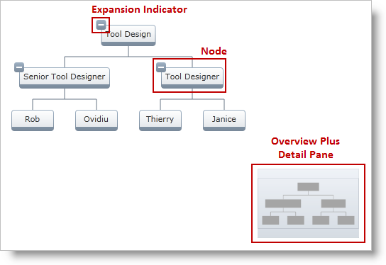
Figure 1: The styleable elements of the xamOrgChart control
Table 1: Styleable elements and their types
In XAML:
<ig:XamOrgChart
    OverviewPlusDetailPaneStyle="..."
    NodeStyle="..."
    ExpansionIndicatorStyle="...">
</ig:XamOrgChart>In XAML:
<ig:OrgChartNodeLayout
    NodeStyle="..."
    ExpansionIndicatorStyle="...">
</ig:OrgChartNodeLayout>In the example, the OrgChartNode object is acquired when a node is clicked.
In XAML:
<ig:XamOrgChart
    NodeMouseLeftButtonDown="XamOrgChart_NodeMouseLeftButtonDown">
</ig:XamOrgChart>
In C#:
private void XamOrgChart_NodeMouseLeftButtonDown(object sender, OrgChartNodeClickEventArgs e)
{
    e.Node.Node.Style = anOrgChartNodeControlStyle;
    e.Node.Node.ExpansionIndicatorStyle= aToggleButtonStyle;
}
In Visual Basic:
Private Sub XamOrgChart_NodeMouseLeftButtonDown(sender As Object, e As OrgChartNodeClickEventArgs)
    e.Node.Node.Style = anOrgChartNodeControlStyle
    e.Node.Node.ExpansionIndicatorStyle= aToggleButtonStyle
End Sub