Version

Configuring the Look-and-Feel of Diagram Items (xamDiagram)

Topic Overview

Purpose

This topic explains how to configure the basic Look-and-Feel properties of diagram items in the xamDiagram™ control.

Required background

The following topics are prerequisites to understanding this topic:

Topic Purpose

This topic provides a conceptual overview of the xamDiagram control and its main features and capabilities.

This topic explains how to add the xamDiagram control to a WPF application.

Diagram Items Look-and-Feel Configuration Summary

Diagram items look-and-feel configuration summary chart

The following table briefly explains the configurable aspects of the diagram items related to their Look-and-Feel and maps them to the properties that configure them.

Configurable aspect Details Properties

Fill

The item’s fill color

Stroke

The node shape/connection line, stroke color, thickness, and dash array

Font

Available Font-Related settings

Opacity

The item’s opaqueness

Connection line type (connections only)

The type of line (Straight or Right-Angle) drawn for a connection

Configuring the Diagram Items Look-and-Feel

Overview

To create the desired diagram item effect, use the Look-and-Feel related properties.

Property settings

The following table maps the desired configuration to the property settings that manage it.

In order to: Use this property: And set it to:

Set the fill color for the node shape/connection line

The desired brush

Set the stroke color for the node shape/connection line

The desired brush

Set the thickness of the stroke

The desired thickness

Set the font color

The desired brush

Set the font family

The desired font family

Set the font size

The desired size

Set the font style

The desired style

Set the font weight

The desired font weight

Set the opacity

The desired value in the range 0 to 1

Set the connection type

Straight or RightAngle

Example

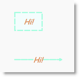
The screenshot below demonstrates how a diagram node and connection look as a result of the following settings:

Property Value

Azure

Aquamarine

5

5 1

Chocolate

Comic Sans MS

30

Italic

Bold

0.7

Straight

xamDiagram Configuring The Look And Feel Of Diagram Items 1.png

Following is the code that implements this example.

In XAML:

<ig:XamDiagram>
    <ig:DiagramNode
        Fill="Azure"
        Stroke="Aquamarine"
        StrokeThickness="5"
        StrokeDashArray="5 1"
        Foreground="Chocolate"
        FontFamily="Comic Sans MS"
        FontSize="30"
        FontStyle="Italic"
        FontWeight="Bold"
        Opacity="0.7"
        Content="Hi!"/>
    <ig:DiagramConnection
        Fill="Azure"
        Stroke="Aquamarine"
        StrokeThickness="5"
        StrokeDashArray="5 1"
        Foreground="Chocolate"
        FontFamily="Comic Sans MS"
        FontSize="30"
        FontStyle="Italic"
        FontWeight="Bold"
        Opacity="0.7"
        Content="Hi!"
        ConnectionType="Straight"
        StartPosition="0,200"
        EndPosition="200,200"/>
</ig:XamDiagram>

Related Topics

The following topics provide additional information related to this topic.

Topic Purpose

This topic explains how to control the size and position of the diagram nodes of the xamDiagram control.

This topic explains how to configure the shape of the diagram nodes of the xamDiagram control by either selecting a pre-defined shape or applying a custom shape.

This topic explains how to configure the connection points of diagram nodes.

This topic explains how to configure where the diagram connections start and end.

This topic explains how to configure the caps of the diagram connections of the xamDiagram control by either selecting a pre-defined cap or applying a custom cap.

This topic explains how to bind the xamDiagram control to data.