This topic explains how the control handles validation errors.
The following topic is a prerequisite to understanding this topic:
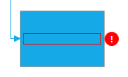
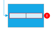
When the control is bound to a data source comprised of data items implementing the IDataErrorInfo interface, it validation errors can be indicated to the user. By default this is done by rendering red border around the error information in both display and edit mode. To enable the errors indication use the SupportDataErrorInfo property and set it to true.
The following image shows two diagram items. The one on the left does not have validation errors and the one on the right has a validation error because its has an empty field:

You can customize the error validation display template by defining a style targeting the TextBlock type as shown in the code snippet below:
In XAML:
<Style TargetType="{x:Type TextBlock}">
    <Setter Property="Validation.ErrorTemplate">
        <Setter.Value>
            <ControlTemplate>
                <DockPanel LastChildFill="true">
                    <Border Background="Red" DockPanel.Dock="right" Margin="5,0,0,0"
                        Width="20" Height="20" CornerRadius="10"
                        ToolTip="{Binding ElementName=customAdorner, Path=AdornedElement.(Validation.Errors)[0].ErrorContent}">
                        <TextBlock Text="!" VerticalAlignment="center" HorizontalAlignment="center"
                            FontWeight="Bold" Foreground="white" />
                    </Border>
                    <AdornedElementPlaceholder Name="customAdorner" VerticalAlignment="Center" >
                        <Border BorderBrush="red" BorderThickness="1" />
                    </AdornedElementPlaceholder>
                </DockPanel>
            </ControlTemplate>
        </Setter.Value>
    </Setter>
</Style>
The following screenshot shows how the above custom error validation display template looks like:

You can customize the error validation edit template by defining a style targeting the AdvancedFocusTextBox type as shown in the code snippet below:
In XAML:
<Style TargetType="{x:Type igPrim:AdvancedFocusTextBox}" >
    <Setter Property="VerticalAlignment" Value="Center" />
    <Setter Property="Margin" Value="0,2,40,2" />
    <Setter Property="Validation.ErrorTemplate">
        <Setter.Value>
            <ControlTemplate>
                <DockPanel LastChildFill="True">
                    <Border Background="Red" DockPanel.Dock="right" Margin="5,0,0,0"
                        Width="20" Height="20" CornerRadius="10"
                        ToolTip="{Binding ElementName=customAdorner, Path=AdornedElement.(Validation.Errors)[0].ErrorContent}">
                        <TextBlock Text="!" VerticalAlignment="Center" HorizontalAlignment="Center"
                        FontWeight="Bold" Foreground="White" />
                    </Border>
                    <AdornedElementPlaceholder Name="customAdorner" VerticalAlignment="Center">
                        <Border BorderBrush="Red" BorderThickness="1" />
                    </AdornedElementPlaceholder>
                </DockPanel>
            </ControlTemplate>
        </Setter.Value>
    </Setter>
</Style>
The following screenshot shows the above custom error validation edit template looks like:

The following topics provide additional information related to this topic.