Version

Styling Expansion Indicators (xamDataPresenter)

Styling Expansion Indicators (xamTreeGrid)

Topic Overview

Purpose

This topic explains how to style the control’s expansion indicators.

Required background

The following topics are prerequisites to understanding this topic:

Topic Purpose

This topic explains the features supported by the control from developer perspective.

This topic provides an overview of the visual elements of the control.

In this topic

This topic contains the following sections:

Styling Expansion Indicators

Styling expansion indicators summary

The xamTreeGrid control’s expansion indicators can be styled by creating a custom style which targets the ExpansionIndicator type.

Configurable aspect Details Target Type

Styling Expansion Indicators

Set a custom template for changing the expansion indicator.

Code example

Following is the code that implements this example.

In XAML:

<Page
  …
  xmlns:igWindows="http://infragistics.com/Windows"
  …>
  <Page.Resources>
    <ResourceDictionary>
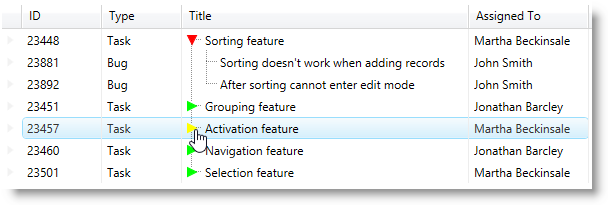
      <Style TargetType="{x:Type igWindows:ExpansionIndicator}">
        <Setter Property="Template">
          <Setter.Value>
            <ControlTemplate TargetType="{x:Type igWindows:ExpansionIndicator}">
              <Grid>
                <Path
                  x:Name="ArrowPath"
                  Width="10"
                  Height="10"
                  Stretch="Fill"
                  Stroke="#FF00FF00"
                  StrokeThickness="1"
                  Fill="{Binding RelativeSource={RelativeSource Self}, Path=Stroke, Mode=OneWay}"
                  Data="M8,5 L8,14 L14,9.5 z"
                  Visibility="Visible" />
              </Grid>
              <ControlTemplate.Triggers>
                <Trigger Property="IsChecked" Value="True">
                  <Trigger.Setters>
                    <Setter TargetName="ArrowPath" Property="Stroke" Value="#FFFF0000" />
                    <Setter TargetName="ArrowPath" Property="RenderTransform">
                      <Setter.Value>
                        <RotateTransform CenterX="5" CenterY="5" Angle="90" />
                      </Setter.Value>
                    </Setter>
                  </Trigger.Setters>
                </Trigger>
                <Trigger Property="IsMouseOver" Value="True">
                  <Trigger.Setters>
                    <Setter TargetName="ArrowPath" Property="Stroke" Value="#FFFFFF00"/>
                    <Setter TargetName="ArrowPath" Property="Cursor" Value="Hand"/>
                  </Trigger.Setters>
                </Trigger>
              </ControlTemplate.Triggers>
            </ControlTemplate>
          </Setter.Value>
        </Setter>
      </Style>
    </ResourceDictionary>
  </Page.Resources>
  …
</Page>

The following screenshot depicts the result from the code above:

xamTreeGrid 10.png

Related Topics

The following topic provides additional information related to this topic.

Topic Purpose

This topic explains how to style the control’s tree connector lines.