Version

XamDashboardTile [Beta]

The XamDashboardTile component is a container control that visualizes an ItemsSource collection or single data point by generating a data visualization control from the Ultimate UI for WPF toolset based on the schema of that data. It also uses the XamToolbar to further interact with and customize these data visualization controls.

xamdashboardtile.png

Requirements

The following are requirements to adding the XamDashboardTile to the page.

  • Add the following NuGet package to your WPF application.

    • Infragistics.WPF.Dashboards

For more information on setting up the NuGet feed and adding NuGet packages, you can take a look at the following documentation: NuGet Feeds:

  • After adding the NuGet package, you need to register the following Feature elements so that the different visualizations used by the XamDashboardTile can be initialized and used. You can do this by placing the following code prior to the InitializeComponent() call in the constructor of your WPF page:

In C#

using Infragistics.Controls.Dashboards;

public MainWindow()
{
    DataChartDashboardTileFeature.Register();
    GeographicMapDashboardTileFeature.Register();
    LinearGaugeDashboardTileFeature.Register();
    RadialGaugeDashboardTileFeature.Register();
    PieChartDashboardTileFeature.Register();

    InitializeComponent();
}
Adding the XamDashboardTile

Once the requirements listed above are complete, you can add the XamDashboardTile to your page. To do this, first define the following XAML namespace:

In XAML

xmlns:ig="http://schemas.infragistics.com/xaml"

After the namespace is defined, you can add the control to the page and bind the ItemsSource property to a value in your view model. This property can be a collection of values or a single value.

In XAML

<ig:XamDashboardTile ItemsSource="{Binding Data}" />

Usage

Depending on what you bind the XamDashboardTile ItemsSource property to will determine which visualization you see by default, as the control will evaluate the data you bind and then choose a visualization from the Ultimate UI for WPF toolset to show. The data visualization controls that are included to be shown in the XamDashboardTile are the following:

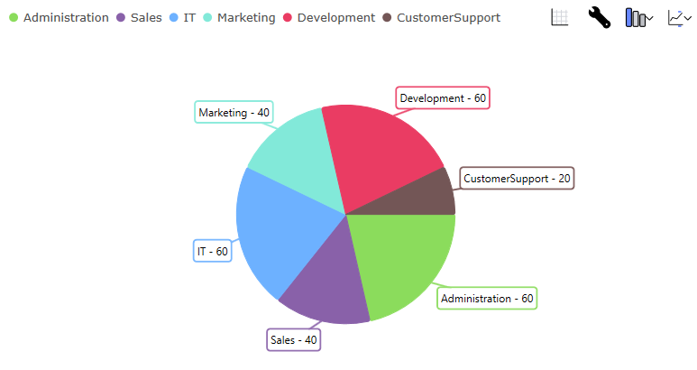
The data visualization that is chosen by default is mainly dependent on the schema and the count of the ItemsSource that you have bound. For example, if you bind a single numeric value, you will get a XamRadialGauge, but if you bind a collection of value-label pairs that are not too close to each other, you will get a XamDataPieChart. If you bind an ItemsSource that has more value paths, you will receive a XamCategoryChart or XamDataChart with multiple column series or line series, depending mainly on the count of the collection bound. You can also bind to a ShapeDataSource to receive a XamGeographicMap.

You are not locked into a single visualization when you bind the ItemsSource, and you can tell the control that you want to see a particular visualization by setting its VisualizationType property. For example, if you specifically wanted to see a line chart, you could define the XamDashboardTile like so:

In XAML

<ig:XamDashboardTile x:Name="dashboardTile" ItemsSource="{Binding Data}" VisualizationType="LineChart" />

In C#

dashboardTile.VisualizationType = DashboardTileVisualizationType.LineChart;

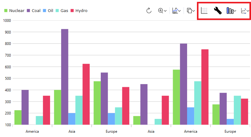
The visualization or properties of the visualization are also configurable using the XamToolbar at the top of the control. This XamToolbar has the default tools for the current visualization with the addition of four XamDashboardTile specific ones, highlighted below:

xamdashboardtiletoolbar.png

From left to right:

  • The first tool will show a data grid with the ItemsSource provided to the control. This is a toggle tool, so if you click it again after showing the grid, it will revert to the visualization.

  • The second tool allows you to configure the properties of the current data visualization.

  • The third tool allows you to change the current visualization entirely. This can be set on the control by setting the VisualizationType property, mentioned above.

  • The last tool allows you to configure which properties on your underlying data item are included for the control. You can configure this by setting the IncludedProperties or ExcludedProperties collection on the control.