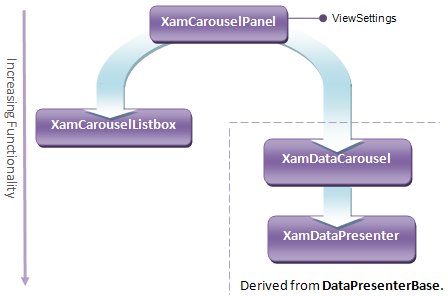
All controls that support the Carousel View build upon a common architectural foundation that you should understand to select the right control for the right task.

While these controls display items using a Carousel layout by default, they are designed to enable flexible layout of items based on any Path you define. This Path is one of the most fundamental principles of working with these controls because the controls used the Path as a guide along which items move, arrange themselves, and Path Effects take place.
The most basic of the four controls is xamCarouselPanel™, a container that enables its contents to follow the Path. It is the engine for the other controls, as it provides them with all of the properties, methods, and events necessary to support the layout of items along a Path. Each of the other controls use xamCarouselPanel internally to handle item presentation in the Carousel View. The relationship between controls is one of delegation, not inheritance.
This frees the controls to inherit from the most appropriate base class that can give them the greatest benefit in terms of functionality. The xamDataCarousel™ and xamDataPresenter™ controls both derive from the DataPresenterBase class, which enables them to perform more powerful data management based on Records and Fields.

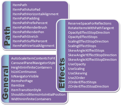
The CarouselViewSettings class is one of the most important properties that the xamCarouselPanel control exposes. Its properties fall into three categories shown in the diagram above. They allow you to exercise fine-grained control over item arrangement and presentation. Every control capable of displaying in Carousel View exposes an object of this type through a property named ViewSettings on the control.
The following table summarizes the functionality of the controls that support the Carousel View, and describes the usage scenarios to which they apply.