This topic gives a brief overview of the new controls and features introduced in the Ultimate UI for WPF 2015 Volume 2 Release.
The data model of the library now supports inserting and deleting of worksheet table’s rows and columns.
The parsing engine now supports an event which is raised after the syntax tree is created and before it is returned to the text document.
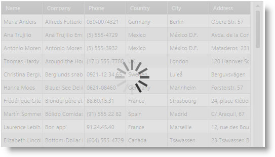
The xamBusyIndicator is a ContentControl that provides visual notification that a long-running activity has started as well as displays the actual progress.

The xamComboEditor now supports customization of the process of populating the dropdown when bound to an enum data type.
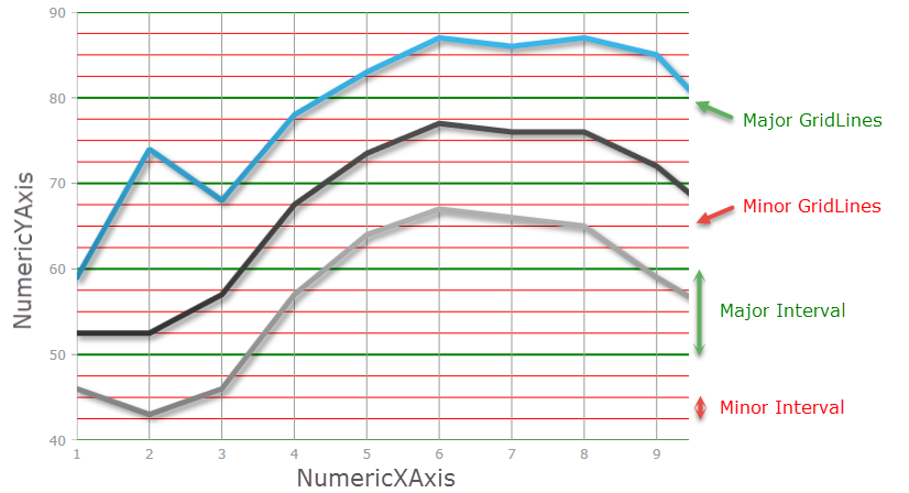
The xamDataChart now supports both Major and Minor intervals which are displayed perpendicular to its axes .
The following screenshot displays a major interval on the NumericYAxis, using major interval value of 10, with a green stroke; and a minor interval on the NumericYAxis, using minor interval value of 2.5, with a red stroke.
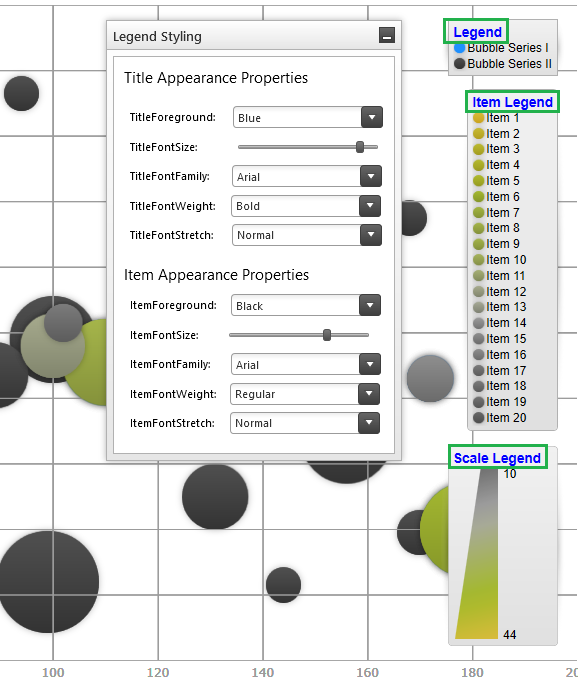
The xamDataChart’s Legend, ItemsLegend and ScaleLegend now supports configuration of its font appearances.
The following screenshot displays a custom Legend Title using the Arial font, in Bold of size 14 with a Blue foreground for all three supported Legend types, (from top to bottom - Legend, ItemLegend and ScaleLegend).
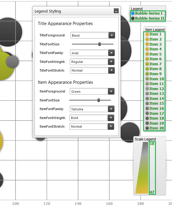
This screenshot displays a custom Legend Items Font using the Tahoma font style, in Bold of size 12 with a Green foreground for all three supported Legend types, (from top to bottom - Legend, ItemLegend and ScaleLegend).
The xamDataGrid’s clear filter button is now rendered disabled (semitransparent) when there is no active filter set.
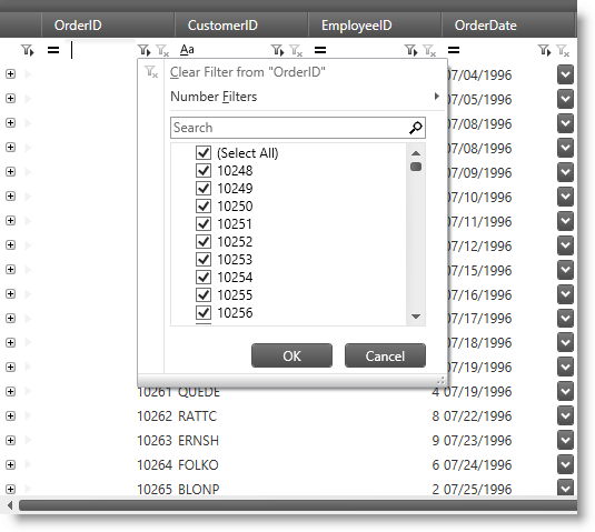
The xamDataGrid control now supports an Excel style filtering UI in the FilterRecord by setting the FilterOperandUIType property to FilterOperandUIType.ExcelStyle.
The data presenter controls now support the ability to set conditionally display and edit templates for cells.
The data presenter controls now support data items implementing the INotifyDataErrorInfo interface.
The data presenter controls now raise an event when the DataSource property has changed.
The data presenter controls now support manual refresh of the control’s user interface.
The xamPropertyGrid control now supports custom editors for expandable properties which also remove the collection’s nested elements list.
The xamPropertyGrid control now supports ways to customize the rendering of the expandable properties.
The xamPropertyGrid control now supports an attribute for excluding combined properties when bound to multiple objects.
The xamPropertyGrid control now supports declarative and programmatic ways for sorting (reordering) the properties list and its categories.
The xamRichTextEditor control now supports a method for obtaining the nearest valid text insertion location from the supplied point. The point should be relative to the xamRichTextEditor control.
The xamSpreadsheet control now supports data validation based on rules set on the worksheet’s cells.