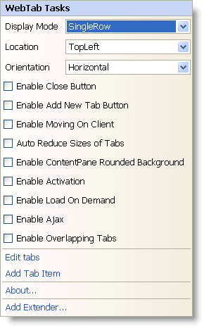
In Visual Studio 2005/2008 (.NET Framework 2.0/3.5), each Ultimate UI for ASP.NET control/component is equipped with a Smart Tag. By selecting the control/component, a Smart Tag anchor appears. When you click this anchor, a pop-up panel appears, providing you with quick and easy access to the most common properties and settings of the control/component.
The WebTab™ Smart Tag contains the following items:
Display Mode – Allows you to set the display mode of tabs, such as single row or scrollable single row or multi row.
Location – Allows you to set the location of the tabs relative to the content pane.
Orientation – Allows you to set the horizontal or vertical orientation of the text and images of the tabs.
Enable Close Button – Allows you to enable the close button on the tabs.
Enable Add New Tab Button – Allows you to enable the button to add new tabs.
Enable Moving On Client – Allows your end users to move the tabs.
Auto Reduce Sizes of Tabs – Allows you to reduce the size of the tabs if all the tabs do not fit in the size of the control.
Enable ContentPane Rounded Background – Allows you to show the content pane of the WebTab with rounded background.
Enable Activation – Allows you to set focus and respond on keys in order to change active tab and select it.
Enable Load On Demand – Allows you to enable load-on-demand in WebTab.
Enable Ajax – Allows you to enable asynchronous postback of WebTab.
Enable Overlapping Tabs – Allows a tab header to be overlapped with the concurrent tab header.
The WebTab Smart Tag contains the following links:
Edit Tabs – Brings up the Edit WebTab dialog for adding or removing tabs, and setting their properties.
Add Tab Item – Adds a new tab to the tabs collection.
About — Clicking this opens the WebTab product information. It contains information such as Status, Version, Expiration and Product Key.
Add Extender – Clicking this will bring up a dialog that shows all of the control extenders that can be used with the WebTab.
See the table below for a description of the item, as well as the item’s corresponding property in the properties grid.
