React Icono del panel
El React Dashboard Tile es un componente automático de visualización de datos que determina, mediante el análisis de una colección/array de DataSource, o un único punto de datos, cuál sería la visualización más adecuada para mostrar. Además, ofrece un conjunto adicional de herramientas integradasIgrToolbar que permiten modificar la visualización que se presenta de diversas maneras.
Se puede seleccionar una amplia variedad de visualizaciones para su visualización en función de la forma de los datos proporcionados, incluidos, entre otros: gráficos de categorías, gráficos radiales y polares, gráficos de dispersión, mapas geográficos, indicadores radiales y lineales, gráficos financieros y gráficos apilados.
Interactuar con el menú de tipo de gráfico en la barra de herramientas permitirá seleccionar una visualización diferente entre la lista de posibles candidatos.
React Dashboard Tile Example
dependencias
Instale los siguientes paquetes en el conjunto de herramientas Ignite UI for React:
npm install igniteui-react-charts
npm install igniteui-react-core
npm install igniteui-react-dashboards
npm install igniteui-react-gauges
npm install igniteui-react-data-grids
npm install igniteui-react-inputs
npm install igniteui-react-layouts
npm install igniteui-react-maps
Se sugieren los siguientes módulos cuando se utiliza el componente Icono de panel:
import { IgrDashboardTileModule, IgrDataChartDashboardTileModule, IgrRadialGaugeDashboardTileModule,
         IgrLinearGaugeDashboardTileModule, IgrGeographicMapDashboardTileModule,
         IgrPieChartDashboardTileModule } from "igniteui-react-dashboards";

IgrDataChartDashboardTileModule.register();
IgrRadialGaugeDashboardTileModule.register();
IgrLinearGaugeDashboardTileModule.register();
IgrGeographicMapDashboardTileModule.register();
IgrPieChartDashboardTileModule.register();
IgrDashboardTileModule.register();
Uso
Dependiendo de a qué asignes la propiedad delDataSource Dashboard Tile, determinará qué visualización ves por defecto, ya que el control evaluará los datos que vincules y luego elegirá una visualización del conjunto de herramientas Ignite UI for React para mostrarla. Los controles de visualización de datos que se incluyen para mostrarse en la Tesela del Panel son los siguientes:
La visualización de datos que se elige por defecto depende principalmente del esquema y del número de losDataSource que tienes asignados. Por ejemplo, si asignas un solo valor numérico, obtendrás aIgrRadialGauge, pero si asignas una colección de pares valor-etiqueta que sean fáciles de distinguir entre sí, probablemente obtendrás unXamDataPieChart. Si asignas a unDataSource que tiene más rutas de valor, recibirás unIgrDataChart con múltiples series de columnas o series de líneas, dependiendo principalmente del número de la colección acotada. También puedes vincular a unShapeDataSource o datos que parecen contener puntos geográficos para recibir unIgrGeographicMap.
No estás atado a una sola visualización cuando asignas elDataSource, y puedes decirle al control que quieres ver una visualización concreta estableciendo suVisualizationType propiedad. Por ejemplo, si quisieras ver específicamente un gráfico de líneas, podrías definir el Cuadro de Control así:
La visualización o propiedades de la visualización también son configurables usando laIgrToolbar parte superior del control. EsteIgrToolbar tiene las herramientas predeterminadas para la visualización actual con la adición de cuatro herramientas específicas para el Panel, destacadas a continuación:
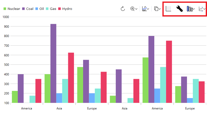
De izquierda a derecha:
- La primera herramienta mostrará una cuadrícula de datos con el
DataSourceque se proporciona al control. Esta es una herramienta para alternar, así que si vuelves a hacer clic después de mostrar la cuadrícula, volverá a la visualización. - La segunda herramienta le permite configurar los ajustes de la visualización de datos actual.
- La tercera herramienta te permite cambiar la visualización actual, lo que te permite representar un tipo de serie diferente o mostrar un tipo de visualización completamente distinto. Esto se puede configurar en el control estableciendo la
VisualizationTypepropiedad mencionada anteriormente. - La última herramienta te permite configurar qué propiedades de tu elemento de datos subyacente están incluidas para el control. Puedes configurarlo configurando la
includedPropertiescolección orexcludedPropertiesen el control.
Esta demostración muestra la integración de mosaicos del panel con el Gráfico circular React. Las opciones de la barra de herramientas en la parte superior derecha brindan acceso para aplicar estilos y cambiar la visualización de datos.
En esta demostración se muestra la integración del icono del panel de control con el mapa geográfico React. Las opciones de la barra de herramientas en la parte superior derecha proporcionan acceso para diseñar y cambiar la visualización de datos.
Referencias de API
IgrToolbarIgrCategoryChartIgrDataChartIgrDataPieChartIgrGeographicMapIgrLinearGaugeIgrRadialGauge