

Ignite UI for Angular Changelog
All notable changes for each version of Ignite UI for Angular are documented on this page.
This topic discusses changes only for components that are not included in the igniteui-angular package. For changes specific to igniteui-angular components, please see CHANGELOG.MD.
22.0.1 (July 2026)
General
-
Angular 22 compatibility — All Ignite UI for Angular components are now fully compatible with Angular 22.
-
Standalone component support — Components can now be used directly in standalone Angular applications without
NgModule. Newprovide*()functions (e.g.provideIgxCategoryChart()) let you register component feature sets throughbootstrapApplication()providers, and imperativeregister*()functions are available for DI-free setups. -
Per-component entry points for improved tree-shaking — Each package now exposes named subpath entry points (e.g.
import 'igniteui-angular-charts/category-chart') that register only the feature set you need. The root package import remains fully side-effect-free and tree-shakeable, so you only pay for the components you use. For DataChart, graduated entry points such asdata-chart-category,data-chart-scatter, anddata-chart-financiallet you pull in individual series families without bundling the entire chart.
Bug Fixes
| Bug Number | Control | Description |
|---|---|---|
| 3689 | DataChart | An error is thrown when destroying chart with a data tooltip layer |
21.1.0 (June 2026)
Enhancements
igniteui-angular-charts
- Added
Checkmarkoption to theMarkerTypeenum. UseMarkerType.Checkmarkon a series to display a V-shaped checkmark icon inside a circle. The newMarkerAutomaticBehavior.Checkmarkenum value allows applying the checkmark shape to all series in the chart, and theSeriesViewer.CheckmarkMarkerTemplateproperty can be used to customize its template. - Added
MarkerSizesupport on marker-enabled chart series to control marker dimensions in device-independent pixels and reset to template-based sizing withNaN.
Bug Fixes
| Bug Number | Control | Description |
|---|---|---|
| 2189 | IgxDataChart | DataChart skips rendering axis when there are no labels |
| 3055 | IgxDataPieChart | added missing styling properties for the Others Slice |
| 38668 | IgxDataTooltipLayer | TitleTextColor is overridden when chart’s TitleTextColor is used |
| 40238 | Excel | fixed Excel Formula parser - Workbook.Load() throwing a Excel.FormulaParseException |
| 41167 | Excel | Object’s Formulas are not round-tripped - Added Excel support for round tripping the camera tool |
| 41419 | Excel | Saving a VBA Signed Excel file does not keep a signature/certificate. |
| 41594 | IgxDataChart | AssigningCategoryStyle args.GetItems is null or not working to update items in the fragment series. |
Enhancements
igniteui-angular-charts
- Added
RangeBarSeriessupport for horizontal range rendering inIgxDataChart.
21.0.0 (January 2026)
Enhancements
igniteui-angular-charts
Added OthersCategoryBrush and OthersCategoryOutline to DataPieChart and ProportionalCategoryAngleAxis
General
- Angular 21 support.
20.2.1 (December 2025)
Bug Fixes
| Bug Number | Control | Description |
|---|---|---|
| 33808 | IgxDataChart | The scale set for IntervalType Ticks in TimeAxisInterval is not displayed |
| 34255 | IgxDataChart | 0.00001 scale tick marks are displayed overlapping each other |
| 38510 | IgxDataChart | AssigningCategoryStyle event support for Stacked Series |
Enhancements
Charts
-
Added LabelFormatOverride event to TimeXAxisLabelFormat so you can now override the formatting with an event at all time-formatting levels on the TimeXAxis.
-
Adjusted the schema generation to account for more items to make it more likely to find valid values for properties.
20.2.0 (November 2025)
igniteui-angular-charts (Charts)
Preview User Annotations
In Ignite UI for Angular, you can now annotate the DataChart with slice, strip, and point annotations at runtime using the new user annotations feature. This allows the end user to add more details to the plot such as calling out single important events such as company quarter reports by using the slice annotation or events that have a duration by using the strip annotation. You can also call out individual points on the plotted series by using the point annotation or any combination of these three.
This is directly integrated with the available tools of the Toolbar.

Preview Collision Detection for Axis Annotations
Ability for axis annotations to automatically detect collisions and truncate to fit better. To enable this feature you must set the following properties:
igniteui-angular-maps (Geographic Map)
- Azure Map Imagery is now RTM.
Bug Fixes
| Bug Number | Control | Description |
|---|---|---|
| 40136 | Excel Library | FormulaParseException exception when loading an Excel workbook |
| 40262 | IgxSpreadsheet | #Circularity! is displayed when there are warnings. Request to match Excel - display a value eg. 0 instead |
| 40458 | IgxSpreadsheet | When using Arial font, the igx-spreadsheet cuts off text in the cells |
| 40490 | IgxDatePicker | Inputs by Autofill won’t give any effects for a date picker |
20.1.0 (September 2025)
igniteui-angular-maps (Geographic Map)
Preview Azure Map Imagery Support
The IgxGeographicMap now supports Azure-based map imagery, allowing developers to display detailed, dynamic maps across multiple application types. You can combine multiple map layers, visualize geographic data, and create interactive mapping experiences with ease.
Note: Support for Bing Maps imagery is being phased out. Existing enterprise keys can still be used to access Bing Maps, ensuring your current applications continue to function while you transition to Azure maps.
Explore some of the publicly available Azure maps here.
igniteui-angular-charts (Charts)
Preview New Axis Label Events
The following events have been added to the IgxDataChart to allow you to detect different operations on the axis labels:
LabelMouseDownLabelMouseUpLabelMouseEnterLabelMouseLeaveLabelMouseMoveLabelMouseClick
Preview Companion Axis
Added CompanionAxis properties to the X and Y axis that allow you to quickly create a clone of an existing axis. When enabled using the CompanionAxisEnabled property, this will default the cloned axis to the opposite position of the chart and you can then configure that axes’ properties.
Preview RadialPieSeries Inset Outlines
There is a new property called UseInsetOutlines to control how outlines on the RadialPieSeries are rendered. Setting this value to true will inset the outlines within the slice shape, whereas a false (default) value will place the outlines half-in half-out along the edge of the slice shape.
Breaking Changes
- A fix was made due to an issue where the
PlotAreaPositionandChartPositionproperties onIgxChartMouseEventArgsclass were reversed. This will change the values thatPlotAreaPositionandChartPositionreturn.
Enhancements
IgxBulletGraph
Preview Added newLabelsVisibleproperty
Charts
-
New properties added to the DataToolTipLayer, ItemToolTipLayer, and CategoryToolTipLayer to aid in styling:
ToolTipBackground,ToolTipBorderBrush, andToolTipBorderThickness -
New properties added to the DataLegend to aid in styling:
ContentBackground,ContentBorderBrush, andContentBorderThickness. TheContentBorderBrushandContentBorderThicknessdefault to transparent and 0 respectively, so in order to see these borders, you will need to set these properties. -
Added a new property to
IgxChartMouseEventArgscalledWorldPositionthat provides the world relative position of the mouse. This position will be a value between 0 and 1 for both the X and Y axis within the axis space. -
Added
HighlightingFadeOpacitytoSeriesViewerandDomainChart. This allows you to configure the opacity applied to highlighted series. -
Expose
CalloutLabelUpdatingevent for domain charts.
IgxLinearGauge
Preview Added newLabelsVisibleproperty
Bug Fixes
| Bug Number | Control | Description |
|---|---|---|
| 31624 | IgxCategoryChart |
Resizing the containing window of the IgxCategoryChart causes the chart to fail to render the series |
| 27304 | IgxDataChart |
Zoom rectangle is not positioned the same as the background rectangle |
| 37930 | IgxDataChart |
Data Annotation Overlay Text Color not working |
| 30600 | IgxDoughnutChart |
No textStyle property for either the chart or series (pie chart has this) |
| 38231 | IgxGrid |
Unpinned column does not return to the original position if hidden columns exist |
| 33861 | Excel Library | Adding line chart corrupts excel File for German culture |
20.0.1 (August 2025)
Bug Fixes
| Bug Number | Control | Description |
|---|---|---|
| 36448 | IgxRadialGauge |
Radial label format properties do not work. (eg. Title, SubTitles) |
igniteui-angular-charts (Charts)
- Added
New MaximumExtentandMaximumExtentPercentageproperties for use with axis labels.
20.0.0 (June 2025)
- Angular 20 support.
19.1.0 (April 2025)
igniteui-angular-maps (Geographic Map)
As of June 30, 2025 all Microsoft Bing Maps for Enterprise Basic (Free) accounts will be retired. If you’re still using an unpaid Basic Account and key, now is the time to act to avoid service disruptions. Bing Maps for Enterprise license holders can continue to use Bing Maps in their applications until June 30,2028. For more details please visit:
igniteui-angular-charts (Charts)
-
Added
Preview Chart Data Annotations layers:- Data Annotation Band Layer
- Data Annotation Line Layer
- Data Annotation Rect Layer
- Data Annotation Slice Layer
- Data Annotation Strip Layer
-
The Data Tooltip and Data Legend expose
Preview LayoutModeproperty that you can use to layout the contents of the tooltip or legend in a table or vertical layout structure. -
Preview TheDefaultInteractionproperty of the charts has been updated to include a new enumeration -DragSelectin which the dragged preview Rect will select the points contained within. -
Preview The ValueOverlay and ValueLayer, in addition to thePreview Chart Data Annotations listed above now expose anOverlayTextproperty that can be used to overlay additional annotation text in the plot area. These appearance of these annotations can be configured by using the many OverlayText-prefixed properties. For example, theOverlayTextBrushproperty will configure the color of the overlay text. -
New Trendline Layer series type that allows you to apply a single trend line per trend line layer to a particular series. This allows the usage of multiple trend lines on a single series since you can have multiple TrendlineLayer series types in the chart.
igniteui-angular-dashboards (Dashboards)
- The
IgxDashboardTilenow supports propagating the aggregations from its DataGrid view to the chart visualization such as sorting, grouping, filtering and selection. This is currently supported by binding theIgxDataSourceof theIgxDashboardTileto an instance ofIgxLocalDataSource.
igniteui-angular
Breaking Changes
- The ‘igniteui-angular-grids’ package has been renamed to ‘igniteui-angular-data-grids’.
Enhancements
Toolbar
- Value layers added from the toolbar now appear on the legend.
- The zoom reset tool has been moved to the zoom drop-down.
Data Pie Chart
- The chart now exposes a
GetOthersContext()method. This will return the contents of the “others” slice.
Bug Fixes
| Bug Number | Control | Description |
|---|---|---|
| 37023 | IgxDataChart |
Tooltips are cut-off/offscreen if overflow hidden is set. |
| 37685 | IgxSpreadsheet |
Poor rendering of numbers formatted with Arial font. |
| 37244 | Excel Library | Custom Data Validation is not working. |
19.0.1 (February 2025)
Enhancements
Toolbar
- Added new
GroupHeaderTextStyleproperty toToolbarandToolPanel. If set, it will apply to allToolActionGroupHeaderactions. - Added new property on
ToolActioncalledTitleHorizontalAlignmentwhich controls the horizontal alignment of the title text. - Added new property on
ToolActionSubPanelcalledItemSpacingwhich controls the spacing between items inside the panel.
Bug Fixes
The following table lists the bug fixes made for the Ignite UI for Angular toolset for this release:
| Bug Number | Control | Description |
|---|---|---|
| 30286 | IgxDataChart |
Bubble Series tooltip content is switched to that of nearby bubble data in clicking a bubble |
| 32906 | IgxDataChart |
IgxDataChart is showing two xAxis on the top |
| 33605 | IgxDataChart |
ScatterLineSeries is not showing the color of the line correctly in the legend |
| 35498 | IgxDataChart |
Tooltips for the series specified in IncludedSeries are not displayed |
| 34776 | IgxDataChart |
Repeatedly showing and hiding the IgxDataChart causes memory leakage in JS Heap |
| 34053 | IgxRadialGauge |
The position of the scale label is shifted |
| 35496 | IgxSpreadsheet |
Error when setting styles in Excel with images |
| 36176 | Excel Library | Exception occurs when loading an Excel workbook that has a LET function |
| 36379 | Excel Library | Colors with any alpha channel in an excel workbook fail to load |
| 26218 | Excel Library | Chart’s plot area right margin becomes narrower and fill pattern and fill foreground are gone just by loading an Excel file |
| 35495 | Excel Library | Pictures in cells are lost when a template file is loaded |
| 34083 | Excel Library | TextOperatorConditionalFormat’s is not loaded/saved properly if the text contains = in a template Excel file |
19.0.0 (January 2025)
- Angular 19 support.
18.2.0 (December 2024)
igniteui-angular-charts (Charts)
Preview Dashboard Tile component is a container control that analyzes and visualizes a bound ItemsSource collection or single point and returns an appropriate data visualization based on the schema and count of the data. This control utilizes a built-in Toolbar component to allow you to make changes to the visualization at runtime, allowing you to see many different visualizations of your data with minimal code.
igniteui-angular-charts (Inputs)
Preview Color Editor can be used as a standalone color picker and is now integrated intoPreview ToolAction of Toolbar component to update visualizations at runtime.
18.1.0 (September 2024)
-
Data Pie Chart - The
DataPieChartis a new component that renders a pie chart. This component works similarly to theCategoryChart, in that it will automatically detect the properties on your underlying data model while allowing selection, highlighting, animation and legend support via the ItemLegend component. -
New Proportional Category Angle Axis - New axes for the Radial Pie Series in theDataChart, to plot slices similar to a pie chart, a type of data visualization where data points are represented as segments within a circular graph. -
Toolbar-
New ToolActionCheckboxList A new CheckboxList ToolAction that displays a collection of items with checkboxes for selecting. A grid inside ToolAction CheckboxList grows in height up to 5 items, then a scrollbar is displayed. Requires IgxCheckboxListModule to be registered.
-
New Filtering Support
-
Axis Field Changes New default IconMenu in Toolbar when targeting CategoryChart. Label fields are mapped to the X-axis and Value fields are mapped to the Y-axis. Target chart reacts in realtime to changes made. IconMenu is hidden when chart has no ItemsSource set.
-
18.0.0 (June 2024)
- Angular 18 support.
igniteui-angular-charts (Charts)
-
Data Legend Grouping & Data Tooltip Grouping - New grouping feature added. The property
GroupRowVisibletoggles grouping with each series opting in can assign group text via theDataLegendGroupproperty. If the same value is applied to more than one series then they will appear grouped. Useful for large datasets that need to be categorized and organized for all users. -
Chart Selection - New series selection styling. This is adopted broadly across all category, financial and radial series for
CategoryChartandDataChart. Series can be clicked and shown a different color, brightened or faded, and focus outlines. Manage which items are effected through individual series or entire data item. Multiple series and markers are supported. Useful for illustrating various differences or similarities between values of a particular data item. AlsoSelectedSeriesItemsChangedevent andSelectedSeriesItemsare available for additional help to build out robust business requirements surrounding other actions that can take place within an application such as a popup or other screen with data analysis based on the selection. -
Treemap Highlighting - Now exposes a
HighlightingModeproperty that allows you to configure the mouse-over highlighting of the items in the tree map. This property takes two options:Brightenwhere the highlight will apply to the item that you hover the mouse over only, andFadeOtherswhere the highlight of the hovered item will remain the same, but everything else will fade out. This highlight is animated, and can be controlled using theHighlightingTransitionDurationproperty. -
Treemap Percent-based Highlighting - New percent-based highlighting, allowing nodes to represent progress or subset of a collection. The appearance is shown as a fill-in of its backcolor up to a specific value either by a member on your data item or by supplying a new
HighlightedItemsSource. Can be toggled viaHighlightedValuesDisplayModeand styled viaFillBrushes. -
Toolbar- NewIsHighlightedoption for ToolAction for outlining a border around specific tools of choice.
igniteui-angular-gauges (Gauges)
-
RadialGauge- New label for the highlight needle.
HighlightLabelTextandHighlightLabelSnapsToNeedlePivotand many other styling related properties for the HighlightLabel were added.
- New label for the highlight needle.
17.3.0 (March 2024)
igniteui-angular-charts
-
New Data Filtering via the
InitialFilterproperty. Apply filter expressions to filter the chart data to a subset of records. Can be used for drill down large data. -
RadialChart- New Label Mode
The
CategoryAngleAxisfor the now exposes aLabelModeproperty that allows you to further configure the location of the labels. This allows you to toggle between the default mode by selecting theCenterenum, or use the new mode,ClosestPoint, which will bring the labels closer to the circular plot area.
- New Label Mode
The
igniteui-angular-gauges
-
RadialGauge- New title/subtitle properties.
TitleText,SubtitleTextwill appear near the bottom the gauge. In addition, the various title/subtitle font properties were added such asTitleFontSize,TitleFontFamily,TitleFontStyle,TitleFontWeightandTitleExtent. Finally, the newTitleDisplaysValuewill allow the value to correspond with the needle’s position. - New
OpticalScalingEnabledandOpticalScalingSizeproperties for theRadialGauge. This new feature will manage the size at which labels, titles, and subtitles of the gauge have 100% optical scaling. You can read more about this new feature in this topic - New highlight needle was added.
HighlightValueandHighlightValueDisplayModewhen both are provided a value and ‘Overlay’ setting, this will make the main needle to appear faded and a new needle will appear.
- New title/subtitle properties.
-
LinearGauge- New highlight needle was added.
HighlightValueandHighlightValueDisplayModewhen both are provided a value and ‘Overlay’ setting, this will make the main needle to appear faded and a new needle will appear.
- New highlight needle was added.
-
BulletGraph- The Performance bar will now reflect a difference between the value and new
HighlightValuewhen theHighlightValueDisplayModeis applied to the ‘Overlay’ setting. The highlight value will show a filtered/subset completed measured percentage as a filled in color while the remaining bar’s appearance will appear faded to the assigned value, illustrating the performance in real-time.
- The Performance bar will now reflect a difference between the value and new
17.2.0 (January 2024)
igniteui-angular-charts (Charts)
- Chart Highlight Filter - The
CategoryChartandDataChartnow expose a way to highlight and animate in and out of a subset of data. The display of this highlight depends on the series type. For column and area series, the subset will be shown on top of the total set of data where the subset will be colored by the actual brush of the series, and the total set will have a reduced opacity. For line series, the subset will be shown as a dotted line.
17.0.0 (November 2023)
igniteui-angular - Toolbar - Preview
- Save tool action has been added to save the chart to an image via the clipboard.
- Vertical orientation has been added via the toolbar’s
Orientationproperty. By default the toolbar is horizontal, now the toolbar can be shown in vertical orientation where the tools will popup to the left/right respectfully. - Custom SVG icons support was added via the toolbar’s
renderImageFromTextmethod, further enhancing custom tool creation.
16.1.0 (June 2023)
New Components
Preview Toolbar - This component is a companion container for UI operations to be used primarily with our charting components. The toolbar will dynamically update with a preset of properties and tool items when linked to ourDataChartorCategoryChartcomponents. You’ll be able to create custom tools for your project allowing end users to provide changes, offering an endless amount of customization.
igniteui-angular-charts (Charts)
-
ValueLayer - A new series type named the
ValueLayeris now exposed which can allow you to render an overlay for different focal points of the plotted data such as Maximum, Minimum, and Average. This is applied to theCategoryChartandFinancialChartby adding to the newValueLinescollection. -
It is now possible to apply a dash array to the different parts of the series of the
DataChart. You can apply this to the series plotted in the chart, the gridlines of the chart, and the trendlines of the series plotted in the chart.
16.0.0 (May 2023)
- Angular 16 support.
15.0.0 (December 2022)
- Angular 15 support.
14.2.0 (November 2022)
Added significant improvements to default behaviors, and refined the Category Chart API to make it easier to use. These new chart improvements include:
- Responsive layouts for horizontal label rotation based on browser / screen size.
- Enhanced rendering for rounded labels on all platforms.
- Added marker properties to StackedFragmentSeries.
- Added
ShouldPanOnMaximumZoomproperty. - New Category Axis Properties:
- ZoomMaximumCategoryRange
- ZoomMaximumItemSpan
- ZoomToCategoryRange
- ZoomToItemSpan
- New Chart Aggregation API for Grouping, Sorting and Summarizing Category string and numeric values, eliminating the need to pre-aggregate or calculate chart data:
- InitialSortDescriptions
- InitialSorts
- SortDescriptions
- InitialGroups
- InitialGroupDescriptions
- GroupDescriptions
- InitialSummaries
- InitialSummaryDescriptions
- SummaryDescriptions
- InitialGroupSortDescriptions
- GroupSorts
- GroupSortDescriptions
The Chart’s Aggregation will not work when using IncludedProperties | ExcludedProperties because these properties are meant for non-aggregated data. Once you attempt to aggregate data these properties should no longer be used. The reason it does not work is because aggregation replaces the collection that is passed to the chart for render. The include/exclude properties are designed to filter in/out properties of that data and those properties no longer exist in the new aggregated collection.
13.2.0 (June 2022)
igniteui-angular-charts (Charts)
- Added the highly-configurable DataLegend component, which works much like the
Legend, but it shows values of series and provides many configuration properties for filtering series rows and values columns, styling and formatting values. - Added the highly-configurable DataToolTip which displays values and titles of series as well as legend badges of series in a tooltip. This is now the default tooltip for all chart types.
- Added animation and transition-in support for Stacked Series. Animations can be enabled by setting the
IsTransitionInEnabledproperty to true. From there, you can set theTransitionInDurationproperty to determine how long your animation should take to complete and theTransitionInModeto determine the type of animation that takes place. - Added
AssigningCategoryStyleevent, is now available to all series inDataChart. This event is handled when you want to conditionally configure aspects of the series items such asFillbackground-color and highlighting. - New
AllowedPositionsenumeration for CalloutLayer. Used to limit where the callouts are to be placed within the chart. By default, the callouts are intelligently placed in the best place but this used to force for exampleTopLeft,TopRight,BottomLeftorBottomRight. - New corner radius properties added for Annotation Layers; used to round-out the corners of each of the callouts. Note, a corner radius has now been added by default.
CalloutCornerRadiusfor CalloutLayerAxisAnnotationBackgroundCornerRadiusfor FinalValueLayerXAxisAnnotationBackgroundCornerRadiusandYAxisAnnotationBackgroundCornerRadiusfor CrosshairLayer
- New
HorizontalViewScrollbarModeandVerticalViewScrollbarModeenumeration to enable scrollbars in various ways. When paired withIsVerticalZoomEnabledorIsHorizontalZoomEnabled, you’ll be able to persist or fade-in and out the scrollbars along the axes to navigate the chart. - New
FavorLabellingScaleEnd, determines whether the axis should favor emitting a label at the end of the scale. Only compatible with numeric axes (e.g.NumericXAxis,NumericYAxis,PercentChangeAxis). - New
IsSplineShapePartOfRangedetermines whether to include the spline shape in the axis range requested of the axis. - New
XAxisMaximumGap, determines the maximum allowed value for the plotted series when usingXAxisGap. The gap determines the amount of space between columns or bars of plotted series. - New
XAxisMinimumGapSize, determines the minimum allowed pixel-based value for the plotted series when usingXAxisGapto ensure there is always some spacing between each category.
13.1.0 (November 2021)
Please ensure package “lit-html”: “^2.0.0” or newer is added to your project for optimal compatibility.
igniteui-angular-charts (Charts)
This release introduces a few improvements and simplifications to visual design and configuration options for the geographic map and all chart components.
- Changed
YAxisLabelLocationproperty’s type to YAxisLabelLocation from AxisLabelLocation inFinancialChartandCategoryChart - Changed
XAxisLabelLocationproperty’s type to XAxisLabelLocation from AxisLabelLocation inFinancialChart - Added
XAxisLabelLocationproperty toCategoryChart - Added support for representing geographic series of
GeographicMapin a legend - Added crosshair lines by default in
FinancialChartandCategoryChart - Added crosshair annotations by default in
FinancialChartandCategoryChart - Added final value annotation by default in
FinancialChart - Added new properties in Category Chart and Financial Chart:
CrosshairsLineThicknessand other properties for customizing crosshairs linesCrosshairsAnnotationXAxisBackgroundand other properties for customizing crosshairs annotationsFinalValueAnnotationsBackgroundand other properties for customizing final value annotationsAreaFillOpacitythat allow changing opacity of series fill (e.g. Area chart)MarkerThicknessthat allows changing thickness of markers
- Added new properties in Category Chart, Financial Chart, Data Chart, and Geographic Map:
MarkerAutomaticBehaviorthat allows which marker type is assigned to multiple series in the same chartLegendItemBadgeShapefor setting badge shape of all series represented in a legendLegendItemBadgeModefor setting badge complexity on all series in a legend
- Added new properties in Series in Data Chart and Geographic Map:
LegendItemBadgeShapefor setting badge shape on specific series represented in a legendLegendItemBadgeModefor setting badge complexity on specific series in a legend
- Changed default vertical crosshair line stroke from #000000 to #BBBBBB in category chart and series
- Changed shape of markers to circle for all series plotted in the same chart. This can be reverted by setting chart’s
MarkerAutomaticBehaviorproperty toSmartIndexedenum value - Simplified shapes of series in chart’s legend to display only circle, line, or square. This can be reverted by setting chart’s
LegendItemBadgeModeproperty toMatchSeriesenum value - Changed color palette of series and markers displayed in all charts to improve accessibility
| Old brushes/outlines | New outline/brushes |
|---|---|
| #8BDC5C #8B5BB1 #6DB1FF #F8A15F #EE5879 #735656 #F7D262 #8CE7D9 #E051A9 #A8A8B7 |
#8BDC5C #8961A9 #6DB1FF #82E9D9 #EA3C63 #735656 #F8CE4F #A8A8B7 #E051A9 #FF903B |
11.2.0 (April 2021)
igniteui-angular-charts (Charts)
This release introduces several new and improved visual design and configuration options for all of the chart components, e.g. DataChart, CategoryChart, and FinancialChart.
- Changed Bar/Column/Waterfall series to have square corners instead of rounded corners
- Changed Scatter High Density series’ colors for heat min property from #8a5bb1 to #000000
- Changed Scatter High Density series’ colors for heat max property from #ee5879 to #ee5879
- Changed Financial/Waterfall series’
NegativeBrushandNegativeOutlineproperties from #C62828 to #ee5879 - Changed marker’s thickness to 2px from 1px
- Changed marker’s fill to match the marker’s outline for
PointSeries,BubbleSeries,ScatterSeries,PolarScatterSeries. You can use setMarkerFillModeproperty to Normal to undo this change - Compressed labelling for the
TimeXAxisandOrdinalTimeXAxis - New Marker Properties:
- series.
MarkerFillMode- Can be set toMatchMarkerOutlineso the marker depends on the outline - series.
MarkerFillOpacity- Can be set to a value 0 to 1 - series.
MarkerOutlineMode- Can be set toMatchMarkerBrushso the marker’s outline depends on the fill brush color
- series.
- New Series Property:
- series.
OutlineMode- Can be set to toggle the series outline visibility. Note, for Data Chart, the property is on the series
- series.
- New chart properties that define bleed over area introduced into the viewport when the chart is at the default zoom level. A common use case is to provide space between the axes and first/last data points. Note, the
ComputedPlotAreaMarginMode, listed below, will automatically set the margin when markers are enabled. The others are designed to specify aDoubleto represent the thickness, where PlotAreaMarginLeft etc. adjusts the space to all four sides of the chart:- chart.
PlotAreaMarginLeft - chart.
PlotAreaMarginTop - chart.
PlotAreaMarginRight - chart.
PlotAreaMarginBottom - chart.
ComputedPlotAreaMarginMode
- chart.
- New Highlighting Properties
- chart.
HighlightingMode- Sets whether hovered or non-hovered series to fade, brighten - chart.
HighlightingBehavior- Sets whether the series highlights depending on mouse position e.g. directly over or nearest item - Note, in previous releases the highlighting was limited to fade on hover.
- chart.
- Added Highlighting Stacked, Scatter, Polar, Radial, and Shape series:
- Added Annotation layers to Stacked, Scatter, Polar, Radial, and Shape series:
- Added support for overriding the data source of individual stack fragments within a stacked series
- Added custom style events to Stacked, Scatter, Range, Polar, Radial, and Shape series
- Added support to automatically sync the vertical zoom to the series content
- Added support to automatically expanding the horizontal margins of the chart based on the initial labels displayed
- Redesigned color palette of series and markers:
| Old brushes/outlines | New outline/brushes |
|---|---|
| #7446B9 #9FB328 #F96232 #2E9CA6 #DC3F76 #FF9800 #3F51B5 #439C47 #795548 #9A9A9A |
#8bdc5c #8b5bb1 #6db1ff #f8a15f #ee5879 #735656 #f7d262 #8ce7d9 #e051a9 #a8a8b7 |
for example:
 |
 |
 |
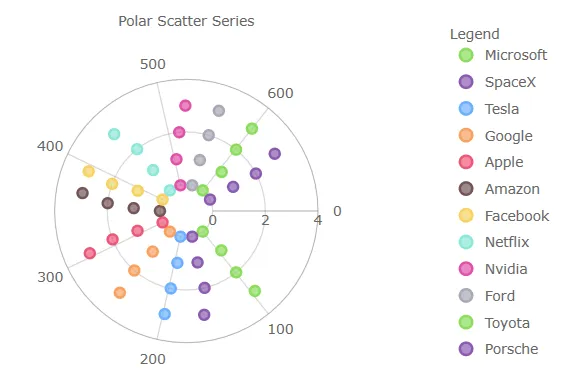 |
Chart Legend
- Added horizontal
Orientationproperty to ItemLegend that can be used with Bubble, Donut, and Pie Chart - Added
LegendHighlightingModeproperty - Enables series highlighting when hovering over legend items
igniteui-angular-maps (GeoMap)
These features are CTP
- Added support for wrap around display of the map (scroll infinitely horizontally)
- Added support for shifting display of some map series while wrapping around the coordinate origin
- Added support for highlighting of the shape series
- Added support for some annotation layers for the shape series
8.2.12
- Changed Import Statements
Import statements have been simplified to use just package names instead of full paths to API classes and enums.
These breaking changes were introduce in these packages and components only:
| Affected Packages | Affected Components |
|---|---|
| igniteui-angular-excel | Excel Library |
| igniteui-angular-spreadsheet | Spreadsheet |
| igniteui-angular-maps | Geo Map, Treemap |
| igniteui-angular-gauges | Bullet Graph, Linear Gauge, Radial Gauge |
| igniteui-angular-charts | Category Chart, Data Chart, Donut Chart, Financial Chart, Pie Chart, Zoom Slider |
| igniteui-angular-core | all classes and enums |
- Code After Changes
Now, you need to use just package names instead of full paths to API classes and enums.
Please also note that the name of the Data Grid component and its corresponding modules have also changed.
// gauges:
import { IgxLinearGauge } from "igniteui-angular-gauges";
import { IgxLinearGaugeModule } from "igniteui-angular-gauges";
import { IgxLinearGraphRange } from "igniteui-angular-gauges";
import { IgxRadialGauge } from 'igniteui-angular-gauges}';
import { IgxRadialGaugeModule } from 'igniteui-angular-gauges';
import { IgxRadialGaugeRange } from 'igniteui-angular-gauges';
import { SweepDirection } from 'igniteui-angular-core';
// charts:
import { IgxFinancialChartComponent } from "igniteui-angular-charts";
import { IgxFinancialChartModule } from "igniteui-angular-charts";
import { IgxDataChartComponent } from "igniteui-angular-charts";
import { IgxDataChartCoreModule } from "igniteui-angular-charts";
// maps:
import { IgxGeographicMapComponent } from "igniteui-angular-maps";
import { IgxGeographicMapModule } from "igniteui-angular-maps";- Code Before Changes
Before, you had to import using full paths to API classes and enums:
// gauges:
import { IgxLinearGaugeComponent } from 'igniteui-angular-gauges/ES5/igx-linear-gauge-component';
import { IgxLinearGaugeModule } from 'igniteui-angular-gauges/ES5/igx-linear-gauge-module';
import { IgxLinearGraphRange } from 'igniteui-angular-gauges/ES5/igx-linear-graph-range';

import { IgxRadialGaugeComponent } from "igniteui-angular-gauges/ES5/igx-radial-gauge-component";
import { IgxRadialGaugeModule } from "igniteui-angular-gauges/ES5/igx-radial-gauge-module";
import { IgxRadialGaugeRange } from "igniteui-angular-gauges/ES5/igx-radial-gauge-range";
import { SweepDirection } from "igniteui-angular-core/ES5/SweepDirection";

// charts:
import { IgxFinancialChartComponent } from "igniteui-angular-charts/ES5/igx-financial-chart-component";
import { IgxFinancialChartModule } from "igniteui-angular-charts/ES5/igx-financial-chart-module";
import { IgxDataChartComponent } from "igniteui-angular-charts/ES5/igx-data-chart-component";
import { IgxDataChartCoreModule } from "igniteui-angular-charts/ES5/igx-data-chart-core-module";

// maps:
import { IgxGeographicMapComponent } from "igniteui-angular-maps/ES5/igx-geographic-map-component";
import { IgxGeographicMapModule } from "igniteui-angular-maps/ES5/igx-geographic-map-module";