Angular Material Theming
The Ignite UI for Angular theming engine makes it easy to be used together with external components imported from other theming libraries like the Angular Material library.
Ignite UI and Angular Material Overview
Angular Material is a UI component library for mobile and desktop Angular web applications. It includes several prebuilt themes and a great number of components that are based on the Material Design specification.
El Ignite UI for Angular es un conjunto completo de widgets de interfaz de usuario basados en material, componentes y kits de interfaz de usuario Sketch y directivas de soporte para Angular que permite a los desarrolladores crear aplicaciones modernas de alto rendimiento. Nuestro motor de temas es fácil de usar y permite la granularidad de temas en diferentes niveles desde un solo componente, varios componentes o toda la suite. Además, se puede utilizar para diseñar componentes de otras bibliotecas de temas con muy poco esfuerzo.
El siguiente artículo demuestra cómo utilizar los componentes Ignite UI y Angular Material en una aplicación y cómo diseñarlos para que se vean similares.
Angular Material Theming Example
Getting Started with Ignite UI and Angular Material
How to install Angular Material
Si está utilizando Angular CLI y tiene un proyecto Angular existente, puede agregar Angular Material con el siguiente comando:
ng add @angular/material
Luego, deberá elegir uno de los temas prediseñados y si desea configurar estilos de tipografía globales y animaciones del navegador para Angular Material. Una vez que haya terminado con esta configuración, su aplicación estará lista para usar los componentes Angular Material.
You can find more information about using the Angular Material library at their official documentation.
How to install Ignite UI for Angular
Para instalar el paquete Ignite UI for Angular junto con todas sus dependencias, importaciones de fuentes y referencias de estilos, ejecute el siguiente comando en el proyecto:
ng add igniteui-angular
Luego, puedes usar los componentes Ignite UI importando sus respectivos módulos en tu archivo app.module.ts:
// manually addition of the Igx Avatar component
import { IgxAvatarModule } from 'igniteui-angular/avatar';
// import { IgxAvatarModule } from '@infragistics/igniteui-angular'; for licensed package

@NgModule({
    imports: [
        ...,
        IgxAvatarModule,
        ...
    ]
)}
Sigue nuestroGetting Started tema para una introducción completa sobre cómo usar Ignite UI for Angular en proyectos existentes. Más información sobre cómo importar y utilizar cada uno de nuestros componentes, junto con ejemplos guiados, se puede encontrar en la documentación del componente.
Ignite UI and Angular Material components
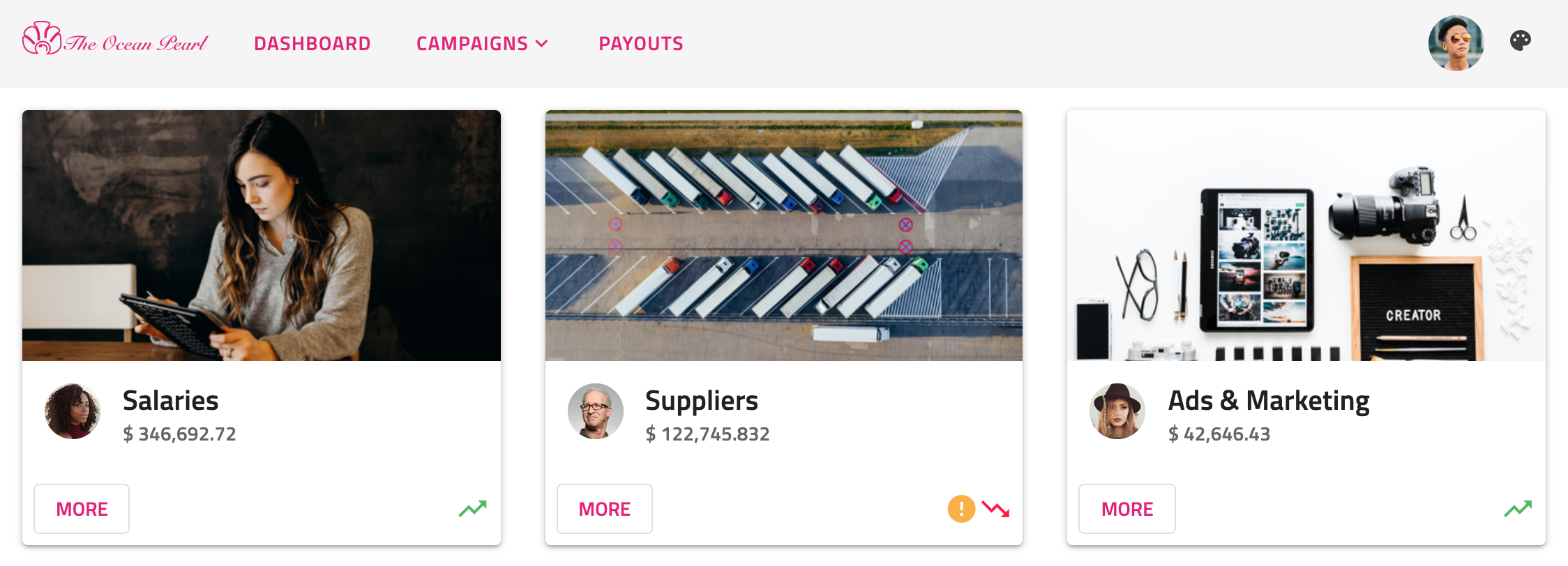
Let's see how our demo sample is done. It is a mixture of Ignite UI and Angular Material components, styled to fit nicely in one application. The navigation in our example is created using the material mat-toolbar together with igx-buttons and igx-avatar. The menu under the Campaigns button is also taken from the Angular Material library. Below the nav, we are using the igx-card component to display some statistics. Within the cards, we have placed multiple items - igx-avatars and igx-icons as well as material buttons.
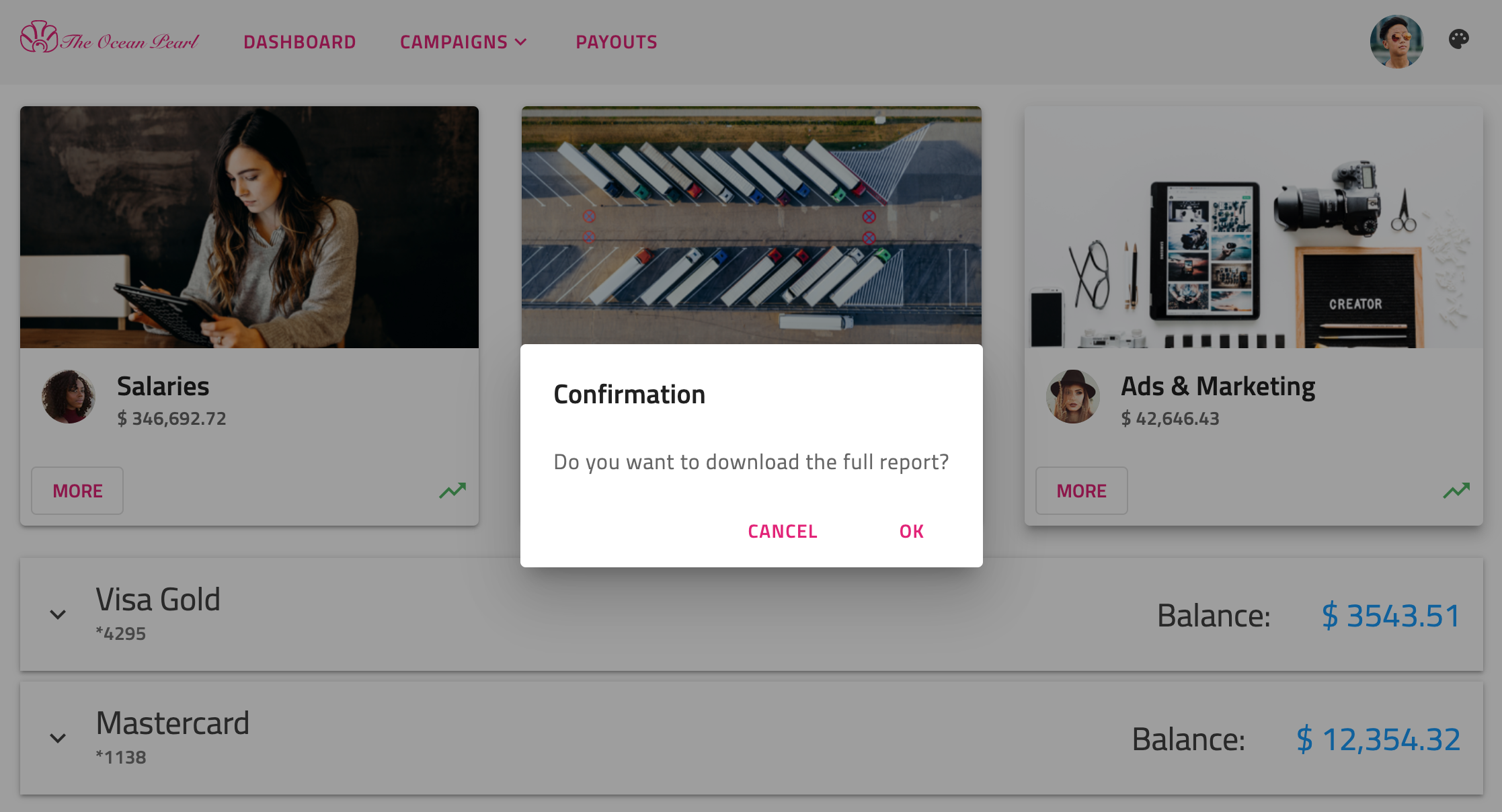
Al pulsar losMore botones, verás eligx-dialog:
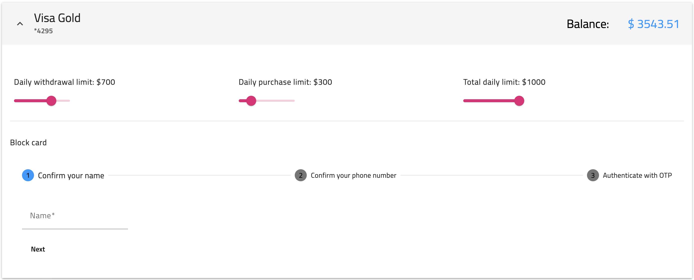
Next, we have added an igx-expansion-panel showing information about some credit cards. Inside its content, there are mat-sliders, an igx-divider and a mat-stepper with mat-form-fields.
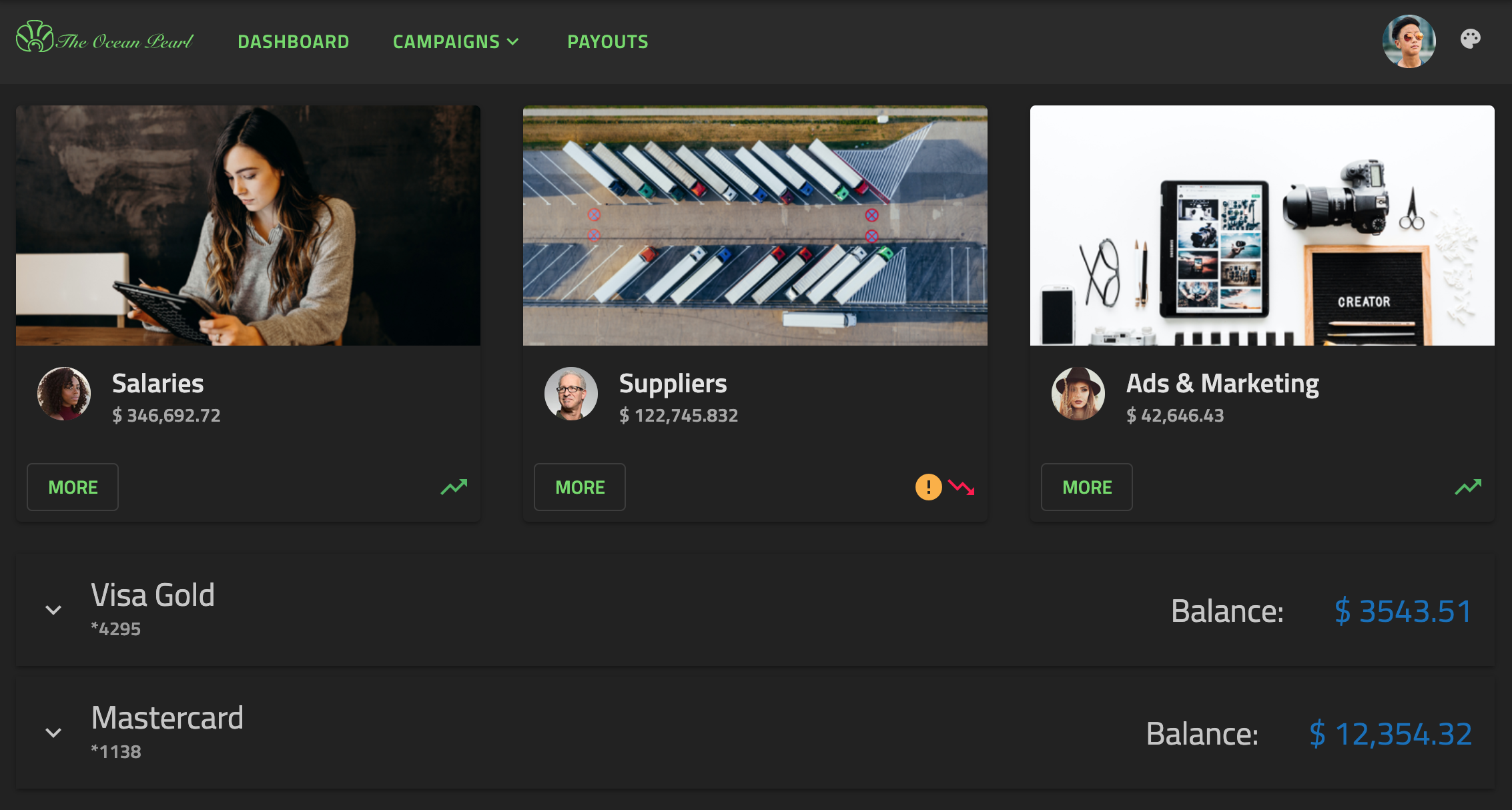
Finally, we inserted an Ignite UI for Angular icon button in the top right corner, that changes the theme of the whole app:
Styling Angular Components
To get started with styling components using the Ignite UI theming engine, create an scss file named of your choice that would be the base file for your global theme. We will call this file _variables.scss. Next, we need to import the Ignite UI and Angular Material index files:
// _variables.scss
```scss
@use "igniteui-angular/theming" as *;
@use "@angular/material" as mat;

// IMPORTANT: Prior to Ignite UI for Angular version 13 use:
// @import '~igniteui-angular/lib/core/styles/themes/index';
Color Palettes
Ignite UI for Angular's palette function produces a color palette map including three sub-palettes for the primary, secondary and gray shades as well as five additional colors for info, success, warn, error and surface. For each color variant, our theming engine automatically generates text contrast colors at runtime, that are also included in the palette. Below, you can see the predefined light material palette:
$igx-light-palette: palette(
    $primary: #09f,
    $secondary: #e41c77
    $info: #1377d5,
    $success: #4eb862,
    $warn: #fbb13c,
    $error: #ff134a,
    $gray: #000,
    $surface: #fff
);
Unlike Ignite UI palettes, Angular Material color palette maps include shades for only one color and their corresponding contrast colors. For example, we can see the $mat-purple palette:
$light-primary-text: white;
$dark-primary-text: rgba(black, 0.87);

$mat-purple: (
  50: #f3e5f5,
  100: #e1bee7,
  ...,
  A700: #aa00ff,
  contrast: (
    50: $dark-primary-text,
    100: $dark-primary-text,
    ...,
    A700: $light-primary-text,
  )
);
Generating Theme Palettes
To define a theme palette, we will have to use the material define-palette function which generates a map of hues to colors. In our sample, we want to style Angular Material components with Ignite UI theme therefore we need to transform our $light-material-palette according to their structure.
To achieve this, we are going to create a Sass function with parameters for $color, $saturations and $palette that returns a map of all color variants followed by the contrast colors. The saturations we are using follow the Material Design color system.
$saturations: (50, 100, 200, 300, 400, 500, 600, 700, 800, 900, A100, A200, A400, A700);

@function material-like-palette(
    $color,
    $saturations,
    $palette,
) {
    $shade: ();
    $contrast: ();
    $result: ();
    @each $saturation in $saturations {
        $shade: map-merge($shade, (
            $saturation: color($palette, $color, $saturation)
        ));
        $contrast: map-merge($contrast, (
            $saturation: color($palette, $color, #{$saturation}-contrast)
        ));
        $result: map-merge($shade, (contrast: $contrast));
    }

    @return $result;
}
Light Theme Palette
We will define a light primary material theme palette using the primary color of the Ignite UI $igx-light-palette and our newly created material-like-palette function. The result has to be passed as a parameter to the define-palette function which will generate color values for the default, lighter, darker and text shades and add them to the palette map:
$light-palette-primary: mat.define-palette(
    material-like-palette('primary', $saturations, $igx-light-palette));
Hagamos lo mismo con la paleta de acentos claros:
$light-palette-accent: mat.define-palette(
    material-like-palette('secondary', $saturations, $igx-light-palette));
Finally, we are ready to pass the two color palettes to the define-light-theme function which will create an Angular Material theme with colors taken from the Ignite UI material color palette:
$custom-mat-light-theme: mat.define-light-theme((
    color: (
        primary: $light-palette-primary,
        accent: $light-palette-accent
    )
));
Note
Visita nuestrapalettes with Sass sección para descubrir más sobre las paletas que ofrece Ignite UI for Angular y aprender a crear una nueva.
Dark Theme Palette
Following the previous approach, we are going to create material palettes for the dark mode. This time, we are also going to define a custom igx-palette:
// Custom palette
$custom-dark-palette: palette(
    $primary: #206094,
    $secondary: #72da67,
    $surface: #222,
    $info: #1377d5,
    $success: #4eb862,
    $warn: #fbb13c,
    $error: #ff134a,
);

// Material dark primary palette
$dark-palette-primary: mat.define-palette(
    material-like-palette('primary', $saturations, $custom-dark-palette));
// Material dark accent palette
$dark-palette-accent: mat.define-palette(
    material-like-palette('secondary', $saturations, $custom-dark-palette));
// Material dark theme
$custom-mat-dark-theme: mat.define-dark-theme((
    color: (
        primary: $dark-palette-primary,
        accent: $dark-palette-accent
    )
));
Themes
In order to switch between light and dark mode, we are adding a custom dark class which will be changed on button click. In our stylesheet file, we are going to include different color palettes scoped to each class.
Ignite UI for Angular comes with predefined themes inspired by the Material Design. To use them, first, you have to include our core mixin and then our built-in theme mixin - theme. We will also make use of our predefined material palettes - $light-material-palette and $dark-material-palette.
For the Angular Material components, we also need to include their core mixin and then the all-component-themes mixin with the aforementioned custom material themes.
// Make sure you always include the core mixin first
@include core();

::ng-deep {
    @include mat.core();
    @include theme($igx-light-palette);
    @include mat.all-component-themes($custom-mat-light-theme);

    .dark {
        @include dark-theme($custom-dark-palette);
        @include mat.all-component-themes($custom-mat-dark-theme);
    }
}
Warning
Asegúrate de colocar el código anterior dentro del::ng-deep selector enpenetrate laEmulated ViewEncapsulation.
Light Mode
Once we are done configuring color palettes and themes, we can make some additional color changes to our components. The background color for our application needs to be set explicitly on the host element. In our sample, we want to use the surface color of the passed palette. The logo is an SVG image hence we can easily change its color using the CSS. Also, we will change some of the colors of the mat-slider component to secondary so that it can fit better in our app:
:host {
    &.light {
        // The background color of the application in light mode
        background: color($igx-light-palette, 'surface');

        // The application logo fill color
        #Path1 {
            fill: color($igx-light-palette, 'secondary');
        }

        // The application logo stroke color
        #Path2 {
            stroke: color($igx-light-palette, 'secondary');
            stroke-width: "0.8";
        }
    }

    //  Update material slider component colors for both light and dark mode
    .mat-mdc-slider.secondary .mdc-slider__track--inactive,
    .mat-mdc-slider.secondary .mdc-slider__thumb-knob {
        background-color: color($custom-mat-light-theme, 'secondary');
    }

    .mat-mdc-slider.secondary .mdc-slider__track--active_fill,
    .mat-mdc-slider.secondary .mdc-slider__thumb-knob {
        border-color: color($custom-mat-light-theme, 'secondary');
    }

    .mat-mdc-slider.secondary .mat-mdc-slider-visual-thumb .mat-ripple > * {
        background-color: color($custom-mat-light-theme, 'secondary');
        opacity: .12;
    }
}
Dark Mode
For our dark variant, we are going to apply the same CSS styles but using the $custom-dark-palette. In addition, we will update some of the colors of the mat-stepper component:
:host {
    &.dark {
        // The background color of the application in dark mode
        background: color($custom-dark-palette, 'surface');

        // The application logo fill color
        #Path1 {
            fill: color($custom-dark-palette, 'secondary');
        }

        // The application logo stroke color
        #Path2 {
            stroke: color($custom-dark-palette, 'secondary');
            stroke-width: "0.8";
        }

        ::ng-deep {
            // The background of the selected step icon inside the material stepper
            .mat-step-header .mat-step-icon-selected {
                background-color: color($custom-dark-palette, 'secondary');
            }

            // The background of the material stepper
            .mat-stepper-horizontal {
                background: color($custom-dark-palette, 'surface');
            }
        }
    }
}
Generate class
The Angular Material toolbar uses CSS classes for its background color. In our sample, we want that color to change according to the selected theme, hence we are going to use the color-classes mixin. It will generate CSS class names for all colors for a given property and color palette, with optional prefix and suffix attached to the class name. For the demo, we will include the mixin twice - once for the light mode with the respective $igx-light-palette as a first value and second time for the dark mode with the $custom-dark-palette:
:host {
    &.light {
        @include color-classes(
            $palette: $igx-light-palette,
            $prop: 'background',
            $prefix: 'bg'
        );
    }

    &.dark {
        @include color-classes(
            $palette: $custom-dark-palette,
            $prop: "background",
            $prefix: "bg"
        );
    }
}
Luego, añade una clase CSS a tu componente de barra de navegación siguiendo el patrón "bg - color from the palette - color variant". En nuestra aplicación de ejemplo, estamos usandobg-gray-100.
Angular Components Typography
Ignite UI for Angular exposes four default type scales for each of its themes, which can be used inside the typography mixin to define the global typography styles of an application. In our example, we are going to apply the material predifined typeface and type-scale but you can create custom ones if you wish.
:host {
    @include typography($font-family: $material-typeface, $type-scale: $material-type-scale);
}
To customize the Angular Material typography, we need to use their define-typography-config function. We will override their $font-family with the Ignite UI $material-typeface and their $button styles as follows:
$custom-typography: mat.define-typography-config(
    $font-family: $material-typeface,
    $button: mat.define-typography-level(14px, $font-weight: 600)
);
Then, the typography config has to be passed to the define-light-theme mixin:
$custom-mat-light-theme: mat.define-light-theme((
    color: (
        primary: $light-palette-primary,
        accent: $light-palette-accent
    ),
    typography: $custom-typography
));
Check Angular Material Typography documentation for more detailed information.
API References
- Light Material Palette
- Dark Material Palette
- Tema de material ligero
- Dark Material Theme
- Función de paleta
- Tipografía Mixin
Temas relacionados:
- paletas
- Temas de componentes
- Tipografía
- Componente de avatar
- Componente de botón
- Componente de diálogo
- Componente de icono
- Componente del panel de expansión
Additional Resources
Nuestra comunidad es activa y siempre da la bienvenida a nuevas ideas.
 GitHub