Descripción general del componente Angular Query Builder
Angular Query Builder es parte de nuestros componentes Angular y proporciona una interfaz de usuario completa que permite a los desarrolladores crear consultas de filtrado de datos complejas para un conjunto de datos específico. Con este componente, pueden crear un árbol de expresiones y establecer condiciones AND/OR entre ellas con editores y listas de condiciones determinadas por el tipo de datos de cada campo. El árbol de expresiones se puede transformar fácilmente en una consulta en el formato que admita el backend.
ElIgxQueryBuilderComponent componente proporciona una forma de crear consultas complejas a través de la interfaz. Al especificar operadores, condiciones y valores AND/OR, el usuario crea un árbol de expresiones que describe la consulta.
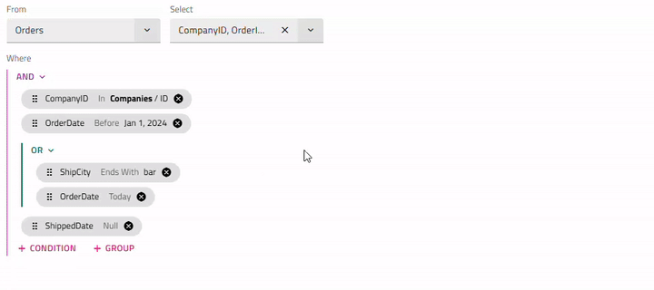
Angular Query Builder Example
Hemos creado este ejemplo de Angular Query Builder para mostrarle las funcionalidades predeterminadas del componente Angular Query Builder. Haga clic en el botón más para agregar condiciones, el grupo "y" y el grupo "o". La agrupación o desagrupación de expresiones, así como el reordenamiento, se pueden lograr a través de la funcionalidad de arrastrar y soltar.
Getting Started with Ignite UI for Angular Query Builder
Para empezar a utilizar el componente Ignite UI for Angular Query Builder, primero debe instalar Ignite UI for Angular. En una aplicación Angular existente, escriba el siguiente comando:
ng add igniteui-angular
Para obtener una introducción completa al Ignite UI for Angular, lea el tema de introducción.
El siguiente paso es importar elIgxQueryBuilderModule archivo en el app.module.ts.
// app.module.ts

import { IgxQueryBuilderModule } from 'igniteui-angular/query-builder';
// import { IgxQueryBuilderModule } from '@infragistics/igniteui-angular'; for licensed package

@NgModule({
    ...
    imports: [..., IgxQueryBuilderModule],
    ...
})
export class AppModule {}
Alternativamente,16.0.0 puedes importarlosIgxQueryBuilderComponent como una dependencia independiente, o usar elIGX_QUERY_BUILDER_DIRECTIVES token para importar el componente y todos sus componentes y directivas de soporte.
// home.component.ts

import { IGX_QUERY_BUILDER_DIRECTIVES } from 'igniteui-angular/query-builder';
import { FilteringExpressionsTree, FieldType } from 'igniteui-angular/core';
// import { IGX_QUERY_BUILDER_DIRECTIVES, FilteringExpressionsTree, FieldType } from '@infragistics/igniteui-angular'; for licensed package

@Component({
    selector: 'app-home',
    template: `
    <igx-query-builder #queryBuilder
        [entities]="entities"
        [(expressionTree)]="expressionTree"
        (expressionTreeChange)="onExpressionTreeChange()">
    </igx-query-builder>
    `,
    styleUrls: ['home.component.scss'],
    standalone: true,
    imports: [IGX_QUERY_BUILDER_DIRECTIVES]
    /* or imports: [IgxQueryBuilderComponent] */
})
export class HomeComponent {
    public expressionTree: FilteringExpressionsTree;
    public entities: Array<any>;

    public onExpressionTreeChange() {
        ...
    }
}
Ahora que tienes importado el módulo o directivas Ignite UI for Angular Query Builder, puedes empezar a usar eligx-query-builder componente.
Using the Angular Query Builder
Si no se establece inicialmente ningún árbol de expresión, comience eligiendo una entidad y cuáles de sus campos debe devolver la consulta. Después de eso, se pueden agregar condiciones o subgrupos.
Para añadir una condición, seleccionas un campo, un operando basado en el tipo de dato del campo y un valor si el operando no es unario. Los operandosIn yNot In te permitirán crear una consulta interna con condiciones para una entidad diferente en lugar de simplemente proporcionar un valor. Una vez que la condición está comprometida, aparece un chip con la información de la condición. Al hacer clic o pasar el cursor sobre el chip, tienes la opción de modificarlo o añadir otra condición o grupo justo después.
Al hacer clic en el botón (ANDoOR) situado sobre cada grupo, se abrirá un menú con opciones para cambiar el tipo de grupo o desagrupar las condiciones del interior.
Dado que cada condición está relacionada con un campo específico de una entidad particular, cambiar la entidad llevará a reiniciar todas las condiciones y grupos preestablecidos. Al seleccionar una nueva entidad se mostrará un diálogo de confirmación, a menos que lashowEntityChangeDialog propiedad de entrada esté configurada como falsa.
Puedes empezar a usar el componente asignando laentities propiedad a un array que describe el nombre de la entidad y un array de sus campos, donde cada campo está definido por su nombre y tipo de datos. Una vez seleccionado un campo, asignará automáticamente los operandos correspondientes según el tipo de dato. El Constructor de Consultas tiene laexpressionTree propiedad de entrada. Podrías usarlo para establecer un estado inicial del control y acceder a la lógica de filtrado especificada por el usuario.
ngAfterViewInit(): void {
    const innerTree = new FilteringExpressionsTree(FilteringLogic.And, undefined, 'Companies', ['ID']);
    innerTree.filteringOperands.push({
        fieldName: 'Employees',
        condition: IgxNumberFilteringOperand.instance().condition('greaterThan'),
        conditionName: 'greaterThan',
        searchVal: 100
    });
    innerTree.filteringOperands.push({
        fieldName: 'Contact',
        condition: IgxBooleanFilteringOperand.instance().condition('true'),
        conditionName: 'true'
    });

    const tree = new FilteringExpressionsTree(FilteringLogic.And, undefined, 'Orders', ['*']);
    tree.filteringOperands.push({
        fieldName: 'CompanyID',
        condition: IgxStringFilteringOperand.instance().condition('inQuery'),
        conditionName: 'inQuery',
        searchTree: innerTree
    });
    tree.filteringOperands.push({
        fieldName: 'OrderDate',
        condition: IgxDateFilteringOperand.instance().condition('before'),
        conditionName: 'before',
        searchVal: new Date('2024-01-01T00:00:00.000Z')
    });
    tree.filteringOperands.push({
        fieldName: 'ShippedDate',
        condition: IgxDateFilteringOperand.instance().condition('null'),
        conditionName: 'null'
    });

    this.queryBuilder.expressionTree = tree;
}
EsexpressionTree una propiedad bindable que significa que se implementa una salida correspondienteexpressionTreeChange que se emite cuando el usuario final cambia la interfaz creando, editando o eliminando condiciones. También puede suscribirse por separado para recibir notificaciones y reaccionar a dichos cambios.
<igx-query-builder #queryBuilder
    [entities]="entities"
    [(expressionTree)]="expressionTree"
    (expressionTreeChange)="onExpressionTreeChange()">
</igx-query-builder>
Expressions Dragging
Los chips de condición se pueden reposicionar fácilmente utilizando los enfoques de reordenamiento de arrastrar y soltar del mouse o del teclado. Con ellos, los usuarios pueden ajustar su lógica de consulta de forma dinámica.
- Arrastrar una ficha no modifica su condición/contenido, solo su posición.
- El chip también se puede arrastrar a lo largo de grupos y subgrupos. Por ejemplo, la agrupación/desagrupación de expresiones se logra a través de la funcionalidad de arrastre de expresiones. Para agrupar las condiciones ya existentes, primero debe agregar un nuevo grupo a través del botón 'agregar' grupo. Luego, mediante el arrastre, las expresiones requeridas se pueden mover a ese grupo. Para desagrupar, puede arrastrar todas las condiciones fuera de su grupo actual y una vez que se elimine la última condición, el grupo se eliminará.
Note
Las fichas de un árbol de consulta no se pueden arrastrar en otro, por ejemplo, del padre al interno y viceversa.
Keyboard interaction
Combinaciones de teclas
- Tab / Shift + Tab- navega al chip siguiente/anterior, indicador de arrastre, botón de eliminación, botón de expresión 'agregar'.
- Arrow Down / Arrow Up- Cuando el indicador de arrastre del chip está enfocado, el chip se puede mover hacia arriba / abajo.
- Space / Enter- La expresión enfocada entra en el modo de edición. Si se ha movido la ficha, esto confirma su nueva posición.
- Esc- El reordenamiento de Chip se cancela y vuelve a su posición original.
Note
El reordenamiento del teclado proporciona la misma funcionalidad que la función de arrastrar y soltar del ratón. Una vez que se mueve una ficha, el usuario debe confirmar la nueva posición o cancelar el reorden.
Templating
El componente Generador de consultas de Ignite UI for Angular permite definir plantillas para el encabezado del componente y el valor de búsqueda utilizando los siguientes nombres de referencia predefinidos:
Plantilla de encabezado
Por defecto, elIgxQueryBuilderComponent encabezado no se mostraba. Para definir tal, elIgxQueryBuilderHeaderComponent debe añadirse dentro de eligx-query-builder.
Luego, para establecer el título de la cabecera se podía usar latitle entrada y el contenido de paso dentro de permiteigx-query-builder-header con plantillas para la cabecera del constructor de consultas.
El siguiente fragmento de código ilustra cómo hacerlo:
<igx-query-builder #queryBuilder [entities]="this.entities">
        <igx-query-builder-header [title]="'Query Builder Template Sample'">
        </igx-query-builder-header>
</igx-query-builder>
Search value
El valor de búsqueda de una condición puede plantarse usando laigxQueryBuilderSearchValue directiva, aplicada al<ng-template> interior del cuerpo de laigx-query-builder entidad:
<igx-query-builder #queryBuilder
    [entities]="entities"
    [expressionTree]="expressionTree">
    <ng-template #searchValueTemplate
                igxQueryBuilderSearchValue
                let-searchValue
                let-selectedField = "selectedField"
                let-selectedCondition = "selectedCondition"
                let-defaultSearchValueTemplate = "defaultSearchValueTemplate">
        @if (
            selectedField?.field === 'Region' &&
            (selectedCondition === 'equals' || selectedCondition === 'doesNotEqual')
            ){
            <igx-select [placeholder]="'Select region'" [(ngModel)]="searchValue.value">
                <igx-select-item *ngFor="let reg of regionOptions" [value]="reg">
                    {{ reg.text }}
                </igx-select-item>
            </igx-select>
        }
        @else if (
            selectedField?.field === 'OrderStatus' &&
            (selectedCondition === 'equals' || selectedCondition === 'doesNotEqual')
            ){
            <igx-radio-group>
                <igx-radio class="radio-sample"
                           *ngFor="let stat of statusOptions"
                           value="{{stat.value}}"
                           [(ngModel)]="searchValue.value">
                    {{stat.text}}
                </igx-radio>
            </igx-radio-group>
        }
            @else {
            <ng-container #defaultTemplate *ngTemplateOutlet="defaultSearchValueTemplate"></ng-container>
        }
    </ng-template>
</igx-query-builder>
Formatter
Para cambiar la apariencia del valor de búsqueda en el chip que se muestra cuando una condición no está en modo edición, puedes establecer una función de formateador en el array de campos. El valor de búsqueda y la condición seleccionada podían accederse a través de los argumentos de valor y rowData de la siguiente manera:
this.ordersFields = [
    { field: "CompanyID", dataType: "string" },
    { field: "OrderID", dataType: "number" },
    { field: "EmployeeId", dataType: "number" },
    { field: "OrderDate", dataType: "date" },
    { field: "RequiredDate", dataType: "date" },
    { field: "ShippedDate", dataType: "date" },
    { field: "ShipVia", dataType: "number" },
    { field: "Freight", dataType: "number" },
    { field: "ShipName", dataType: "string" },
    { field: "ShipCity", dataType: "string" },
    { field: "ShipPostalCode", dataType: "string" },
    { field: "ShipCountry", dataType: "string" },
    { field: "Region", dataType: "string", formatter: (value: any, rowData: any) => rowData === 'equals' || rowData === 'doesNotEqual' ? `${value.value}` : value }},
    { field: "OrderStatus", dataType: "number" }
];
Demo
Hemos creado este ejemplo de Angular Query Builder para mostrarle las funcionalidades de plantillas y formateador para el encabezado y el valor de búsqueda del componente Angular Query Builder.
Estilismo
Query Builder Theme Property Map
Al modificar una propiedad principal, todas las propiedades dependientes relacionadas se actualizan automáticamente para reflejar el cambio:
| Propiedad principal | Propiedad dependiente | Descripción |
|---|---|---|
$background |
$label primer plano | El color para las etiquetas del creador de consultas "from" y "select" |
| $header-antecedentes | El color de fondo del encabezado del constructor de consultas | |
| $header primer plano | El color de primer plano del encabezado del constructor de consultas | |
| $subquery-encabezado de fondo | El color de fondo del encabezado de subquery | |
| $subquery-color de borde | El color del borde del bloque de consulta | |
| $separator color | El color del separador del bloque de consulta | |
| $header-border (solo Bootstrap) | El color del borde del encabezado del constructor de consultas |
Para empezar a estilizar el Query Builder, necesitamos importar elindex archivo, donde están todas las funciones de tema y los componentes mezclados:
@use "igniteui-angular/theming" as *;

// IMPORTANT: Prior to Ignite UI for Angular version 13 use:
// @import '~igniteui-angular/lib/core/styles/themes/index';
El Query Builder toma su color de fondo de su tema, usando elbackground parámetro. Para cambiar el fondo necesitamos crear un tema personalizado:
$custom-query-builder: query-builder-theme(
  $schema: $dark-material-schema,
  $background: #292826,
  ...
);
Dado que tenemos otros componentes dentro del Generador de consultas, como botones, chips, menús desplegables y entradas, necesitamos crear un tema separado para cada uno:
$custom-button: flat-button-theme(
  $schema: $dark-material-schema,
  $foreground: #ffcd0f,
);

$custom-input-group: input-group-theme(
  $schema: $dark-material-schema,
  $focused-secondary-color: #ffcd0f
);

$custom-chip: chip-theme(
  $schema: $dark-material-schema,
  $background: #ffcd0f,
);

$custom-icon-button: outlined-icon-button-theme(
  $schema: $dark-material-schema,
  $foreground: #ffcd0f,
);
En este ejemplo solo cambiamos algunos de los parámetros de los componentes listados, pero losbutton-themechip-themedrop-down-themeinput-group-theme temas proporcionan muchos más parámetros para controlar su estilo respectivo.
Note
En lugar de codificar los valores de color como acabamos de hacer, podemos lograr mayor flexibilidad en cuanto a colores usando laspalette funciones ycolor. Por favor, consulta elPalettes tema para obtener una guía detallada sobre cómo utilizarlos.
El último paso es incluir los nuevos temas componentes usando eltokens mixin.
:host {
    @include tokens($custom-query-builder);
    @include tokens($custom-input-group);
    @include tokens($custom-chip);
    @include tokens($custom-icon-button);

    .igx-filter-tree__buttons {
      @include tokens($custom-button);
    }
}
Note
Si el componente utiliza unaEmulated ViewEncapsulation, es necesario quepenetrate esta encapsulación use::ng-deep estilizar los componentes dentro del componente constructor de consultas (botón, chip, desplegable ... etc.).
Demo
Note
La muestra no se verá afectada por el tema global seleccionado deChange Theme.
Styling with Tailwind
Puedes diseñar el constructor de consultas usando nuestras clases utilitarias personalizadas de Tailwind. Asegúrate de configurar primero a Tailwind.
Junto con la importación de viento de cola en su hoja de estilo global, puede aplicar las utilidades de tema deseadas de la siguiente manera:
@import "tailwindcss";
...
@use 'igniteui-theming/tailwind/utilities/material.css';
El archivo de utilidad incluye variantes tantolight comodark de tema.
- Usa
light-*clases para el tema ligero. - Usa
dark-*clases para el tema oscuro. - Añadir el nombre del componente después del prefijo, por ejemplo, ,
light-query-builder,dark-query-builder.
Una vez aplicadas, estas clases permiten cálculos dinámicos de temas. Desde ahí, puedes anular las variables CSS generadas usandoarbitrary properties. Después de los dos puntos, proporciona cualquier formato de color CSS válido (HEX, variable CSS, RGB, etc.).
Puedes encontrar la lista completa de propiedades en el tema de creador de consultas. La sintaxis es la siguiente:
<igx-query-builder
  class="!light-query-builder ![--background:#90B69F]">
  ...
</igx-query-builder>
Note
El signo de exclamación(!) es necesario para asegurar que la clase de utilidad tenga prioridad. Tailwind aplica estilos en capas y, sin marcar estos estilos como importantes, serán anulados por el tema predeterminado del componente.
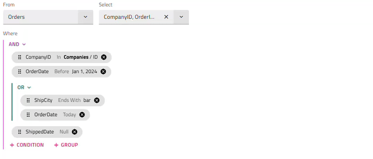
Al final, tu generador de consultas debería verse así:
También puede optimizar el desarrollo de su aplicación Angular utilizando WYSIWYG App Builder ™ con componentes de interfaz de usuario reales.
API References
- API de componentes IgxQueryBuilder
- IgxQueryBuilderHeaderComponent
- IgxQueryBuilderSearchValueTemplateDirectiva
- Estilos de componentes IgxQueryBuilder
Additional Resources
Nuestra comunidad es activa y siempre da la bienvenida a nuevas ideas. GitHub