Customizing Ignite UI for Angular Theming
Este artículo le guiará a través de los detalles de la personalización de la Ignite UI for Angular aplicación de temas, la creación de temas y la optimización del tamaño de la hoja de estilo producida. El artículo muestra detalles de cómo funciona el motor de temas de Ignite UI for Angular y presenta un uso avanzado del mismo. El artículo es muy útil tanto para realizar una personalización completa de los estilos de los componentes, de modo que la aplicación Angular se adapte para que coincida con el aspecto deseado, como para hacer que la aplicación sea óptima para la implementación reduciendo los tamaños de estilo a solo lo que usa la aplicación.
Note
Este documento describe el sistema de temas en Ignite UI for Angular desde la versión 15 en adelante. Entre los ejemplos se incluyen el uso de las API de Sass proporcionadas por el motor de creación de temas y las variables CSS expuestas.
Getting Started
Usaremos el método App Builder para producir una aplicación Angular y luego modificaremos el estilo de la misma en el repositorio generado. Comenzamos creando una nueva aplicación a partir de la plantilla "Encabezado + mini navegación + contenido + panel lateral" en el App Builder y agregamos algunos componentes a la superficie de diseño.
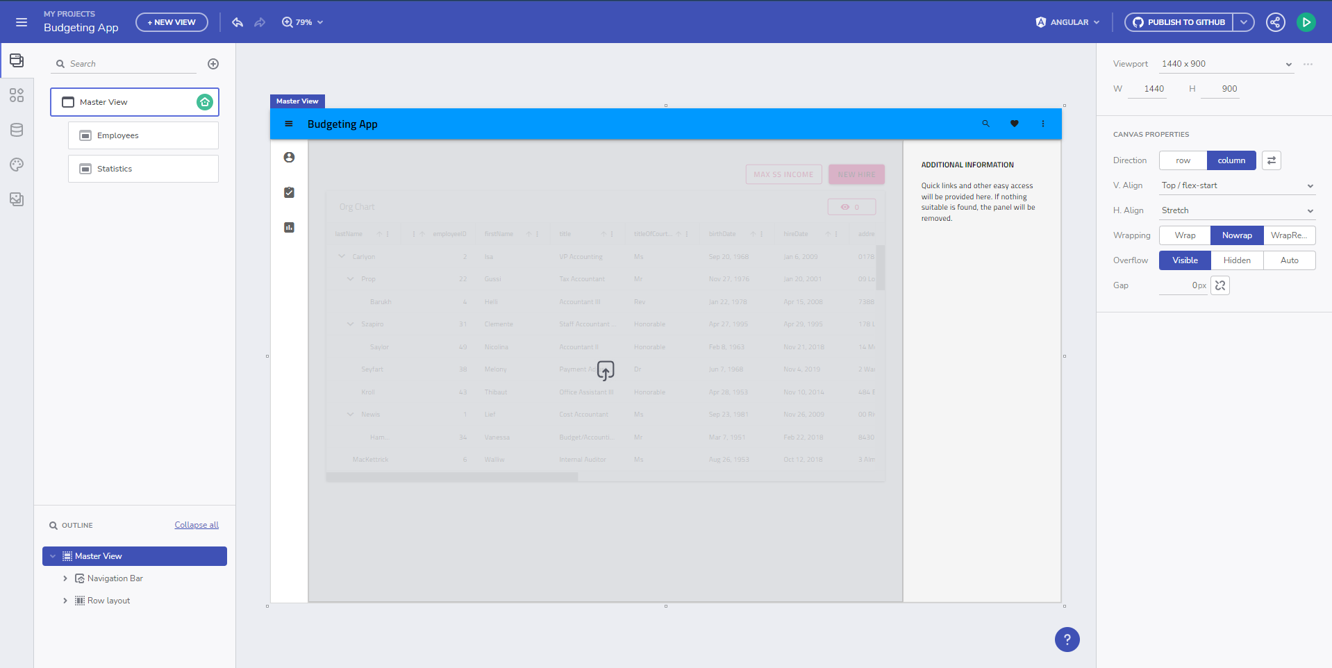
A continuación, generamos nuestra app, utilizando Angular como objetivo, a un repositorio de GitHub, sobre el que trabajaremos tanto desde el App Builder como modificando el propio código generado. Después de clonar el repositorio y compilar el proyecto, obtenemos la aplicación Angular ejecución en su estado inicial.
As you can see, the application has applied default theming, which is material light variant. The generated styles.scss file looks like this:
/* You can add global styles to this file, and also import other style files */

// Standard CSS normalize, comment out if not required or using a different module
@use "minireset.css/minireset";
@use "@infragistics/igniteui-angular/theming" as *;

@include core();
@include typography();
@include light-theme($light-material-palette);

body {
  background: hsla(var(--ig-surface-500));
  color: var(--ig-surface-500-contrast);
}

html, body {
  height: 100%;
}

.ig-typography {
  h1, h2, h3, h4, h5, h6, p, .ig-typography__body-1 {
    margin: 0;
  }
}

.outer-wrapper > *:not(router-outlet) {
  width: 100%;
}
Theme Customization
We want a dark variant of the same theme, add our own color palette to match our branding, and change the font to Poppins instead of the default Titillium Web, all of which we can change directly through the App Builder and we can push the change as a pull request from the App Builder into the repository.
The updated styles.scss looks like this:
@include core();
@include typography($font-family: "Poppins");

$custom-palette: palette(
  $primary: #1028c7,
  $secondary: #e0d94c,
  $surface: #000,
  $gray: #fff
);

@include theme(
    $palette: $custom-palette,
    $schema: $dark-material-schema
);
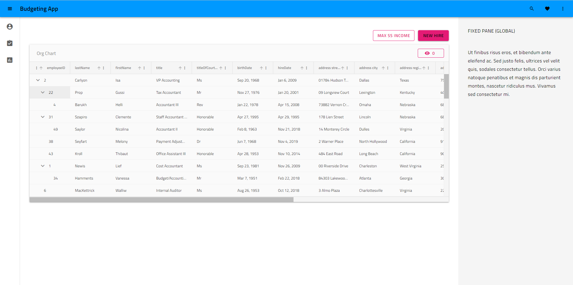
As you can see, the code generation changed from the specific @include light-theme($light-material-palette);, which is the default theme and color palette, to a generic theme() include, which provides as parameters our custom color palette and a dark material schema for the theming structure. The running Angular app result looks like this now:
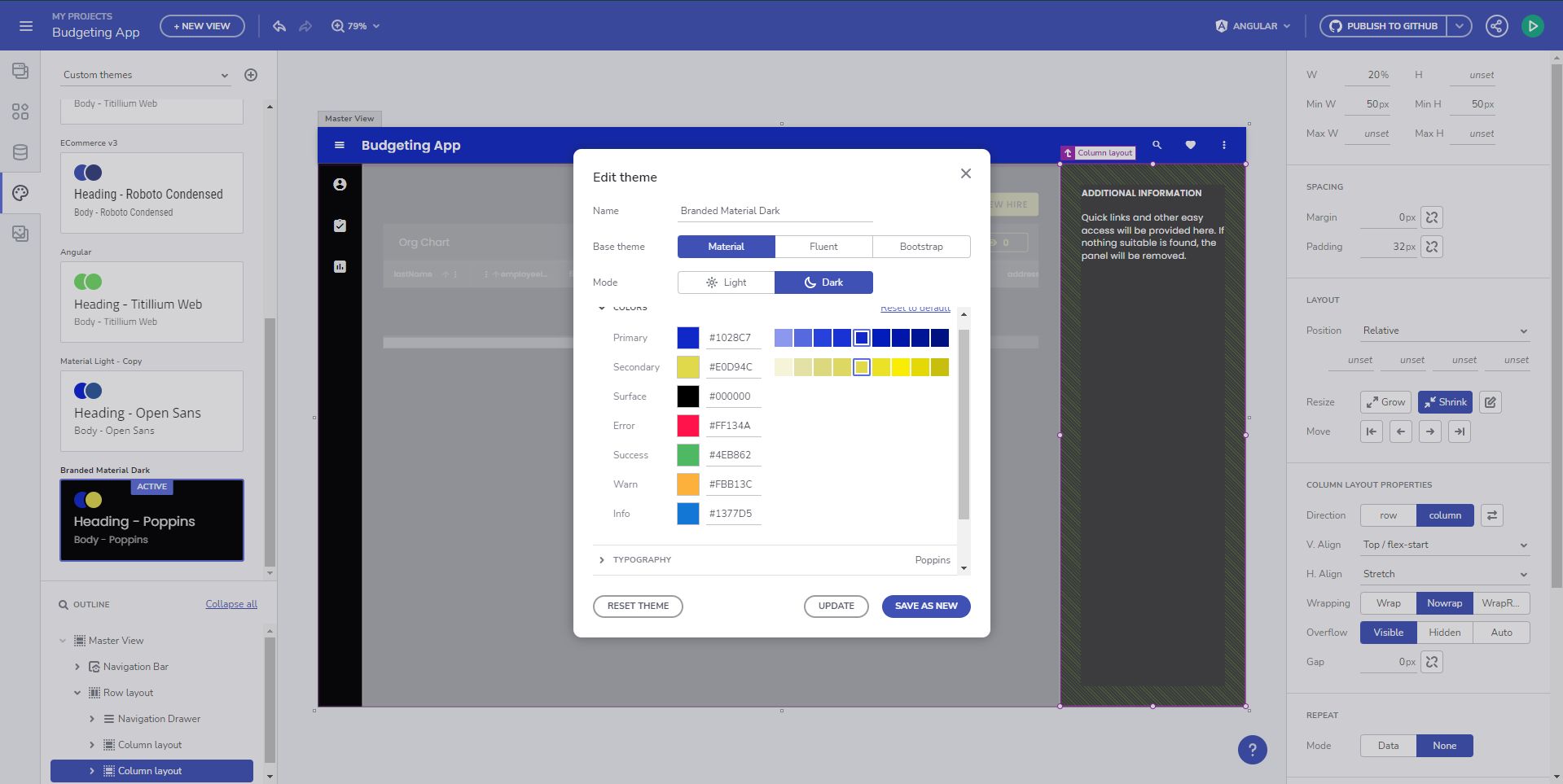
Queremos profundizar y personalizar un tema de componente específico en nuestra aplicación y lo haremos incorporando las variables CSS para un tema de componente individual, en este caso el tema de la barra de herramientas de cuadrícula.
@include core();
@include typography($font-family: "Poppins");

$primary: #1028c7;

/* All of the components will use this custom color palette */
$custom-palette: palette(
  $primary: $primary,
  $secondary: #e0d94c,
  $surface: #000,
  $gray: #fff
);

@include theme(
    $palette: $custom-palette,
    $schema: $dark-material-schema
);

/* Grid Toolbar */
/* All grid toolbars will have custom background and elevations */
$toolbar-theme: grid-toolbar-theme(
  $background-color: $primary
);

@include css-vars($toolbar-theme);
/* END Grid Toolbar */
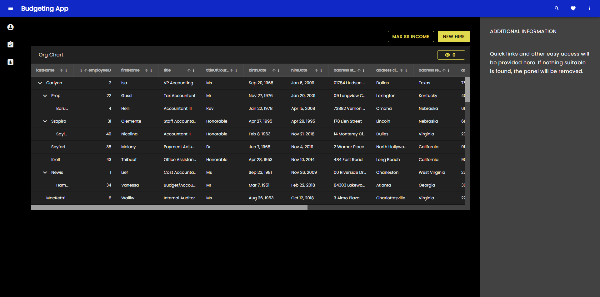
Y el resultado en nuestra aplicación ahora se ve así:
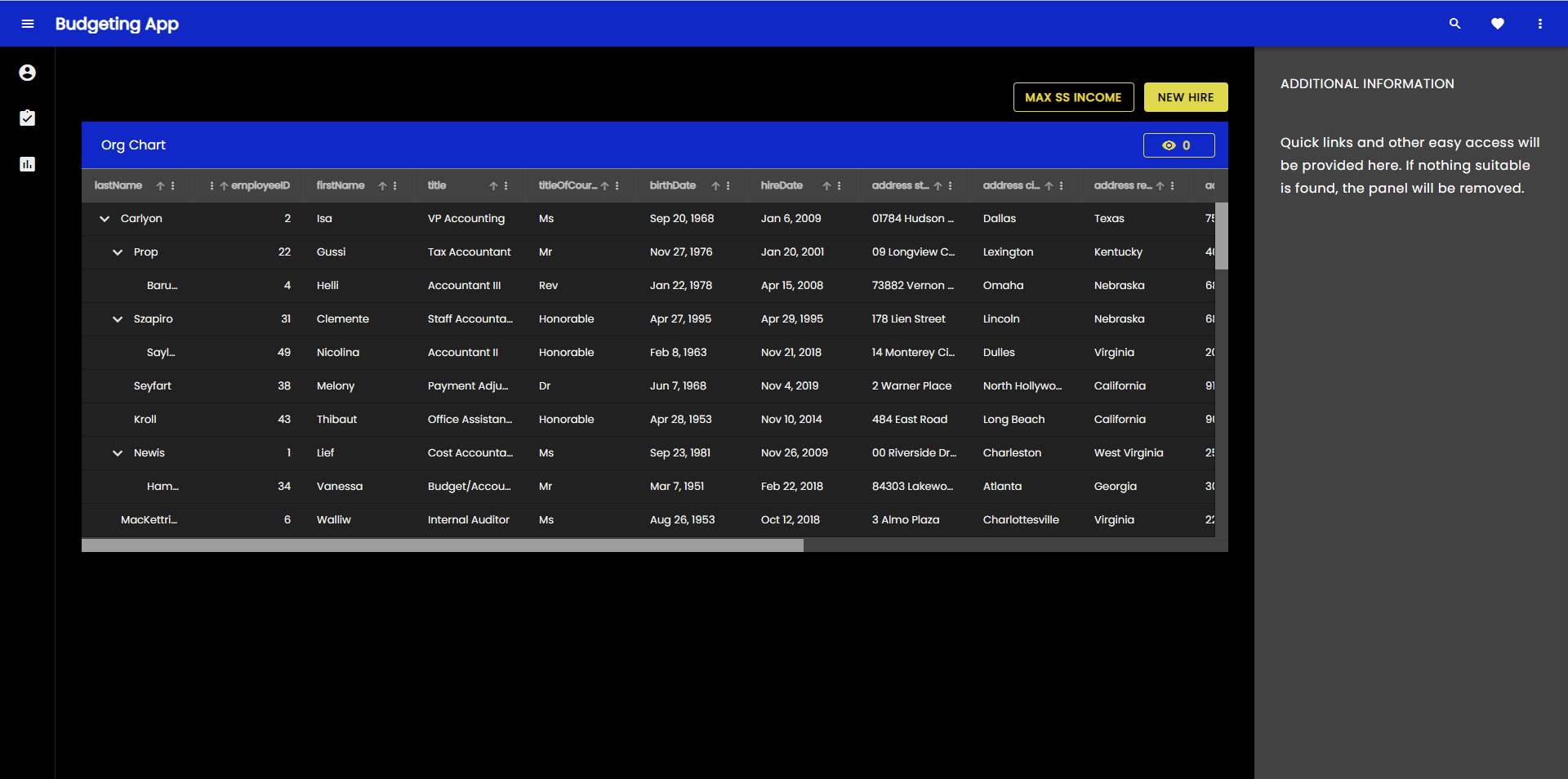
Se puede aplicar el mismo proceso para anular y personalizar cualquiera de los temas componentes individualmente.
Switching custom themes at runtime
Ahora profundicemos aún más y creemos dos versiones personalizadas del tema, que se pueden cambiar en tiempo de ejecución. Podemos hacer esto con el control/preferencia del usuario y permitirles cambiarlo en cualquier momento. Sin embargo, para el ejemplo, usaremos la preferencia de usuario definida por el sistema operativo (claro u oscuro) para aplicar un tema que coincida con la configuración actual del sistema operativo. Para ello necesitaremos dos paletas de colores:
@use "minireset.css/minireset";
@use "@infragistics/igniteui-angular/theming" as *;

@include core();
@include typography($font-family: "Poppins");

$primary-dark: #1028c7;
$primary-light: #3c55f1;
$secondary-dark: #e0d94c;
$secondary-light: #b4a904;

$custom-palette-dark: palette(
  $primary: $primary-dark,
  $secondary: $secondary-dark,
  $surface: #000,
  $gray: #ccc
);

$custom-palette-light: palette(
  $primary: $primary-light,
  $secondary: $secondary-light,
  $surface: #fff,
  $gray: #222
);
Then our theme definition will go in the general scope, which we will use for the light variation and we will create a palette override in a @media query when dark color schema OS preference is detected:
@include theme(
  $palette: $custom-palette-light,
  $schema: $light-material-schema
);

@media (prefers-color-scheme: light) {
  /* Grid Toolbar override for light color scheme */
  igx-grid-toolbar {
    --background-color: #{$primary-light};
    --title-text-color: #{text-contrast($primary-light)};
  }
  /* END Grid Toolbar */
}

@media (prefers-color-scheme: dark) {
  // changes native element schema (scrollbars, select, etc.)
  :root {
    color-scheme: dark;
  }

  @include palette($custom-palette-dark);

  /* Grid Toolbar override for dark color scheme */
  igx-grid-toolbar {
    --background-color: #{$primary-dark};
    --title-text-color: #{text-contrast($primary-dark)};
  }
  /* END Grid Toolbar */
}
Note
I have switched the igx-grid-toolbar theme override to overriding just two of its variables, instead of reincluding all of the theme variables using css-vars().
All theme variables can be found in the corresponding sass api doc and are equivalent to the sass variables, but prefixed with -- instead of $.
Y el resultado ahora se ve así con el tema ligero del sistema operativo:

Y así es como se ve con el tema oscuro del sistema operativo:

Note
El cambio de tiempo de ejecución completo, incluido el cambio de esquema de tema Ignite UI, solo es posible si se crean dos temas completos. En el ejemplo anterior, cambiamos las paletas de colores, pero el esquema de tema sigue siendo $light-material-schema, por lo que no se utilizan todos los tonos correctos de la paleta de colores cuando cambiamos a la paleta de colores oscuros.
What can be customized
Ignite UI tematización abstrae múltiples dimensiones de la tematización y proporciona capacidades de retematización muy sólidas. Los desarrolladores y diseñadores pueden aprovechar las API del motor de temas para crear un diseño visual personalizado para sus aplicaciones, lo que les da un aspecto único al usar Ignite UI for Angular. El motor de temas también expone variables de cada una de las dimensiones, que se pueden usar para aplicar temas al resto de la estructura de la aplicación, que no se construye directamente con Ignite UI for Angular componentes como interfaz de usuario. Las dimensiones expuestas para modificaciones son:
- Colors (color palette)
- Shape (borders and radiuses)
- Elevations (shadows)
- Tipografía (fuentes y tamaños de fuente)
- Tamaño (el tamaño de la información que se ajusta en la pantalla)
Note
Si realmente desea un diseño visual totalmente personalizado, deberá modificar todas las dimensiones temáticas admitidas y aprovechará al máximo las API de Sass. Si solo necesita cambiar cosas como las fuentes y algunos colores, puede echar un vistazo a la sección de paletas y tipografía. En la mayoría de los casos, todo lo que necesitará es cambiar algunas variables CSS y no necesitará las API de Sass completas. Hemos hecho esto lo más granular posible, para que se puedan aplicar modificaciones sin resultados secundarios inesperados en el diseño visual de sus aplicaciones.
Theme Optimization
Después de realizar algunas personalizaciones, crearemos la aplicación que generamos y modificamos para ver cómo se ve el tema de nuestra aplicación en términos de tamaño.
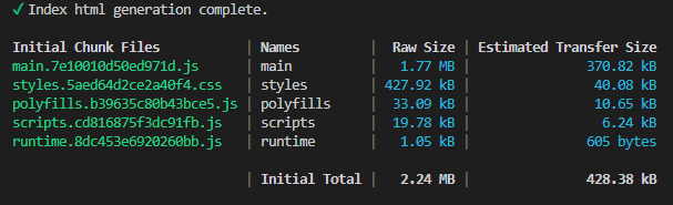
As you can see, the application theme is slightly over 400kb, which comes down to ~40kb when compressed and transferred over. This is not large, but can it be more optimal? The answer is yes, unless every single component from the Ignite UI for Angular suite is used. Calling @include theme() brings in all of the component themes, but we have a mechanism for telling the function what to exclude. There's an $exclude parameter to the theming mixin, which takes component names as an array and excludes those from the theme at build time. Since it's not so easy to find and list all of the components available in the package, it's preferable if you can just list all of the components you use. We expose the full component list as a variable, which you have access to once you
@use "@infragistics/igniteui-angular/theming" as *;
The components array is found at $components and you can reduce this list with the components you use and exclude all the rest, like in this example:
$include: (
  igx-navbar,
  igx-ripple,
  igx-icon,
  igx-button,
  igx-input-group,
  igx-combo,
  igx-nav-drawer,
  igx-grid,
  igx-grid-toolbar
);

@include theme(
  $palette: $custom-palette,
  $schema: $dark-material-schema,
  /* Removing all included components from the full list and excluding the rest  */
  $exclude: map.keys(map.remove($components, $include...))
);
Note
Algunos temas componentes dependen de otros temas componentes.
Incluso si excluye ciertos temas, la compilación los conservará si utiliza un tema de componente, que depende de un tema excluido.
¿Cómo se ve nuestra compilación después de haber excluido ciertos temas?
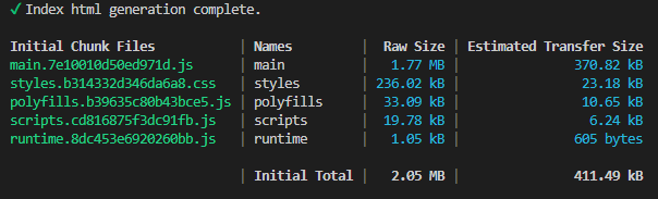
As you can see, our styles size is reduced to almost half it's original size. This looks pretty good at the moment, but can we reduce this even further? In fact, we can. Most of the styles size is taken by the largest components in the suite, in this case the IgxTreeGridComponent that we have in one of our views. However, we don't use this component in any other view. We can make the view with the igx-tree-grid a lazy-loaded route and we can include the theme for the grids only for that route, hence making our top-level css even smaller. How is this done?
Comenzaremos creando un nuevo módulo y un nuevo módulo de enrutamiento en la carpeta con el componente de empleados en nuestra aplicación.
// employees.module.ts
import { NgModule } from '@angular/core';
import { CommonModule } from '@angular/common';

import { EmployeesRoutingModule } from './employees-routing.module';
import { EmployeesComponent } from './employees.component';
import { IgxButtonModule, IgxComboModule, IgxTreeGridModule } from '@infragistics/igniteui-angular';


@NgModule({
  declarations: [
    EmployeesComponent
  ],
  imports: [
    CommonModule,
    EmployeesRoutingModule,
    IgxComboModule,
    IgxTreeGridModule,
    IgxButtonModule
  ]
})
export class EmployeesModule { }
// employees-routing.module.ts
import { NgModule } from '@angular/core';
import { RouterModule, Routes } from '@angular/router';
import { EmployeesComponent } from './employees.component';

const routes: Routes = [{ path: '', component: EmployeesComponent }];

@NgModule({
  imports: [RouterModule.forChild(routes)],
  exports: [RouterModule]
})
export class EmployeesRoutingModule { }
// Updated top-level app-routing.module.ts
import { NgModule } from '@angular/core';
import { Routes, RouterModule } from '@angular/router';

import { PageNotFoundComponent } from './error-routing/not-found/not-found.component';
import { UncaughtErrorComponent } from './error-routing/error/uncaught-error.component';
import { ErrorRoutingModule } from './error-routing/error-routing.module';
import { StatisticsComponent } from './statistics/statistics.component';

export const routes: Routes = [
  { path: '', redirectTo: 'statistics', pathMatch: 'full' },
  { path: 'error', component: UncaughtErrorComponent },
  // { path: 'employees', component: EmployeesComponent, data: { text: 'Employees' } },
  // lazy-loading the employees route
  { path: 'employees', loadChildren: () => import('./employees/employees.module').then(m => m.EmployeesModule) },
  { path: 'statistics', component: StatisticsComponent, data: { text: 'Statistics' } },
  { path: '**', component: PageNotFoundComponent } // must always be last
];

@NgModule({
  imports: [RouterModule.forRoot(routes), ErrorRoutingModule],
  exports: [RouterModule, ErrorRoutingModule]
})
export class AppRoutingModule {
}
Now we remove the IgxTreeGridModule and IgxComboModule imports, as well as the EmployeesComponent from our app.module.ts because we don't use the imports in any other views and we can have only one component declaration in all modules.
Then we will proceed by removing the igx-grid, igx-grid-toolbar and igx-combo from our theme includes, and we will include them on the employees.component.scss level.
/* employees.component.scss */
@use "@infragistics/igniteui-angular/theming" as *;

:host ::ng-deep {
  height: 100%;
  display: flex;
  justify-content: flex-start;
  align-items: stretch;
  align-content: flex-start;

  $primary: #1028c7;
  @include core();

  @include grid(grid-theme());

  @include combo(combo-theme());

  @include grid-toolbar(
    grid-toolbar-theme(
        $background-color: $primary,
    );
}
/* Updated styles.scss */
@use "sass:map";
@use "minireset.css/minireset";
@use "@infragistics/igniteui-angular/theming" as *;

@include core();
@include typography($font-family: "Poppins");

$primary: #1028c7;

$custom-palette: palette(
  $primary: $primary,
  $secondary: #e0d94c,
  $surface: #000,
  $gray: #fff
);

$include: (
  igx-navbar,
  igx-ripple,
  igx-icon,
  igx-button,
  igx-nav-drawer
);

@include theme(
  $palette: $custom-palette,
  $schema: $dark-material-schema,
  $exclude: map.keys(map.remove($components, $include...),)
);
Note
You probably want to put all your variables, like color palette values in a separate _variables.scss file, which you can include from multiple components to reuse the variables.
El resultado en términos de construcción es el siguiente:
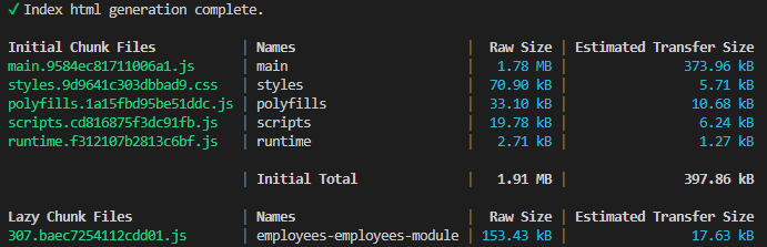
As you can see, our top-level styles.css came down to a little over 70kb, which is a little less than 6kb when compressed. We started at ~428kb, ~40kb compressed and managed to bring this down about 7 times in terms of compressed size. The rest is being delivered only when the view containing the igx-tree-grid and igx-combo components is being loaded.
Additional Resources
Temas relacionados:
Nuestra comunidad es activa y siempre da la bienvenida a nuevas ideas.
 GitHub