

Customizing Ignite UI for Angular Theming
This article will walk you through the details of customizing Ignite UI for Angular application theming and optimizing the size of the produced stylesheet. The article shows details of how the Ignite UI for Angular theming engine works and presents advanced usage of it. The article is very useful for both making full customization of the component styles, such that your Angular application is tailored to match your desired look and feel, and for making your application optimal for deployment by reducing the style sizes down to only what is used by the app.
This document describes the theming system in Ignite UI for Angular from version 15 forward. Examples include both using the Sass APIs provided by the theming engine and exposed CSS variables.
Getting Started
We will be using the App Builder to produce an Angular application and then we will modify the styling of it in the generated repository. We start by creating a new app from “Header + mini nav + content + side pane” template in the App Builder and we add some components to the design surface.
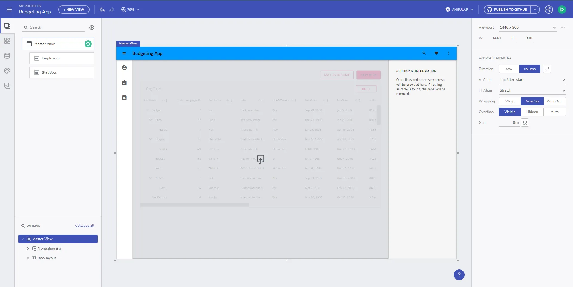
Then we generate our app, using Angular as a target, to a GitHub repository, on top of which we will work both from the App Builder and modifying the generated code itself. After cloning the repository and building the project, we get the running Angular application in its initial state.

As you can see, the application has applied default theming, which is material light variant. The generated styles.scss file looks like this:
/* You can add global styles to this file, and also import other style files */

@use "@infragistics/igniteui-angular/theming" as *;

// Standard CSS normalize, remove if it is not required.
@layer ig.reset {
  @import "minireset.css";
}

@include core();
@include typography();
@include light-theme($light-material-palette);

body {
  background: hsla(var(--ig-surface-500));
  color: var(--ig-surface-500-contrast);
}

html, body {
  height: 100%;
}

.ig-typography {
  h1, h2, h3, h4, h5, h6, p, .ig-typography__body-1 {
    margin: 0;
  }
}

.outer-wrapper > *:not(router-outlet) {
  width: 100%;
}
Theme Customization
We want a dark variant of the same theme, add our own color palette to match our branding, and change the font to Poppins instead of the default Titillium Web, all of which we can change directly through the App Builder and we can push the change as a pull request from the App Builder into the repository.

The updated styles.scss looks like this:
@include core();
@include typography($font-family: "Poppins");

$custom-palette: palette(
  $primary: #1028c7,
  $secondary: #e0d94c,
  $surface: #000,
  $gray: #fff
);

@include theme(
    $palette: $custom-palette,
    $schema: $dark-material-schema
);
As you can see, the code generation changed from the specific @include light-theme($light-material-palette);, which is the default theme and color palette, to a generic theme() include, which provides as parameters our custom color palette and a dark material schema for the theming structure. The running Angular app result looks like this now:

We want to dig deeper and customize a specific component theme in our application and we will do this by bringing in the CSS variables for an individual component theme, in this case the grid toolbar theme.
@include core();
@include typography($font-family: "Poppins");

$primary: #1028c7;

/* All of the components will use this custom color palette */
$custom-palette: palette(
  $primary: $primary,
  $secondary: #e0d94c,
  $surface: #000,
  $gray: #fff
);

@include theme(
    $palette: $custom-palette,
    $schema: $dark-material-schema
);

/* Grid Toolbar */
/* All grid toolbars will have custom background and elevations */
$toolbar-theme: grid-toolbar-theme(
  $background: $primary
);

@include tokens($toolbar-theme);
/* END Grid Toolbar */
And the result in our app now looks like this:

The same process can be applied to override and customize any of the component themes individually.
Switching custom themes at runtime
Now let’s dig even deeper and create two custom versions of the theme, which can be switched between at runtime. We can do this with user control/preference and let them switch it at any time. For the example, however, we will use the OS defined user preference (light or dark) in order to apply a theme, which matches the current OS setting. In order to do this, we will need two color palettes:
@use "@infragistics/igniteui-angular/theming" as *;

@layer ig.reset {
  @import "minireset.css";
}

@include core();
@include typography($font-family: "Poppins");

$primary-dark: #1028c7;
$primary-light: #3c55f1;
$secondary-dark: #e0d94c;
$secondary-light: #b4a904;

$custom-palette-dark: palette(
  $primary: $primary-dark,
  $secondary: $secondary-dark,
  $surface: #000,
  $gray: #ccc
);

$custom-palette-light: palette(
  $primary: $primary-light,
  $secondary: $secondary-light,
  $surface: #fff,
  $gray: #222
);
Then our theme definition will go in the general scope, which we will use for the light variation and we will create a palette override in a @media query when dark color schema OS preference is detected:
@include theme(
  $palette: $custom-palette-light,
  $schema: $light-material-schema
);

@media (prefers-color-scheme: light) {
  /* Grid Toolbar override for light color scheme */
  igx-grid-toolbar {
    --background: #{$primary-light};
    --title-text-color: #{text-contrast($primary-light)};
  }
  /* END Grid Toolbar */
}

@media (prefers-color-scheme: dark) {
  // changes native element schema (scrollbars, select, etc.)
  :root {
    color-scheme: dark;
  }

  @include palette($custom-palette-dark);

  /* Grid Toolbar override for dark color scheme */
  igx-grid-toolbar {
    --background: #{$primary-dark};
    --title-text-color: #{text-contrast($primary-dark)};
  }
  /* END Grid Toolbar */
}I have switched the igx-grid-toolbar theme override to overriding just two of its variables, instead of reincluding all of the theme variables using tokens.
All theme variables can be found in the corresponding sass api doc and are equivalent to the sass variables, but prefixed with -- instead of $.
And the result now looks like this with light OS theme:

And this is how it looks with dark OS theme:

Full runtime switch, including Ignite UI theme schema preset switch is possible, only if two full themes are built. In the example above, we’re switching the color palettes, but the theme schema remains $light-material-schema, so not all of the correct shades from the color palette are used when we switch to the dark color palette.
What can be customized
Ignite UI theming abstracts multiple dimensions of theming and provides for very robust retheming capabilities. Developers and designers can take advantage of the theming engine APIs to make tailored visual design for their applications, which gives them unique look and feel when using Ignite UI for Angular. The theming engine also exposes variables from each of the dimensions, which can be used to apply theming to the rest of the application structure, which is not directly built with Ignite UI for Angular components as UI. The dimensions exposed for modifications are:
- Colors (color palette)
- Shape (borders and radiuses)
- Elevations (shadows)
- Typography (fonts and font sizes)
- Size (the size of information that is fitted on the screen)
If you really want a fully custom visual design, you will need to modify all of the supported theming dimensions and you will take full advantage of the Sass APIs. If you just need to change things like the fonts and а few colors, then you can just take a look at the section for palettes and typography. In most cases, all you will need is to change a few CSS variables and you won’t need the full Sass APIs. We’ve made this as granular as possible, so modifications can be applied without unexpected side results on the visual design of your applications.
Theme Optimization
Starting with Ignite UI for Angular 22.1.0, component structural styles ship inside each component’s own bundle instead of a single, all-or-nothing global stylesheet. Your build tool (webpack, esbuild, etc.) includes structural CSS only for the components your application actually imports, automatically, without any additional configuration on your part.
Calling @include theme() (together with core() and typography()) generates the shared design tokens — the --ig-* CSS custom properties consumed by every component — for your global stylesheet. Since structural styles no longer live here, this output is already much smaller than a stylesheet that used to bundle every component’s structural CSS regardless of whether it was used.
You can trim the token output further with the $exclude parameter, which removes a listed component’s tokens from the global preset. This is useful when you know your application will never use a given component and don’t want to ship tokens for it. Since it’s not so easy to find and list all of the components available in the package, it’s preferable if you can just list all of the components you use. We expose the full component list as a variable, which you have access to once you
@use "@infragistics/igniteui-angular/theming" as *;The components array is found at $components and you can reduce this list with the components you use and exclude all the rest, like in this example:
$include: (
  igx-navbar,
  igx-ripple,
  igx-icon,
  igx-button,
  igx-input-group,
  igx-combo,
  igx-nav-drawer,
  igx-grid,
  igx-grid-toolbar
);

@include theme(
  $palette: $custom-palette,
  $schema: $dark-material-schema,
  /* Removing all included components from the full list and excluding the rest  */
  $exclude: map.keys(map.remove($components, $include...))
);Some component themes depend on other component themes.
Even if you exclude certain themes, they will be retained by the build if you use a component theme, which depends on an excluded theme.
Scoping a feature’s custom theme to its lazy-loaded route
Even with automatic tree-shaking, you’ll often still want to keep custom token overrides for a component close to the one feature that uses them, instead of adding them to your global stylesheet where every view has to carry them. Say your IgxTreeGridComponent and IgxComboComponent instances, richly customized to match a specific design, are only used inside one “Employees” view and nowhere else in your app. Rather than defining their custom colors in the app-wide styles.scss, you can colocate those overrides with the feature itself by lazy-loading that view as its own route.
We will start by creating a new module and a new routing module in the folder with the employees component in our app.
// employees.module.ts
import { NgModule } from '@angular/core';
import { CommonModule } from '@angular/common';

import { EmployeesRoutingModule } from './employees-routing.module';
import { EmployeesComponent } from './employees.component';
import { IgxButtonModule, IgxComboModule, IgxTreeGridModule } from '@infragistics/igniteui-angular';


@NgModule({
  declarations: [
    EmployeesComponent
  ],
  imports: [
    CommonModule,
    EmployeesRoutingModule,
    IgxComboModule,
    IgxTreeGridModule,
    IgxButtonModule
  ]
})
export class EmployeesModule { }
// employees-routing.module.ts
import { NgModule } from '@angular/core';
import { RouterModule, Routes } from '@angular/router';
import { EmployeesComponent } from './employees.component';
const routes: Routes = [{ path: '', component: EmployeesComponent }];
@NgModule({
imports: [RouterModule.forChild(routes)],
exports: [RouterModule]
})
export class EmployeesRoutingModule { }// Updated top-level app-routing.module.ts
import { NgModule } from '@angular/core';
import { Routes, RouterModule } from '@angular/router';
import { PageNotFoundComponent } from './error-routing/not-found/not-found.component';
import { UncaughtErrorComponent } from './error-routing/error/uncaught-error.component';
import { ErrorRoutingModule } from './error-routing/error-routing.module';
import { StatisticsComponent } from './statistics/statistics.component';
export const routes: Routes = [
{ path: '', redirectTo: 'statistics', pathMatch: 'full' },
{ path: 'error', component: UncaughtErrorComponent },
// { path: 'employees', component: EmployeesComponent, data: { text: 'Employees' } },
// lazy-loading the employees route
{ path: 'employees', loadChildren: () => import('./employees/employees.module').then(m => m.EmployeesModule) },
{ path: 'statistics', component: StatisticsComponent, data: { text: 'Statistics' } },
{ path: '**', component: PageNotFoundComponent } // must always be last
];
@NgModule({
imports: [RouterModule.forRoot(routes), ErrorRoutingModule],
exports: [RouterModule, ErrorRoutingModule]
})
export class AppRoutingModule {
}Now we remove the IgxTreeGridModule and IgxComboModule imports, as well as the EmployeesComponent declaration, from our app.module.ts because we don’t use them in any other views and a component can only be declared in one module.
Then we move the custom igx-grid, igx-grid-toolbar, and igx-combo themes out of the global stylesheet and colocate them with the component that uses them, in employees.component.scss. We use scoped mode because the components are excluded from the global theme() output below. CSS custom properties normally inherit through Emulated View Encapsulation; if a generated selector for a nested component does not match, wrap only that include in ::ng-deep or move it to a global stylesheet:
/* employees.component.scss */
@use "@infragistics/igniteui-angular/theming" as *;

:host {
  height: 100%;
  display: flex;
  justify-content: flex-start;
  align-items: stretch;
  align-content: flex-start;

  $primary: #1028c7;

  @include tokens(
    grid-theme(
      $schema: $dark-material-schema,
      $background: #1a1a1a,
      $foreground: #fff,
      $accent-color: $primary
    ),
    $mode: 'scoped'
  );

  @include tokens(
    combo-theme(
      $schema: $dark-material-schema,
      $toggle-button-background: $primary
    ),
    $mode: 'scoped'
  );

  @include tokens(
    grid-toolbar-theme(
      $schema: $dark-material-schema,
      $background: $primary
    ),
    $mode: 'scoped'
  );
}
Because the Employees stylesheet now emits complete scoped themes, the top-level stylesheet can continue excluding igx-grid, igx-combo, and igx-grid-toolbar from its token output. It only emits global tokens for the shared components listed in $include:
/* Updated styles.scss */
@use "sass:map";
@use "@infragistics/igniteui-angular/theming" as *;

@layer ig.reset {
  @import "minireset.css";
}

@include core();
@include typography($font-family: "Poppins");

$primary: #1028c7;

$custom-palette: palette(
  $primary: $primary,
  $secondary: #e0d94c,
  $surface: #000,
  $gray: #fff
);

$include: (
  igx-navbar,
  igx-ripple,
  igx-icon,
  igx-button,
  igx-nav-drawer
);

@include theme(
  $palette: $custom-palette,
  $schema: $dark-material-schema,
  $exclude: map.keys(map.remove($components, $include...))
);You probably want to put all your variables, like color palette values in a separate _variables.scss file, which you can include from multiple components to reuse the variables.
The result: the global stylesheet no longer carries color overrides that only matter for the Employees view, and since IgxTreeGridComponent and IgxComboComponent are now only imported by the lazy-loaded EmployeesModule, their structural styles are fetched together with that module’s chunk — only when a user actually navigates to the Employees view, rather than on every page load.
Additional Resources
Related topics:
Our community is active and always welcoming to new ideas.