Descripción general de los componentes de Angular Chip
The Angular Chip componentes un elemento visual que muestra información en un contenedor ovalado. El componente tiene varias propiedades: puede ser plantillado, eliminado y seleccionado. Múltiples chips pueden reordenarse y conectarse visualmente entre sí, usando el área del chip como contenedor.
Angular Chip Example
Getting Started with Ignite UI for Angular Chip
Para comenzar con el componente Ignite UI for Angular Chip, primero debe instalar Ignite UI for Angular. En una aplicación Angular existente, escriba el siguiente comando:
ng add igniteui-angular
Para obtener una introducción completa al Ignite UI for Angular, lea el tema de introducción.
El siguiente paso es importar IgxChipsModule en el archivo app.module.ts:
// app.module.ts

import { IgxChipsModule } from 'igniteui-angular/chips';
// import { IgxChipsModule } from '@infragistics/igniteui-angular'; for licensed package

@NgModule({
    ...
    imports: [..., IgxChipsModule],
    ...
})
export class AppModule {}
Alternativamente,16.0.0 puedes importarlosIgxChipComponent como una dependencia independiente, o usar elIGX_CHIPS_DIRECTIVES token para importar el componente y todos sus componentes y directivas de soporte.
// home.component.ts

import { IGX_CHIPS_DIRECTIVES } from 'igniteui-angular/chips';
import { NgFor } from '@angular/common';
// import { IGX_CHIPS_DIRECTIVES } from '@infragistics/igniteui-angular'; for licensed package

@Component({
  selector: 'app-home',
  template: `
    <igx-chip *ngFor="let chip of chipList" [id]="chip.id">
      {{ chip.text }}
    </igx-chip>
  `,
  styleUrls: ['home.component.scss'],
  standalone: true,
  imports: [IGX_CHIPS_DIRECTIVES, NgFor],
})
export class HomeComponent {
  public chipList = [
    { text: 'Country', id: '1', icon: 'place' },
    { text: 'City', id: '2', icon: 'location_city' },
    { text: 'Address', id: '3', icon: 'home' },
    { text: 'Street', id: '4', icon: 'streetview' },
  ];
}
Ahora que tienes importado el módulo o directivas Ignite UI for Angular Chips, puedes empezar a usar eligx-chip componente.
Using the Angular Chip Component
TieneIgxChipComponent unaid propiedad de entrada que permite distinguir fácilmente las diferentes instancias del chip. Si no se proporciona unid, se generará automáticamente.
<igx-chip *ngFor="let chip of chipList" [id]="chip.id">
  {{chip.text}}
</igx-chip>
Selección

La selección puede activarse estableciendo laselectable propiedad de entrada entrue. Al seleccionar un chip, se activa elselectedChanging evento. Proporciona el nuevoselected valor para que puedas obtener el nuevo estado y el eventooriginalEvent original que activó el cambio de selección. Si esto no se hace mediante la interacción del usuario, sino estableciendo laselected propiedad de forma programática, eloriginalEvent argumento tiene un valor denull.
<igx-chip *ngFor="let chip of chipList" [selectable]="true">
  <igx-icon igxPrefix>{{chip.icon}}</igx-icon>
  {{chip.text}}
</igx-chip>
Note
Este componente utiliza Iconos de Material. Añade el siguiente enlace a tuindex.html:<link href="https://fonts.googleapis.com/icon?family=Material+Icons" rel="stylesheet">
Removing

La eliminación puede activarse configurando laremovable entrada entrue. Cuando está activado, se muestra un botón de eliminar al final del chip. Al retirar un chip, se emite elremove evento.
De forma predeterminada, el chip no se elimina automáticamente del árbol DOM al hacer clic en el icono de eliminación. La eliminación debe realizarse manualmente.
<igx-chip *ngFor="let chip of chipList" [id]="chip.id" [removable]="true" (remove)="chipRemoved($event)">
  <igx-icon igxPrefix>{{chip.icon}}</igx-icon>
  {{chip.text}}
</igx-chip>
public chipRemoved(event: IBaseChipEventArgs) {
    this.chipList = this.chipList.filter((item) => {
        return item.id !== event.owner.id;
    });
    this.changeDetectionRef.detectChanges();
}
Arrastrando
El arrastre se puede activar configurando ladraggable entrada entrue. Cuando está activado, puedes hacer clic y arrastrar el chip.
<igx-chip *ngFor="let chip of chipList" [id]="chip.id" [draggable]="true">
  <igx-icon igxPrefix>{{chip.icon}}</igx-icon>
  {{chip.text}}
</igx-chip>
Note
Para reordenar los chips necesitas gestionar el evento usando elIgxChipsAreaComponent.
Para crear la muestra de demostración, utilizaremos las funciones anteriores:
<igx-chip *ngFor="let chip of chipList" [id]="chip.id" [selectable]="true" [removable]="true" (remove)="chipRemoved($event)">
  <igx-icon igxPrefix>{{chip.icon}}</igx-icon>
   {{chip.text}}
</igx-chip>
Luego, necesitamos añadir lachipList función y que gestiona elremove evento:
import { IBaseChipEventArgs } from 'igniteui-angular/chips';
// import { IBaseChipEventArgs } from '@infragistics/igniteui-angular'; for licensed package
...
public chipList = [
    {
        text: 'Country',
        id: '1',
        icon: 'place'
    },
    {
        text: 'City',
        id: '2',
        icon: 'location_city'
    },
    {
        text: 'Town',
        id: '3',
        icon: 'store'
    },
    {
        text: 'First Name',
        id: '4',
        icon: 'person_pin'
    }
];

private changeDetectionRef: any;

public chipRemoved(event: IBaseChipEventArgs) {
    this.chipList = this.chipList.filter((item) => {
        return item.id !== event.owner.id;
    });
    this.changeDetectionRef.detectChanges();
}
Si todo ha ido bien deberías ver esto en tu navegador:
Chip Templates
Todos losIgxChipComponent elementos son templados.
Puedes crear plantillas de yprefixsuffix el del chip, usando lasIgxPrefix directivas y de lasIgxSuffix siguientes:

<igx-chip>
  <igx-icon igxPrefix>insert_emoticon</igx-icon>
  <igx-icon igxSuffix style="transform: rotate(180deg)">insert_emoticon</igx-icon>
  <span>Why not both?</span>
</igx-chip>
Puedes personalizar el tamaño del chip usando la variable CSS [--ig-size]. Por defecto está configurado comovar(--ig-size-large). También puede configurarse envar(--ig-size-medium) ovar(--ig-size-small), mientras todo lo que está dentro del chip mantiene su posición relativa:

<igx-chip>Hi! My name is Chip!</igx-chip>

<igx-chip style="--ig-size: var(--ig-size-medium)">
  I can be smaller!
</igx-chip>

<igx-chip style="--ig-size: var(--ig-size-small)">
  <igx-icon igxPrefix>child_care</igx-icon>
  Even tiny!
</igx-chip>
Puedes personalizarloselect icon usando laselectIcon entrada. Acepta valores de tipoTemplateRef y anula el icono por defecto manteniendo la misma funcionalidad.

<igx-chip *ngFor="let chip of chipList" [selectable]="true" [selectIcon]="mySelectIcon">
  <igx-icon igxPrefix>{{chip.icon}}</igx-icon>
  {{chip.text}}
</igx-chip>

<ng-template #mySelectIcon>
  <igx-icon>check_circle</igx-icon>
</ng-template>
Puedes personalizarloremove icon usando laremoveIcon entrada. Toma un valor de tipoTemplateRef y lo renderiza en lugar del icono de eliminar por defecto.
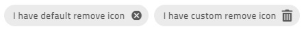
<igx-chip *ngFor="let chip of chipList" [removable]="true" [removeIcon]="myRemoveIcon">
  <igx-icon igxPrefix>{{chip.icon}}</igx-icon>
  {{chip.text}}
</igx-chip>

<ng-template #myRemoveIcon>
  <igx-icon>delete</igx-icon>
</ng-template>
Demo
Para crear el ejemplo de demostración a continuación, usaremos las funciones anteriores:
<igx-chip
*ngFor="let chip of chipList"
[id]="chip.id"
[selectable]="true"
[removable]="true"
(remove)="chipRemoved($event)"
>
    <igx-icon igxPrefix>{{chip.icon}}</igx-icon>
    {{chip.text}}
</igx-chip>
Luego, necesitamos añadir lachipList función y que gestiona elremove evento:
import { IBaseChipEventArgs } from 'igniteui-angular/chips';
// import { IBaseChipEventArgs } from '@infragistics/igniteui-angular'; for licensed package
...
public chipList = [
    {
        text: 'Country',
        id: '1',
        icon: 'place'
    },
    {
        text: 'City',
        id: '2',
        icon: 'location_city'
    },
    {
        text: 'Town',
        id: '3',
        icon: 'store'
    },
    {
        text: 'First Name',
        id: '4',
        icon: 'person_pin'
    }
];

private changeDetectionRef: any;

public chipRemoved(event: IBaseChipEventArgs) {
    this.chipList = this.chipList.filter((item) => {
        return item.id !== event.owner.id;
    });
    this.changeDetectionRef.detectChanges();
}
Si todo ha ido bien deberías ver esto en tu navegador:
Chip Area
SeIgxChipsAreaComponent utiliza al manejar escenarios más complejos que requieren interacción entre chips (arrastre, selección, navegación, etc.).
Reorder Chips

El chip puede ser arrastrado por el usuario final para cambiar su posición. El arrastre está desactivado por defecto, pero puede activarse usando ladraggable propiedad de entrada. Tienes que gestionar manualmente el reordenamiento del chip. Aquí es donde el área del chip resulta útil, ya que proporciona elreorder evento que devuelve el nuevo orden cuando un chip se arrastra sobre otro.
<igx-chips-area (reorder)="chipsOrderChanged($event)">
  <igx-chip *ngFor="let chip of chipList" [draggable]="'true'">
    <igx-icon igxPrefix>{{chip.icon}}</igx-icon>
    {{chip.text}}
  </igx-chip>
</igx-chips-area>
public chipsOrderChanged(event: IChipsAreaReorderEventArgs) {
    const newChipList = [];
    for (const chip of event.chipsArray) {
        const chipItem = this.chipList.filter((item) => {
            return item.id === chip.id;
        })[0];
        newChipList.push(chipItem);
    }
    this.chipList = newChipList;
}
Keyboard Navigation
El chip se puede enfocar usando laTab tecla o haciendo clic en ella. Cuando los chips están en una zona de chip, pueden reordenarse usando la navegación por teclado:
Controles del teclado cuando el chip está enfocado:
IZQUIERDA: mueve el foco al chip de la izquierda.

DERECHA: mueve el foco al chip de la derecha.

ESPACIO: alterna la selección de chip si es seleccionable.

DELETE- Activa el
removeevento para queigxChipla eliminación del chip pueda gestionarse manualmente.SHIFT + LEFT- Activa
reorderel evento cuandoigxChipAreael chip actualmente enfocado debe moverse a la izquierda.SHIFT + RIGHT- Activa
reorderel evento cuandoigxChipAreael chip actualmente enfocado debe moverse una posición a la derecha.
Controles del teclado cuando el botón Quitar está enfocado:
- SPACE o ENTER dispara la
removesalida para que la eliminación del chip pueda gestionarse manualmente.
- SPACE o ENTER dispara la
Aquí hay un ejemplo del área del chip usando IgxAvatar como prefijo e íconos personalizados para todos los chips:
<igx-chips-area (reorder)="chipsOrderChanged($event)">
  <igx-chip
    *ngFor="let chip of chipList"
    [id]="chip.id"
    [selectable]="true"
    [selectIcon]="mySelectIcon"
    [removable]="true"
    [removeIcon]="myRemoveIcon"
    (remove)="chipRemoved($event)"
    [draggable]="'true'">
    <igx-avatar
      class="chip-avatar-resized"
      igxPrefix
      [src]="chip.photo"
      shape="circle">
    </igx-avatar>
    {{chip.name}}
  </igx-chip>
</igx-chips-area>

<ng-template #mySelectIcon>
  <igx-icon>check_circle</igx-icon>
</ng-template>

<ng-template #myRemoveIcon>
  <igx-icon>delete</igx-icon>
</ng-template>
Cambie el tamaño del avatar para que se ajuste al chip:
.chip-avatar-resized {
  width: 2em;
  height: 2em;
  min-width: 2em;
}
Añade laschipList funciones y que gestionan los eventos:
import { IBaseChipEventArgs, IChipsAreaReorderEventArgs } from 'igniteui-angular/chips';
// import { IBaseChipEventArgs, IChipsAreaReorderEventArgs } from '@infragistics/igniteui-angular'; for licensed package

...
public chipList = [
    {
        id: '770-504-2217',
        name: 'Terrance Orta',
        photo: 'https://es.infragistics.com/angular-demos/assets/images/men/27.jpg'
    },
    {
        id: '423-676-2869',
        name: 'Richard Mahoney',
        photo: 'https://es.infragistics.com/angular-demos/assets/images/men/13.jpg'
    },
    {
        id: '859-496-2817',
        name: 'Donna Price',
        photo: 'https://es.infragistics.com/angular-demos/assets/images/women/50.jpg'
    }
];

private changeDetectionRef: any;

public chipRemoved(event: IBaseChipEventArgs) {
    this.chipList = this.chipList.filter((item) => {
        return item.id !== event.owner.id;
    });
    this.changeDetectionRef.detectChanges();
}

public chipsOrderChanged(event: IChipsAreaReorderEventArgs) {
    const newChipList = [];
    for (const chip of event.chipsArray) {
        const chipItem = this.chipList.filter((item) => {
            return item.id === chip.id;
        })[0];
        newChipList.push(chipItem);
    }
    this.chipList = newChipList;
}
Si todo está configurado correctamente, deberías ver esto en tu navegador:
Demo
Estilismo
Chip Theme Property Map
Cuando modificas una propiedad primaria, todas las propiedades dependientes relacionadas se actualizan automáticamente:
| Propiedad principal | Propiedad dependiente | Descripción |
|---|---|---|
$background |
$text-color | El color del texto del chip. |
| $border color | El color del borde de la viña. | |
| $hover antecedentes | El chip flota color de fondo. | |
| $hover-color de borde | El chip flota el color del borde del curso. | |
| $hover-text-color | El chip flota color de texto. | |
| $focus-antecedentes | El color de fondo del enfoque en chip. | |
| $selected antecedentes | El chip seleccionó el color de fondo. | |
$focus-antecedentes |
$focus-text-color | El texto del chip enfoca color. |
| $focus-color de borde | El color del borde del enfoque del chip. | |
| $focus-contorno-color (solo variantes bootstrap y añígo) | El enfoque del chip delinea el color. | |
$selected antecedentes |
$selected-text-color | El color de texto del chip seleccionado. |
| $selected-color del borde | El color de borde seleccionado del chip. | |
| $hover-selección de antecedentes | El chip seleccionado flota en el color de fondo. | |
$hover-selección de antecedentes |
$hover-color-texto-seleccionado | El chip seleccionado flota color de texto. |
| $hover-color-borde-seleccionado | El chip seleccionado flota con el color del borde. | |
| $focus-seleccionado-fondo | El chip seleccionado enfoca el color de fondo. | |
$focus-seleccionado-fondo |
$focus-color-texto-seleccionado | El texto del chip seleccionado enfoca el color. |
| $focus-color-borde-seleccionado | El chip seleccionado enfoca el color del borde. | |
| $focus-selecto-contorno-color (solo variantes bootstrap e índigo) | El chip enfoca el color del contorno en el estado seleccionado. |
Para empezar a estilizar el chip, necesitamos importar elindex archivo, donde están todas las funciones de tema y los componentes mezclados:
@use "igniteui-angular/theming" as *;

// IMPORTANT: Prior to Ignite UI for Angular version 13 use:
// @import '~igniteui-angular/lib/core/styles/themes/index';
Siguiendo el enfoque más sencillo, creamos un nuevo tema que extiende ychip-theme acepta algunos parámetros que estilizan los elementos del chip. Al especificar el$background o el o,$selected-background el tema calcula automáticamente los colores de estado apropiados y contrasta los primeros planos. Aún puedes sobrescribir cualquier otro parámetro con valores personalizados según lo necesites.
$custom-chip-theme: chip-theme(
    $background: #57a5cd,
    $selected-background: #ecaa53,
    $remove-icon-color: #d81414,
    $border-radius: 5px,
);
Finalmente, incluya el tema personalizado en su aplicación:
:host {
  @include tokens($custom-chip-theme);
}
En el ejemplo siguiente, puedes ver cómo usar el componente del chip con variables CSS personalizadas te permite crear un diseño que visualmente se asemeja al chip utilizado en elAnt sistema de diseño.
Styling with Tailwind
Puedes diseñar el chip usando nuestras clases utilitarias personalizadas de Tailwind. Asegúrate de configurar primero a Tailwind.
Junto con la importación de viento de cola en su hoja de estilo global, puede aplicar las utilidades de tema deseadas de la siguiente manera:
@import "tailwindcss";
...
@use 'igniteui-theming/tailwind/utilities/material.css';
El archivo de utilidad incluye variantes tantolight comodark de tema.
- Usa
light-*clases para el tema ligero. - Usa
dark-*clases para el tema oscuro. - Añadir el nombre del componente después del prefijo, por ejemplo, ,
light-chip,dark-chip.
Una vez aplicadas, estas clases permiten cálculos dinámicos de temas. Desde ahí, puedes anular las variables CSS generadas usandoarbitrary properties. Después de los dos puntos, proporciona cualquier formato de color CSS válido (HEX, variable CSS, RGB, etc.).
Puedes encontrar la lista completa de propiedades en el tema del chip. La sintaxis es la siguiente:
<igx-chip
  class="!light-chip
  ![--background:#99BAA6]
  ![--remove-icon-color:#C92828]"
  ...
>
  {{chip.text}}
</igx-chip>
Note
El signo de exclamación(!) es necesario para asegurar que la clase de utilidad tenga prioridad. Tailwind aplica estilos en capas y, sin marcar estos estilos como importantes, serán anulados por el tema predeterminado del componente.
Al final, tus chips deberían verse así:
Custom sizing
Puedes usar la--size variable, dirigiéndote directamente a:igx-chip
igx-chip {
  --size: 50px;
}
O puedes usar la variable universal--ig-chip-size para dirigirte a todas las instancias:
<div class="my-app">
  <igx-chip></igx-chip>
</div>
.my-app {
  --ig-chip-size: 50px;
}
También puedes usar uno de los tamaños predefinidos, asignándolo a la--ig-size variable. Los valores disponibles para--ig-size son--ig-size-small,--ig-size-medium, y--ig-size-large:
igx-chip {
  --ig-size: var(--ig-size-small);
}
Obtén más información al respecto en el artículo Talla.
API
Theming Dependencies
References
Nuestra comunidad es activa y siempre da la bienvenida a nuevas ideas. GitHub